The Minnesota Wild always felt like a team in limbo when it comes to their style of jerseys. They undoubtedly have one of the coolest logos in the league, but the dull color scheme of dark green, red and white has always seemed to handcuff the potential of the jersey. Not to mention they’ve been in the league over 20 years now and never really had a serious overhaul of their uniforms, but rather three natural transitions that leave fans wanting more.
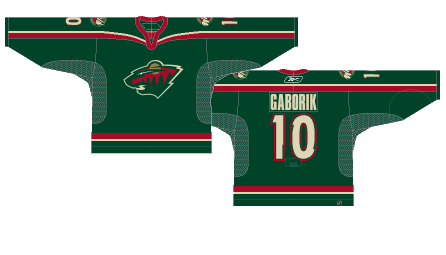
Worst: Reebok Home (2007-2017)
What started as an alternate in 2003 was eventually slightly modified and adopted to be their full-time home jersey in 2007. It’s not uncommon for teams to utilize one of their complementary colors as an alternate jersey, but the Wild ditching their forest green in favor of going in heavy on the red was just a mistake, a decade long mistake.

Number 9: Current Away (2013-Present)
The Wild away jerseys have remained basically unchanged for almost a decade now. Even before, they’re just slightly different than their original white jerseys. It’s a pretty simple design, but also pleasing to look at and maybe the best the Wild could do. But it’s also a very forgettable kit that could possibly benefit from a little more flair.

Number 8: Current Home (2017-Present)
Minnesota joined the stripe-across-the-chest movement when Adidas took over in 2017, and it finally put an end to those ugly red jerseys, but overall still feels like it’s lacking somehow. Adding a red stripe in the sleeves is a much needed splash of color of an otherwise stale jersey.

Number 7: 2016 Stadium Series (2016)
At the time, this was the first appearance of red on their green jerseys since their inaugural green unis. By Stadium Series standards, these jerseys were rather tame. In fact, any standards these jerseys are rather tame.

Number 6: Winter Classic (2022)
Ok, fair warning here, seeing these jerseys in action during the actual game was awesome. They look like they were ripped straight out of the early days of the NHL. They walk the line between really ugly and absolutely awesome perfectly. Exactly what you want to see from a vintage Winter Classic kit.

Number 5: Reebok Alternate (2009-2017)
These alternates ultimately ushered in their current home and away jerseys through slight variations of color and stripe placement. At the time of their arrival, it was the only green jersey in the rotation as the Wild were in their all red everything phase, but the Wild would later steal the color for their home jerseys and the stripe pattern for their away unis. A cool vintage feel with an awesome crest, but once again just too stale to be memorable.

Number 4: Reverse Retro (2021)
The Wild essentially just dipped their current away jersey in vintage Minnesota North Stars colors and it immediately made the Wild scheme so much better. Maybe dial the yellow back just a bit and they could have their next jerseys. New boom period in Minnesota hockey history.

Number 3: Original Away (2000-2013)
A jersey so nice that is survived over half the span of the franchise itself. It’s basic but very clean, it shows off a perfect mixture of their green, red and tan color scheme, and lets the crest stand alone as the focal point of the jersey.

Number 2: Original Home (2000-2007)
The solid green jerseys with subtle red and tan piping on the sleeves and tail stripe is the best approach the Wild ever took to their jerseys. It’s not recommended for all teams, but sometimes simple is best and when you have a unique color in the NHL like the Wild did, showcasing the forest green is their best approach.

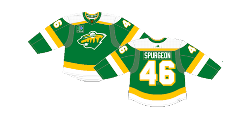
First: Reverse Retro 2.0 (2022-23)
Just like their previous reverse retro attempt, they went with Minnesota North Star colors on their normal jersey and it’s 1,000 times better. There were brief rumors that the organization had considered bringing them back for the 2025-26 season on a full-time basis, but they were shot down, which is a shame because it’s the exact rebrand the team needs. They have returned as their current alternates though, which will just have to do in the meantime.

By: Dan Esche (@DanTheFlyeraFan)
Photo credit: hockeywilderness.com / nhluniforms.com

