
The Washington Capitals have a pretty limited jersey history for a team that has been around since the mid-1970’s. The franchise has only gone through three different major variations over the years, yet have managed to craft some of the most memorable looks in NHL history.
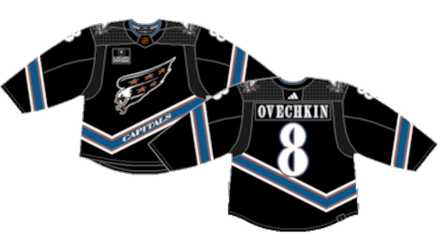
Worst: Current Home (2007-Present)
The current Caps jerseys aren’t terrible, they’re just tired. They’re a bit unique when it comes to overall design, but the Caps are one of just a handful of teams that haven’t updated their jerseys since Reebok took over in 2007. Yeah, they won their Cup in these jerseys, but it’s time for a breath of fresh air in Washington.

Number 12: Current Away (2007-Present)
Ditto for their current aways.

Number 11: 2015 Winter Classic (2015)
These are… a choice. The Caps had do to for a vintage design for an outdoor game, but didn’t draw from their immediate jersey history. The stars above the “W” were an homage to previous Caps jerseys, and the contrast of the crest features the Washington Monument. The maroon and “W” were also tributes to past teams in Washington D.C. dated back to the 1930’s. They’re more than suitable for one-off throwback jerseys, but the general public weren’t fans of the subtle inclusion of little-known history.

Number 10: 2018 Stadium Series (2018)
Typically speaking, teams have one idea for a throwback jersey for special events, then they just become the brainchild of corporate designers whose only goal it to make something different without considering whether or not it’s a good idea. The Capitals would later clean up this look for their modern alternates.

Number 9: Original Home (1974-1995)
The original Caps jerseys are loud. They embraced the red, white and blue patriotism of Washington D.C. An updated version of these jerseys were brought back as alternates from 2015-2017.

Number 8: Original Away (1974-1995)
When you think of vintage 1970’s NHL jerseys, the Caps original white setup has to be one of the first that comes to mind. A wacky logo, a patriotic red, white and blue color scheme and a cliché star pattern tie the uniform together. A modern version of this look was brought back for the 2011 Winter Classic and and deployed as alternate jersey for a few years after.

Number 7: Current Alternate (2021-Present)
The jersey design itself is pretty cool. Based off their 2018 Stadium Series kit, there’s a perfect amount of red and white accents on the jersey to break up the navy blue. A blue jersey to differentiate from their red and white home and away unis goes a long way as well. You smack an actual crest on these jerseys and all of a sudden you have a real hockey jersey. The “W” is a nod to their 2015 Winter Classic kit, but still isn’t a great idea for a modern day crest.

Number 6: 2023 Stadium Series (2023)
In recent years, Stadium Series jerseys have become a fresh look, but mainly fall back on the “make everything big” theory, and the Capitals’ eagle spanning the entire front of the jersey meets that standard. It’s certainly creative and the colors work well, and if they dialed back the size of the crest a bit, they would make for decent away jerseys in the regular rotation.

Number 5: Capitol Away (1997-2007)
These jerseys were very cool and very unique, but were also a tad dingy. It’s a risk you run with a black-based hockey jersey with a darker complementary color on the stripes. They were a one-of-a-kind jersey with a crest that featured the dome of the capitol building with the same unique nameplate font that was featured on the white home jerseys of the time. When it comes to wackiest hockey jerseys of all time, these are pretty high on the list.

Number 4: Screaming Eagle Away (1995-2000)
To be fair to the Capitals, they were quick to pull the rip cord on this one. The jersey is still pretty awesome, but it’s a tad too blue. The Caps added the black capitol jerseys a couple years later and decided that these would take a back seat before ultimately getting retired after just five seasons. Looking back, they’re still well done jerseys, but the white version is so much better.

Number 3: Screaming Eagle Home (1995-2007)
When it comes down to the greatest jerseys in NHL history, the Capitals screaming eagle unis are in the discussion. The wacky 90’s off-centered “V” tail stripe, the unique font for the nameplates and numbers, the crest, the color scheme, everything. It’s just an immaculate hockey jersey.

Number 2: Reverse Retro 1.0 (2021)
Remember the “breath of fresh air” comment from the current home jerseys? Well this is it. The Caps were one of the big winners from the Adidas Reverse Retro series in 2021 by bringing back the famous screaming eagle that was buried for 14 years, but with a twist by adding their current color scheme. It’s a perfect design with a modern twist. How the Capitals haven’t adopted these jerseys full time is beyond me.

First: Reverse Retro 2.0 (2022-23)
Just when you think the screaming eagle can’t get any better, they give it a blackout look. They combined their history with the color scheme of the dome jersey with the perfection of the screaming eagle and walked away with magnificent jerseys that should so much more than one-offs.
By: Dan Esche (@DanTheFlyeraFan)
photo credit: capsjerseys.com / nhluniforms.com
