

The Carolina Hurricanes entered the league in 1997 when the franchise relocated from Hartford with some pretty high jersey expectations to live up to. The Whalers had some of the most iconic jerseys in the history of the NHL, and even though the Hurricanes took a different approach when it came to color scheme and overall design, the early days of the Hurricanes’ jerseys made their own look special. The overall feel of the jerseys has stayed the same over the years, but certain looks are better than others.
Worst: Reebok 2.0 Home (2013-2017)
When the Carolina Hurricanes opted for a jersey rebrand in 2013, it couldn’t have been a bigger failure. Removing the excess black and white striping on the sleeves as well as the warning flags on the tail made for one of the most bland, boring jerseys of the era. Luckily Adidas came along a few years later and added some color back, but boy was this a rough patch for Hurricanes jerseys.

Number 12: Reebok 2.0 Away (2013-2019)
The re-designed away jerseys weren’t much better than the homes. Although keeping the red and black stripes was at least reminiscent of their old style, the red shoulder yoke was a new feature in their history. They’re not the worst jerseys of all time, but are fairly run-of-the-mill and a huge step back for the Hurricanes.

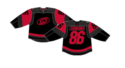
Number 11: Second Alternate/Current Home (2018-Present)
A second attempt at a black alternate jersey is a more accurate representation of real world flags. Two flags means a hurricane warning while one represents a tropical storm. It doesn’t have the same overall beauty as the originals, but it’s more than acceptable for a modern day alternate jersey in the NHL.

Number 10: Current Away (2019-Present)
The Hurricanes are the most recent team to enter the diagonal font style of jerseys. It’s the return of the warning flag tail stripe to the away jerseys while ditching the red shoulder yoke. A little extra black sprinkled throughout the jersey would go a long way to make them even better. It’s a simple but effective jersey.

Number 9: Reverse Retro 2.0 (2022-23)
“While these are certainly reverse, they’re definitely not retro. Perhaps not understanding the assignment, the Hurricanes swap the colors of their current road uniform for their 2022-23 Reverse Retro entry.” Is the bio for these jerseys on nhluniforms.com. We couldn’t have said it any better ourselves.

Number 8: 2023 Stadium Series (2023)
One of the NHL’s go-to Stadium Series designs is a monochromatic that is otherwise pretty uncreative. This is the first time the Hurricanes had their normal logo on a black jersey, which is usually reserved for the warning flag crest. It may be an overdone idea by the league, but red and black is a nearly impossible color scheme to screw up, and thus, they’re fine.
Number 7: Current Alternate (2017-Present)
After a few years of those god awful boring solid red jerseys, the Hurricanes opted to deploy a modern version of their original unis. they’re not exact replicas, the silver was removed and the striping is in a different pattern, but the return of black as an alternate color is far closer to what Hurricanes fans loved back in the day.

Number 6: Reverse Retro (2021)
Given the Hurricanes brought back the real Whalers jerseys for a Heritage Night just a few years prior, the reverse retro collection opted to not take a direct approach to the Hartford team, but rather re-design the look with a modern Hurricanes influence. The silver/grey was the tie from the current Hurricanes jerseys to the 1990’s versions of the Whalers unis. Even though they’re not the best, it’s pretty much impossible to go wrong with the Whalers logo and color scheme.

Number 5: Original Alternate (2008-2017)
These were the very first alternate jersey in franchise history dating back to their Hartford days. Even though they were technically wrong from a real world weather perspective, a solid back jersey with red and silver trim makes for an incredibly sleek look. It was a nice break from their busy, bright home and away jerseys and served as a base for their updated alternate black jerseys under Adidas.

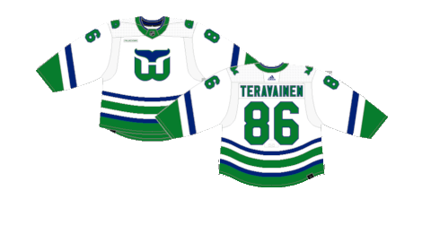
Number 4: Whalers Heritage (2024)
The Hurricanes updated their Heritage night jerseys in 2024 using the white version instead of the green. It’s hard to go wrong with any version of Whalers jerseys and these new white jerseys are about as clean as a hockey jersey can get.
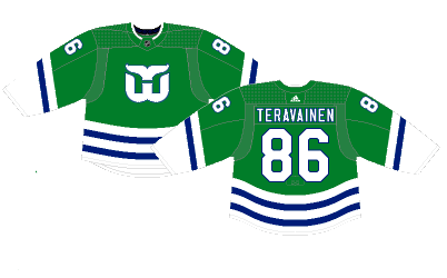
Number 3: Whalers Heritage (2018)
The white jerseys are slick, but the green is unbeatable. How the Hurricanes went 20 years without a nod to their Hartford history is beyond me, but they finally brought back the Whale in 2018 with an almost identical recreation of the Whalers away jerseys worn from 1985 to 1992. Bringing back some of the coolest jerseys in NHL history for a Heritage Night once a season is a solid idea and they should quite frankly be incorporated more often.
Number 2: Original Home (1997-2013)
A red and black color scheme are one of those things that’s incredibly difficult to screw up, and the Hurricanes absolutely knocked these out of the park. The warning flags in the tail stripe are a brilliant touch and the silver as a forth color really helps tie everything together. One of the best jerseys of the 2000’s.

First: Original Away (1997-2013)
The away version of the original Hurricanes setup is overall better. The white base is much easier on the eyes, thus easier to appreciate the detail of the tail stripe and logo. It may not be remembered as one of the best jerseys in recent history, but they should absolutely be in the discussion.

By: Dan Esche (@DanTheFlyeraFan)
photo credit: nhl.com / nhluniforms.com
