

There are few teams in the league that have tried as many different styles of jersey as the Anaheim Ducks. They were one of the first teams to wear an alternate third jersey, they’ve rebranded, and changed color schemes. In the process, they have worn some of the best, and some of the wackiest jerseys in NHL history.
Worst: 90’s Alternate (1997-1999)
You know when you turn on an episode of Full House or Fresh Prince and look at their outfits and think “God, that’s so 90’s”? That’s how these jerseys feel. After burying the wild wing jerseys in 1996, the Ducks re-entered the third jersey pool with an all green, or jade, to be specific, jerseys with an eggplant and grey strip from the shoulders down to the arms. This was technically the Mighty Ducks’ fourth jersey, as they also had white alternates with the same design.

Number 17: White 90s Alternate (1997-1999)
These were the white version of the 1997 alternates. While still ugly in their own right, the white is much easier on the eyes than the full jade. The design on the sleeves and shoulder stayed the same as the other alternate. These jerseys outlived the jade by a full season, when they were dropped from the rotation in 2000, which marked the second time the Ducks dropped an alternate jersey entirely.

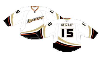
Number 16: Anaheim Ducks Home (2006-2014)
When the Mighty Ducks rebranded as the Anaheim Ducks, they ditched the popular eggplant color scheme for a black jersey with gold, white and orange striping. The Ducks did win their Stanley Cup in these jerseys, so they’ll hold some prominence in the organization’s history, but they’re still a pretty bland kit overall.

Number 15: Anaheim Ducks White (2006-2014)
Ditto for the white versions.
Number 14: Wild Wing (1995-1996)
The Ducks were one of the first teams to utilize an alternate “third” jersey in the NHL, and boy, oh, boy was this a swing and a miss. Known as the “wild wing”, the crest featured a sublimated version of the teams’ mascot coming out from under the ice. The nameplate and numbers on the back were nearly impossible to read due to the whacky font they chose. They were only worn a handful of times during the 1995-96 season before they were retired and lost to history. Probably for the better.

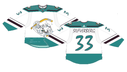
Number 13: 25th Anniversary (2018-19)
What you need to know about the Ducks is that they have teased the Mighty Duck jerseys a handful of times, but other than an October 13, 2013 heritage night, they never brought the real deal back. This was their attempt for the 25th anniversary during the 2018-19 season. The alternates aren’t terrible, but they feel like an entirely different jersey than the tried and true Mighty Ducks. Just an unfair tease to what should’ve been.

Number 12: Reverse Retro 1.0 (2021)
Just as the 20th anniversary of the Wild Wing was approaching and the bastard jerseys were buried, the Ducks decided to pay homage to them for the first incarnation of Adidas’ Reverse Retro line. They possess the same level of whacky the original version did, but the inverse of the while and jade really does make a difference when it comes to presentability. They’re not great, but the re-imagination did the Wild Wing well.
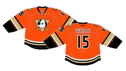
Number 11: 2014 Stadium Series (2014)
These represent the first time the Ducks wore all orange jerseys. It had been a secondary color since the addition of the “Webbed D” jerseys a few years prior. As with most Stadium Series jerseys, they need to be unique. The jersey itself is rather boring compared to what most teams roll out, but the holographic crest and oversized numbers are eye popping.
Number 10: Webbed D Away (2014-2024)
When the Ducks rebranded yet again, they used the “Webbed D” which was serving as their alternate logo for the last few seasons. These jerseys aren’t necessarily bad, but an average kit that stays around for a full decade loses most of the appeal it brings to the table.

Number 9: Webbed D Home (2010-2024)
While these jerseys would eventually become the Ducks home unis in 2014, they were worn as an alternate since 2010. The splash of orange and different crest was a breakup of the monotony their previous black uniforms held.

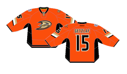
Number 8: Orange Alternate (2015-2017) (2019-2023)
In a redesigned look from the 2014 Stadium Series, the Ducks deploy an orange alternate for the first time, and (with the exception of the 20th anniversary one-offs worn in 2013) it marks the first time the original Mighty Ducks logo was brought back, albeit recolored to fit their new scheme.
Number 7: 30th Anniversary (2023-2024)
If you’re going to break out a whacky color on a whacky jersey, it’s best to just go all out with it, and the Ducks certainly hit that with their 30th anniversary unis. The pants, socks, jerseys and helmets are all eggplant colored. The crest is a slightly tweaked version of the patch that appeared on the shoulders of the original Mighty Ducks jerseys originally appearing in 1996. They’re definitely fun, and that’s all you can ask from hockey jerseys.

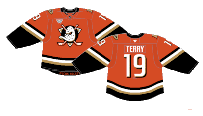
Number 6: New Home (2024-Present)
As Fanatics takes over, the Ducks change their home and away uniforms for the first time in over a decade. they opt for all orange everything with slight tweaks to their alternate orange jerseys. Much like the Philadelphia Flyers’ rebrand, the new shade of orange is a lot less aggressive than the previous and makes the look far more palatable.
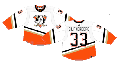
Number 5: New Away (2024-Present)
The recolored crest and new number font may take a minute to get used to, but at their core, the white version of the new look are a solid base for a jersey.

Number 4: Reverse Retro 2.0 (2022-2023)
Since the Ducks are hellbent on not bringing back the proper vintage Mighty Ducks jerseys and infusing orange in everything, these are actually a pretty cool design. The orange pants and white tied the entire uniform together. As much as we like the new Ducks jerseys, these is the kit that probably should’ve been their new away look.
Number 3: Black Alternate (2003-2006)
These will probably be the biggest disagreement on this list, but the Anaheim black alternates were simple and effective. the black base, unique striping with the eggplant and a lack of jade green separated them from their own pack with style.

Number 2: Original Road (1993-2006)
What can be said about these jerseys? They’re just iconic. We could wax poetic for multiple paragraphs about these jerseys or we could all just take a minute to sit back and take in the beauty in silence.

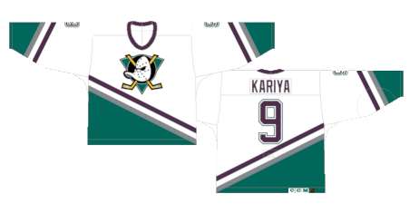
First: Original Home (1993-2006)
Ripped right from the silver screen, the white version of the Mighty Ducks jerseys are perfection. A unique design that applies the best use of the color scheme with a slightly cleaner look than the eggplant version. Sometimes, the beauty really is in the simplicity.
By: Dan Esche (@DanTheFlyeraFan)
photo credit: nhluniforms.com
