

For a sports organization that has been in existence well over 40 years, it’s incredibly rare to see virtually no change when it comes to uniforms. The New Jersey Devils have only worn three incarnations of full-time kits over the years and and each reinvention had just minor tweaks from the previous. They have expanded their catalog in recent years, so now seems like a good time to rank the Devils jerseys from worst to first!
Worst: Reverse Retro 1.0 (2021)
By the letter of the law, these are the reverse of their retro jerseys. They also look like Satan was in charge of the ugly Christmas sweater contest in hell’s DMV.

Number 9: Original Away (1982-1992) (2014 Stadium Series) (2010-2017)
These were the original home jerseys when the Devils relocated to New Jersey from Colorado, they made an appearance at the 2014 Stadium Series foregoing a new look in favor of a reusing a vintage setup, and the Devils wore the jerseys as one-offs for seven years to celebrate St. Patrick’s day. These jerseys are not “good” per se, but they definitely have that vintage vibe to them that few other teams can say they have when it comes to a throwback jersey.

Number 8: Original Home (1982-1992) (2018-Present)
If you have to mix green into the color scheme, this is easily the best way to do it. It’s subtle, it’s subdued and if you weren’t paying attention you wouldn’t even notice it. It was a much better choice for the Devils to make these the heritage kits and ditching the red jerseys.

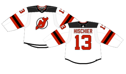
Number 7: Adidas Away (2017-Present)
Anytime the NHL changes jersey manufacturers, the new company likes to put their own design spin on things, and Adidas’ choice was taking a minimalist approach. The Nashville Predators and New Jersey Devils were among the two teams hit hardest by the change. Removing the tail stripe in favor of a thin black trim really took them from simple and sleek to a modernized rebrand no one asked for.
Number 6: Adidas Home (2017-Present)
Ditto for the red jerseys. In fact, it’s arguable the blandness is felt harder on these than the away versions even if the pop of white on the sleeve stripes looks good.

Number 5: Reverse Retro 2.0 (2022-2023)
Much like the Colorado Avalanche, the New Jersey Devils opted to pay homage to the team that came before them- the Colorado Rockies- for their Reverse Retro 2.0 line. Was the Rockies’ color scheme really any better than the green Devils jerseys? Ehh. But it was a pleasant change of pace and the clown car colors are not insulting when used in a secondary fashion on a white jersey.

Number 4: Jersey Alternate (2021-Present)
This was the first time the Devils had a full-time alternate jersey, nearly a quarter century after the NHL started the program. The solid black jersey with white stripes has been tried a few times in NHL history, most notably the Blackhawks and Islanders, but they didn’t feel the need to classify them. Do most people call New Jersey just “Jersey” yes. Did they also label their jersey as “Jersey?” Also yes. It led to such greatness as the “hat” hat, so who can really complain?

Number 3: 2024 Stadium Series (2024)
A common trope for the NHL Stadium Series jerseys across the league is removing white from the color palette. It has been a hit-or-miss in terms of results, but the Devils 2024 Stadium Series jerseys may be the best example of the decision paying off. An all black crest, letters and numbers on a red jersey works pretty well both visually and embracing the “Devils” name.

Number 2: Classic White (1992-2017)
25 years the Devils went without making changes to their jerseys, and it’s easy to see why. They’re simple, clean and work perfectly with the crest. The Devils won two of their three Stanley Cups wearing these jerseys, so they’ll always have a place in their history even if they no longer exist in this form.

First: Classic Red (1992-2017)
A simple design and basic color scheme is sometimes all you need for an iconic hockey jersey.

By: Dan Esche (@DanTheFlyeraFan)
photo credit: nhluniforms.com
