

When it comes to hockey jerseys, the Tampa Bay Lightning are a team that just can’t get it right. With a unique name and color scheme with endless possibilities, they have seemingly missed the mark just about every time they’ve tried to reinvent themselves. Though there have been a few diamonds in the rough that brought out the best of what their jerseys have to offer, so let’s rank ’em!
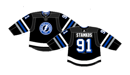
Worst: Adidas Alternate (2018-2022)
Why? What’s the point? These pseudo practice jerseys were apparently designed with Adidas’ Primeknit shoes in mind which is… a choice.

Number 13: Current Away (2011-Present)
The Lightning have worn this style of away jerseys for over a decade. The current versions do not feature the “Tampa Bay” on the crest, a choice they made back in 2017, but otherwise, they’re the same. Solid white jerseys, a boring crest and a single solid stripe on the sleeves and tail- Boring.
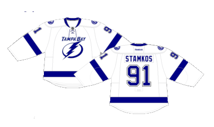
Number 12: Current Home (2011-Present)
Ditto for the current home jerseys. The blue base works slightly better than the white unis, but there’s still not much of a design choice to either critique or praise.

Number 11: Bolts Alternate (2014-2017)
This was the first attempt the Bolts made for an alternate back jersey after blue became their full-time home color in 2011. They’re painfully bland with a done-to-death horizontal workmark and the concept art does not do justice to the white stripe, it’s thick with about three c’s.

Number 10: Reebok Edge Away (2007-2011)
The Reebok Edge takeover really didn’t do most teams any good, but the Lightning weren’t that bad. With a new slightly tweaked crest and a redesign that removed their tail-stripe completely, the Bolts actually deployed a style that worked well with their color palette.

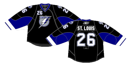
Number 9: Reebok Edge Home (2007-2011)
The black versions put the Edge look on better display.
Number 8: 2022 Stadium Series (2022)
Stadium Series jerseys are always hit or miss, and the Lightning walked away with something closer to the former. They paid homage to their previous kits by bringing back the “BOLTS” wordmark, but added a whacky lightning bolt design on the front while keeping the rest of the jersey barren of much else. They served their purpose for a one-off attraction, but could’ve been even better with more pizzazz.

Number 7: Storm Alternate (1996-1999)
It’s only right that a team named the Lightning had a jersey with a literal storm on it. They definitely scream 90s in a glorious way. They’re not the best jerseys in history, but for a gimmick uniform, they fit the bill perfectly.

Number 6: Original Away (1992-2007)
The original Lightning jerseys went through four different incarnations, mainly tweaking the colors and font of the name and numbers on the back. The larger and off-centered striping on the sleeves and tail give them a cool and unique look that also screams vintage at the same time.

Number 5: Original Home (1992-2007)
The absurdly big striping can be better appreciated on the white jerseys

Number 4: Reebok Edge Alternate (2008-2014)
The original “BOLTS” alternate jerseys brought in during the 2.0 version of the Reebok Edge system may be the best example of use of color scheme in the history of the organization. Plop a real crest on these bad boys and they would’ve had some of the best uniforms in the NHL. Unfortunately, they only stuck around in an alternate role for a handful of years.

Number 3: Current Alternate (2024-Present)
The Bolts newest jerseys are admittedly pretty damn clean. The three different colored stripes on the sleeves and two-tone numbers look great. The crest is the same design that has adorned their shoulder yoke for years. All in all a very cool jersey that would benefit as the basis for a complete home and away makeover.
Number 2: Reverse Retro 1.0 (2021)
The Lightning hit the Reverse Retro gimmick out of the park on the first go-around. The vintage feel of their original jerseys done up with the blue as the main color really puts the design to the best use. They really should’ve stuck around as their home jerseys, but alas, they were one-offs.

First: Reverse Retro 2.0 (2022-2023)
The Bolts had another strong showing during the 2.0 version of the Reverse Retro line, this time redoing the storm jerseys. The “sky” defaulting to white while the water got properly colored with the black and grey storm clouds and lighting plus the return of the whacky lettering and font is just the right kind of fun. They may still be an acquired taste, but it’s hard to nail the RR schtick better than this.

By: Dan Esche (@DanTheFlyeraFan)
photo credit: nhluniforms.com
