

The Dallas Stars may be among the NHL teams with the greatest disparity of quality in their jerseys. They can lay claim to some of the dirt worst jerseys in league history, while also throwing a few into the conversation for the best as well. So, with that in mind, let’s rank ’em!
Worst: Reebok Edge 2.0 (2008-2013)
Honest question, who thought this was a good idea? These were originally worn as an alternate for two seasons before becoming the full-time away unis, which means they were voluntarily brought into the mix despite the disaster of their black home jersey counterparts. Among the worst and most boring jerseys in NHL history.

Number 13: Reebok Edge Home (2007-2013)
The instillation of the Reebok Edge system wasn’t kind to most teams in the league, but Dallas in particular got shafted. A black jersey with “DALLAS” written across the chest. Some graphic designer was paid big bucks to come up with this jersey, and that should make us all reconsider our career choices.

Number 12: Reebok Edge 1.0 (2007-2011)
These were the original Reebok Edge away jerseys and at least they kept the previous Stars logo to make a proper crest, making them only slightly better than the “DALLAS” wordmark they were replaced with.

Number 11: Original Home (1993-1999)
There’s something about jerseys that feature linear stripes on the sleeves that just screams 1990s. They’re not the worst jerseys that have ever existed, but they’re not really good either.

Number 10: Original Away (1993-1999)
Ditto for the black away version as well.

Number 9: Mooterus (2003-2006)
Obviously these jerseys have become famous for their uterus-looking logo, making it hard to see anything else. But it’s actually a pretty unique design for a jersey with fine (albeit misguided) attempt at an alternate crest but featured a color scheme that just doesn’t work at all and the failed taurus was a disaster.

Number 8: Reverse Retro 2.0 (2022-2023)
The second incarnation of Adidas’ Reverse retro line was an homage to the original Stars jerseys recolored with their modern victory green. It was a nice nod to the past and served the RR gimmick well, but they really shouldn’t be anything more than one-off specialties.

Number 7: 2020 Winter Classic (2020)
The Stars wore jerseys modeled after the Dallas Texans of the United States Hockey League in the 1940s for their first Winter Classic appearance. The tan pants ended up stealing the look, but as standalone jerseys, they’re a pretty solid look. The design is simplistic with a sharp alternate logo. Sometimes an uncomplicated jersey is all you need.

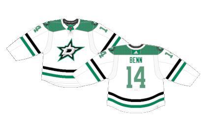
Number 6: Current Away (2013-Present)
The victory green road jerseys were the first Stars jerseys to feature a proper shoulder yoke. The tricolored sleeve stripes are simple but effective full-time away jerseys.
Number 5: Reverse Retro 1.0 (2021)
The Stars bring back their star design with a beautiful whiteout palette. They’re as clean as a hockey jersey can get. Maybe the star outline gets a little lost without a secondary color to make it pop, but it’s hard to get mad at these.

Number 4: Blackout Alternate (2021-Present)
In stark contract to their whiteout jerseys, the Stars broke out a blackout alternate with a neon “skyline green” quite literally highlighting their new alternate logo. It’s the perfect mix of whacky and unique, with the green subdued just enough to not be offensively overwhelming to the jersey.

Number 3: Current Home (2013-Present)
The victory green home jerseys are just a great look. It’s a unique color all their own and the basic white and black secondary colored stripe patterns just tie it all together.

Number 2: White Star (1999-2006)
Did the Stars borrow this look from the All-Star games of the mid-90s? Yes. Should they be punished for it? Absolutely not. It fits the team name, it works great with the color scheme, and it’s a jersey that breaks to mold of the typical monotony of regular stripes on hockey jerseys.

First: Green Star (1997-2006)
The green version of their All-Star jerseys are just perfect. The black and green make the star pop and the white and tan outline ties the entire look together. For all the misses the Stars have had in their jersey history, they also had one of the coolest jerseys in the history of the NHL.

By: Dan Esche (@DanTheFlyeraFan)
photo credit: nhluniforms.com
