When it comes to hockey jerseys, the Calgary Flames are one of those teams that have some of the coolest and most beloved designs of all time. They have managed to walk the fine line between distinctive designs all their own and a rockin’ color scheme that enhances most of their uniforms, a match most teams often struggle to achieve.
Worst: 2011 Heritage Classic (2011)
The basic design of the jerseys is pretty cool and other teams have made it work, and that typically gets some brownie points when it comes to these rankings, but man, the darker color scheme was just a miss all around. They were supposed to pay homage to the Calgary Tigers from the 1920s, but they just look like Ronald McDonald went to federal prison.

Number 13: Pedestal Home (1995-2000)
There are few jerseys in the league that scream “that’s so 90s” more than these bad boys. They’re undoubtedly unique, but just because they could’ve doesn’t mean they should’ve.

Number 12: Pedestal Away (1995-2000)
The red versions are slightly less bad.

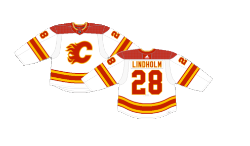
Number 11: 2019 Heritage Classic (2019) (2021-Present)
Spoiler alert: we’re going to say nice things about the red versions of these jerseys further down the list, but these just aren’t it. The white jersey does not do any favors to the red and yellow color palette and is just missing something that their home red version counterparts have in spades.

Number 10: Reebok Edge Home (2007-2020)
Calgary walked away with a pretty decent jersey when Reebok Edge took over. They lost the unique tail design that were on the previous version, and you can argue they’re very… busy… but they walked away in good standings in the Edge system, so much so that the jerseys stayed in the rotation for over a decade, something that most teams can’t say.

Number 9: Reebok Edge Away (2007-2020)
Ditto for the white away version.

Number 8: Wordmark Alternates (2013-2016)
These jerseys only made a handful of appearances over the course of a few seasons and generally weren’t received well, but we’re unsure why. The tail striping is slightly off centered, the crest has a vintage feel to it, and the rest of the jersey is pretty basic and inoffensive. Maybe they tried too hard to manufacture a vintage look, but that doesn’t make them bad jerseys.

Number 7: 2023 Heritage Classic (2023)
The newest jerseys on this list come from the 2023 Heritage Classic. It’s hard to go wrong with a creme jersey with the striping and exaggerated shoulder yoke makes for beautiful look. A slightly tweaked crest and you’d have jersey perfection.

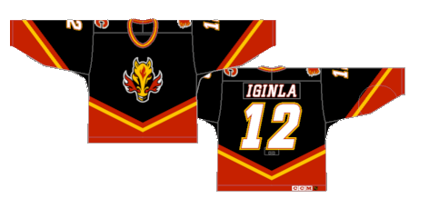
Number 6: Blasty (1998-2006)
The Flames added a black jersey to the rotation with a flaming horse head that would come to be known as Blasty. The new crest became a fan favorite and the “V” design would become the basis for a red and white version of the jerseys as well, unfortunately they did not feature Blasty on the crest, however.

Number 5 : White Away (2000-2007)
It’s a simple but unique design that could only be better if Blasty replaced the flaming C.

Number 4: Red Home (2003-2007)
The red versions were the last to be added to the rotation, but are overall the best use of the design and color scheme.

Number 3: Reverse Retro 2.0 (2022-23)
We weren’t very nice to the original pedestal jerseys, but the modernized black version is easily the best color scheme for the motif. They’re wacky, vintage and have a badass color palette. They’re not the best jerseys of all time, but they are perfectly fine for a one-off homage.

Number 2: Reverse Retro 1.0 (2021) (2022-Present)
The original Blasty jerseys were a fun alternate. These are just badass jerseys. They were so popular that they made a return as the alternates the following season. Our beloved Blasty, long may he rein.

First: Current Home (2009-2013) (2016-2017) (2018-Present)
Remember when we said we were going to say nice things about these? Well here it is. The reimagined version of their original jerseys from the 80s have made appearances as alternates and heritage unis for years before becoming the full-time home jerseys in 2021. The brighter shade of red, the white version of the “C,” the vintage design, they’re just clean jerseys that nail the look they set out to achieve.

By: Dan Esche (@DanTheFlyeraFan)
photo credit: nhluniforms.com

