

The Buffalo Sabres are quite the case study when it comes to hockey jerseys. They got it right the first time, decided to change it up, then spent 40 years fighting an uphill battle with various disastrous designs in an attempt to find a new smash hit, only to end up back at the same color and motif they started on. Buckle up, folks, this is going to be a ride.
Worst: Yellow Alternate (2013-2015)
These are just so bad. They’re essentially glorified practice jerseys, which has actually happened a few times since these dropped, mainly during the Reverse Retro series in Winnipeg and Detroit. They were only around for a couple seasons before being retired for good, but they’ll live in hockey jersey lore forever.

Number 15: Buffaslug Home (2006-2010)
Anytime the “Buffaslug” jerseys get brought up, the crest takes center stage in any conversation, mainly because it’s an abomination. The jersey design itself is rather unique, and the Sabres were the first team to put numbers in the chest, a gimmick which would take the league by storm over the following few years, but on the whole, the fanbase was right to reject these.
Number 14: Buffaslug Away (2006-2010)
The white version leaves a little room to appreciate the unique design of the jersey itself.
Number 13: 50th Anniversary (2019-2020)
The gold trim was added to celebrate the 50th anniversary of the franchise, and while it’s a pretty clean look, there’s nothing really special about them.
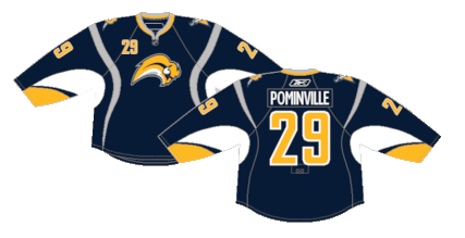
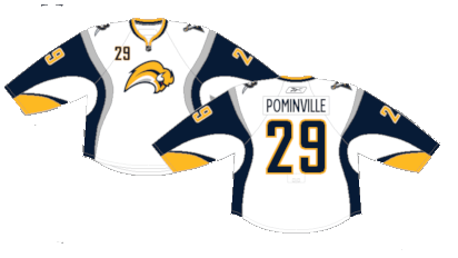
Number 12: Navy Blue Away (2010-2020)
The death of the Buffaslug led to the Sabres attempting to bring back an altered version of their original kits with navy blue as their shade of choice. There’s nothing insultingly wrong with these, but they were worn during the doldrums years which will always taint their existence.

Number 11: Navy Blue Home (2010-2020)
Ditto for the home version.

Number 10: 2018 Winter Classic (2018)
The Sabres’ first Winter Classic appearance in a decade brought out these jerseys. At the time, the return of the royal blue, albeit as a secondary color was a nice change of pace. They’re a clean jersey, even if it’s not a groundbreaking design.

Number 9: Dinner Plate (2000-2006)
As standalone jerseys, they’re not that bad. Pretty standard striping, the early 00s wordmark on the tail, an alternate crest that isn’t offensively stupid, but they just don’t really fit in with anything else the Sabres have done, which is where their bastard child status comes from.
Number 8: 40th Anniversary (2010-2012)
The 40th anniversary jerseys were an homage to the original Sabres jerseys, as well as a logo inspired by the Buffalo Bisons, an AHL squad that played in Buffalo before the Sabres arrived.

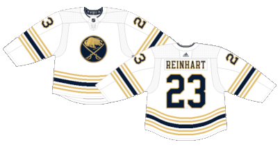
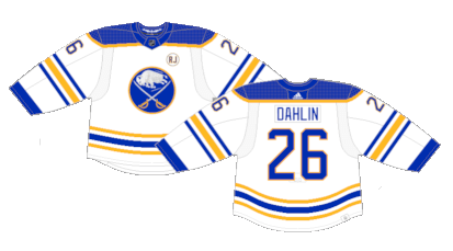
Number 7: Royal Blue Away (1970-1996) (2021-Present)
There’s something about the away version of the royal blue unis that have a classic feel to them. The blue and gold are deployed perfectly on a white jersey, a look that worked decades ago and will still work decades from now.
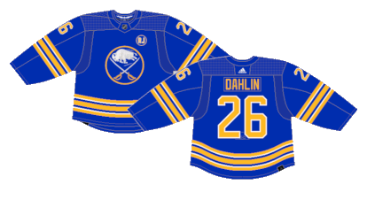
Number 6: Royal Blue Home (1970-1980) (2021-Present)
The Sabres really did get it right the first time. The royal blue is a great shade and makes the most of the gold striping. After decades of miss after miss, the organization finally returned to their original look in 2021 and hopefully won’t get any big ideas to stray anytime soon.
Number 5: 2022 Heritage (2022)
It really is hard to go wrong with a creme jersey. It’s a perfect vintage look without changing up the design itself.

Number 4: Reverse Retro 1.0 (2021)
I don’t think there’s a single person that ever asked for the dinner plates to return, but admittedly they work pretty well in the blue and gold scheme. They shouldn’t be anything more than one-offs, but they nailed the Reverse Retro gimmick with a cool reimagining of a past spectacle.

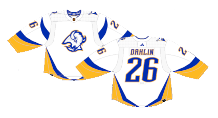
Number 3: White Goat Head (1996-2006)
The white versions of the original goat head jerseys weren’t bad, but they didn’t hold the same mystique that the black version did.

Number 2: Reverse Retro 2.0 (2022-23)
They may just be recolored versions of the Goat Head jerseys, but it’s enough to give them a whole different feel. A very angels versus demons vibe between the two, a look that was rounded out when they wore white pants and socks as well.
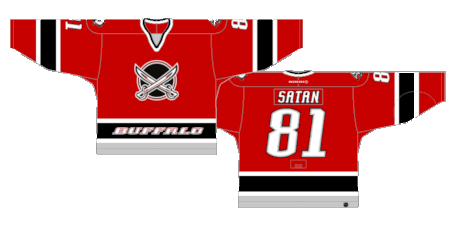
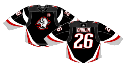
First: Black Goat Head (1996-2006) (2022-Present)
It was a pretty big shock in the mid-90s when the Sabres ditched their blue and gold in favor of black and red. But unlike most of the jerseys the Sabres have tried, these stood the test of time. They reintroduced them into the rotation in 2022 and they’re just as spectacular as they were 20 years ago.
By: Dan Esche (@DanTheFlyeraFan)
photo credit: nhluniforms.com
