
The Original Six Chicago Blackhawks have some of the most iconic jerseys in the sport. But the addition of regular outdoor games capitalizing on their popularity through the 2010s means the organization had to keep going to the well to reinvent themselves, which led to some rather interesting compositions.
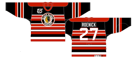
Worst: 2019 Winter Classic (2019)
These were an homage to the original Black Hawks jerseys from 1920s. There have been a few teams that have tried a black jersey with white stripes over the years and it just doesn’t work in any case.

Number 11: 75th Anniversary (1991-1992)
These are some loud jerseys, especially considering the Blackhawks originally wore various versions of these from the 30s to the 50s. The uneven barber pole look was certainly a choice.
Number 10: Reverse Retro 1.0 (2021)
The problem with the Blackhawks having multiple outdoor games is that they ran out of source material for their reverse retro look. They’re technically an inverse look from their away jerseys during the barber pole era, but as far as hockey jerseys go, it’s not a great look.
Number 9: Reverse Retro 2.0 (2022-23)
The reimagining of the barber pole jerseys cleaned up some of the business of the excess striping, but the overall feel remains the same. If they used the vintage roundel crest for these instead of “CHICAGO” (the same design choice the Red Wings used in the same Reverse Retro release) there may be an argument to put them higher on the list.

Number 8: 2014 Stadium Series (2014)
The holographic look was the go-to design during the four Stadium Series games that took place in 2014. The Ducks, Kings, Rangers and Islanders all had either silver undertones or a shimmery crest. While it makes them unique, the rest of the jersey is a pretty quiet motif.

Number 7: 2015 Winter Classic (2015)
These are hockey jerseys alright. They’re an homage to the original white versions that debuted in the mid-50s that would become a staple for the next 70 years, but it’s about as simple a jersey design as there’s ever been.
Number 6: 2017 Winter Classic (2017)
Ditto for these, except the black typically on the cuffs of the sleeve moves to the tail. They did break out a vintage version of the Indian head logo, however, unlike their outdoor appearance from a few years prior.

Number 5: 2016 Stadium Series (2016)
Ya know, if you’ve been following along with the rest of the Worst to First jersey series on this site, you may be getting pretty good at determining a jerseys origins before you read the title. Reebok Edge jerseys, for example, are pretty easy to point out, and in this case, Stadium Series jerseys all stick out as well. The oversized nameplate and numbers, the oversized stripes, the attempt to manufacture a vintage look, these have it all. They’re not bad by any means, just part of a cookie cutter gimmick.

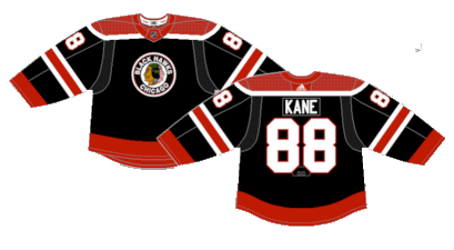
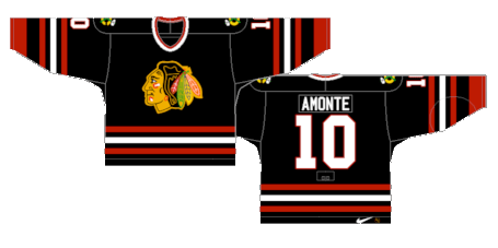
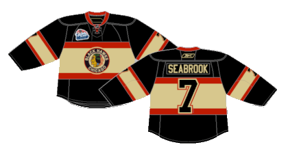
Number 4: Black Alternate (1996-2007) (2008-2009)
If the Blackhawks have to stray away from their typical red and white, these were probably the best way to do it. Nothing too crazy, just a “reverse retro” design before it was cool.
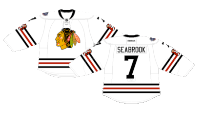
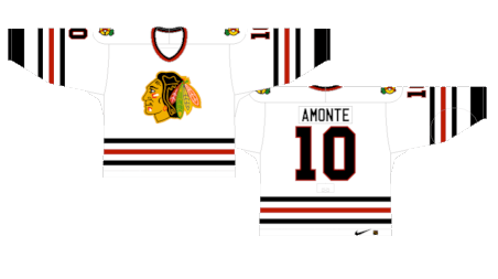
Number 3: Current Away (1955-Present)
We may have buried both Winter Classic versions of these jerseys, but the standard Blackhawks white uniform is a classic, plain and simple.
Number 2: 2009 Winter Classic (2009-2011)
These were an homage to the Blackhawks jerseys from the mid-30s. Typically when teams break out a creme design, the color isn’t used in a secondary role like this, but they’re certainly distinctive and a nice nod to the past.
First: Current Home (1955-Present)
The Blackhawks have had minimal changes to their red jerseys for the last 70 years. Much like the white jerseys, there’s not a lot to analyze, they’re just classically cool hockey jerseys.

By: Dan Esche (@DanTheFlyeraFan)
photo credit: nhluniforms.com
