

When you think about cool hockey jerseys, the Florida Panthers are historically not a team that would come to mind. And for a vast majority of their existence, that would be fair. But not anymore. The Panthers had the glow up to end all glow ups, it just took 30 years to get there. Lately they’ve been hitting home run after home run, so let’s rank ’em!
Worst: Original Away (1993-2007)
There are some hockey jerseys that just scream 90s, and the red Panthers jerseys do just that. It’s actually incredible they were wearing versions of these jerseys up until 2007, because they feel painfully vintage, and not in a good way, now.

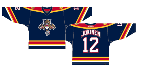
Number 11: Original Blue (1998-2007)
At least the red jerseys have a certain vibe about them because it puts the color scheme on full display, but the navy blue jerseys that went from an alternate to their full-time home jerseys just don’t have much life to them.
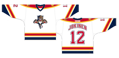
number 9: Original Home (1993-2007)
The white version is easily the best use of the design and color scheme.
Number 8: Reebok Edge 2.0 (2011-2016)
The Panthers fell right into the cookie cutter nature of the Reebok Edge system. The removal of the tail stripe, the shoulder yoke leaking down into the sleeve stripe, the random piping on the torso, just about every trope the Edge jerseys were known for. They were actually released three years after the initial Edge takeover and replaced the blue version as the full-time home jerseys.

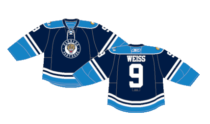
Number 7: Reebok Edge Home (2007-2011)
Speaking of the blue versions, here they are. What helps these jerseys is they yellow piping throughout (another heavy Reebok Edge trope) to help break up the monotony of the dark blue and red. They served as the full-time home jerseys upon the initial Edge release but were retired in favor of red home jerseys as seen above.

Number 6: Reebok Edge Alternate (2009-2012)
Gotta be honest here, we had absolutely no recollection of these jerseys existing before researching this piece. And it’s probably for good reason. The light blue came out of nowhere, the forced vintage nature of the roundel crest. It’s not the worst jersey of all time, but it very much felt like the Panthers were attempting to copy the Penguins’ homework on this one but changed it up just a bit to hope the teacher wouldn’t notice.
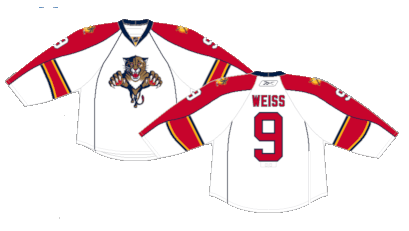
Number 5: Reebok Edge Away (2007-2016)
Just like their original jerseys, the white version of the Edge jerseys are the best version given what they had to work with.
Number 4: Current Away (2016-Present)
Talk about a glow up. The Panthers reinvented their white jerseys for the first time since 2007. The design is in homage to the 101st Airborne Division of the U.S. Army. Panthers owner Vincent Viola, a graduate of West Point, was a member of the elite infantry division.

Number 3: Current Home (2016-Present)
The matured crest on a matured jersey. They’ll mean even more now that the organization won their first Stanley Cup wearing these jerseys.

Number 2: Reverse Retro 1.0 (2021)
A slightly darker shade of red with an updated stripe pattern turns the very 90s feel of their original jerseys into a slick modern homage.

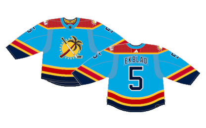
First: Reverse Retro 2.0 (2022-2023)
Any time NHL teams roll out a unique, whacky new jersey, you never know how it’ll land with the fans. The alternate crest takes center stage on a powder blue jersey with striping similar to their original home jerseys. They may not sit with the purists, but they’re lots of fun, which is all you can really ask from a one-off jersey.
By: Dan Esche (@DanTheFlyeraFan)
photo credit: nhluniforms.com
