

Here’s a serious question for ya- have the New York Islanders ever had a good jersey? Because the answer feels like a “no.” Beauty is in the eye of the beholder, and they did have a couple kits that weren’t bad, but if you’re unfamiliar with their jersey history, buckle up for a list full of jerseys with all the fun of a college-level calculus class.
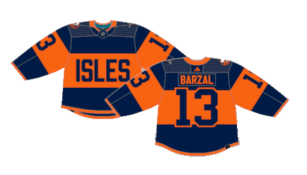
Worst: 2024 Stadium Series (2024)
Not only were the Islanders the losers of the four Stadium Series jerseys in 2024, but they may be among the worst jerseys of all time. They got the default Stadium Series gimmick of just removing any semblance of white from the jersey and the 783-point font on the front screams Walmart knockoffs.
Number 14: Fisherman Home (1995-1998)
The Gorton Fisherman jerseys hold a place in everyone’s mind because they were so wacky, but they weren’t actually good. There’s a fine line to walk when breaking out a one-of-a-kind design between unique in a quirky good way and unique in a bonkers crackpot way. These are the latter.

Number 13: Fisherman Away (1995-1998)
All it’s missing is a little bit of tie dye to achieve 1990s perfection.

Number 12: Black Alternate (2015-2017)
The organization’s second attempt at a black alternate was just as off script as their first, just for completely different reasons. Some graphic designer got paid big bucks to draw this up, which should make us all reconsider our career choices.

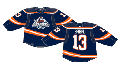
Number 11: Reebok Alternate (2011-2014)
Enter the “Why can’t you just be normal” meme here. The football-style jerseys with a disastrous color scheme was certainly a choice. Points for outside-the-box thinking, I suppose, but just because they could’ve doesn’t mean they should’ve.

Number 10: Current Alternate (2018-Present)
These are slightly tweaked versions of their 2014 Stadium Series jerseys, which actually made them look a little better than the outdoor kits. It’s non-offensive but painfully boring, a recurring theme of most Islanders jerseys.
Number 9: Navy Blue (1998-2007)
The Islanders ditched the fisherman jerseys for something much more familiar, but opted for a darker blue for some reason.

Number 8: Navy Blue (1998-2007)
The darker blue was an appropriate look for the Islanders, it represented their drab choice in jerseys perfectly.

Number 7: Orange Alternate (2002-2007)
It’s actually impressive these jerseys weren’t debuted in the 90s, because that’s the thing that comes to mind at first glance. It’s the only time in their history that their secondary color of orange served as the base color for a jersey with a design that isn’t terrible per se, but there’s a reason why no other team has attempted to replicate this look.

Number 6: Reebok Edge Away (2007-2010)
The Reebok Edge system wasn’t too harsh to the Islanders. The color scheme works and there’s no design choices that are overly flawed or aggressive like other Edge kits.

Number 5: Reebok Edge Home (2007-2010)
Ditto for the home jerseys.

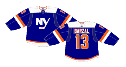
Number 4: Current Home (2010-Present)
Clean. Classic. Cool. Simple is better for the Islanders current away jerseys.

Number 3: Reverse Retro 1.0 (2021)
The Reverse Retro with the most boring idea goes to… The orange and white stripes switch places and the darker blue returns. By Islanders jersey standards, these are pretty decent, despite the lack of effort into the RR gimmick.

Number 2: Reverse Retro 2.0 (2022-23)
The reimagining of the original Fisherman jersey may not bear a ton of resemblance to the originals, but that’s probably for the better. The Gorton’s crest returns and the color palette is dulled down and the striping a little less wacky left behind a perfectly fine homage to a polarizing classic.
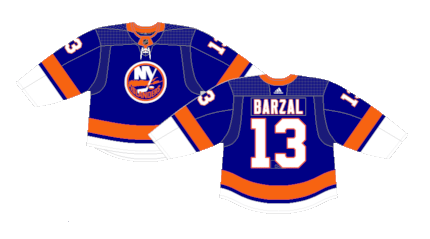
First: Current Home (2008-Present)
In this history of this Worst to First Jersey series, I don’t think there’s ever been a winner by default, but the Islanders current home jerseys top their trash pile of designs. They’re a slightly tweaked version of their original away unis, making decent use of the color scheme and striping.
By: Dan Esche (@DanTheFlyeraFan)
photo credit: nhluniforms.com
