
Unlike most NHL teams, the San Jose Sharks have been true to one color for their entire history. Their teal is a classic and a staple with only minimal changes through their 30 years in the Bay Area. But that hasn’t stopped the organization from trying a plethora of different styles and designs in an attempt to find their perfect jersey.
Worst: Original Black Alternate (2001-2007)
If they wanted a black alternate essentially devoid of color, this is the way to do it, but it doesn’t leave much in the way of excitement when it comes to a hockey jersey.

Number 15: Reebok Edge 2.0 Away (2013-2022)
Speaking of not much to judge, the Sharks went light on their Edge 2.0 look. They ditched the shoulder yoke and tail stripe. It may lead to a clean look, but at the end of the day they’re just white jerseys.

Number 14: Reverse Retro 1.0 (2021)
The Reverse Retro release attempted to make gray the base color for a handful of teams across the league, and the Sharks were one of them during the 1.0 run. But there’s a good reason why the look has never caught on before- it’s bland and dulls the entire jersey.
Number 13: Reebok Edge 2.0 Home (2013-2022)
It’s a hockey jersey alright.

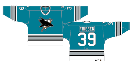
Number 12: Reebok Edge 1.0 Away (2007-2013)
The Reebok Edge system completely reinvented the Sharks jerseys, giving them a more prim and proper motif. For some reason they chose to gut the shoulder yoke and tail stripe a few years later, but for a refreshed look in a notoriously disastrous Edge release, it’s not a terrible jersey.
Number 11: Reebok Edge Home (2007-2013)
There’s something about the addition of the orange trim that adds to the vibe of a California beach. They may not be the best or most unique jersey of all time, but they were a win by Reebok Edge standards.

Number 10: Black Alternate 2.0 (2008-2017)
Their second attempt at a black alternate was slightly more creative than the originals, but still nothing worth remembering. the new alternate crest was kinda cool, but not enough to salvage the jersey as a whole. They’d later bring back a third try at a black “stealth” alternate where they’d have two teal stripes on the sleeve instead of one and ditch the full shark body crest.

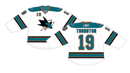
Number 9: Dark Teal Away (1997-2007)
If you’re of a certain age, these are the Sharks jerseys you grew up with. The darker teal with an increase in the black and grey really did diminish the entire jersey despite having a unique aura on the whole.

Number 8: Dark Teal Home (1998-2007)
The white versions were much more pleasing to look at.

Number 7: Original Home (1991-1998)
Clean. Classic. Cool. Just a slick classic jersey that hasn’t seen the light of day since 1998.

Number 6: 2015 Stadium Series (2015)
While most Stadium Series have a similar feel, the Sharks deployed their color scheme in a way that makes them both stand out from the crowd and made for a very cool one-off look.
Number 5: Original Away (1991-1998)
Very rarely does a team get their jerseys right on the first try, but the Sharks nailed it. They’ve been brought back a few times as anniversary kits and they still look great, holding up to the test of time. Grey was the perfect color to tie the teal and white together.
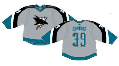
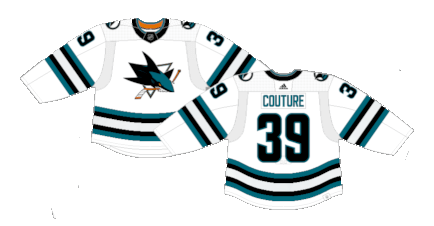
Number 4: Current Away (2022-Present)
It may be the weakest of their three current uniforms, but it’s so much better than their last few incarnations of white jerseys.
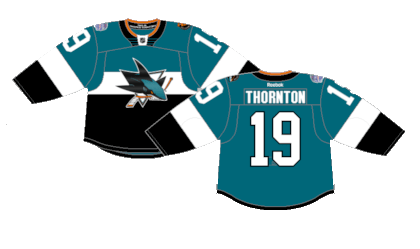
Number 3: Current Home (2022-Present)
We’re going to ignore the fact that the pants and socks are teal as well which is a bit aggressive, but as standalone jerseys they’re quite crisp. Despite the fact that there’s not much groundbreaking happening in terms of design, it’s a divergent look to what they’ve tried in the past and the return of a tail stripe makes a big difference.

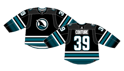
Number 2: Cali Fin Alternate (2023-Present)
The Sharks’ third attempt at a black jersey was finally the winner. The new alternate crest, the sunrise gradient on the sleeves and tail, they’re a perfect black jersey with just enough color to tie the entire look together.
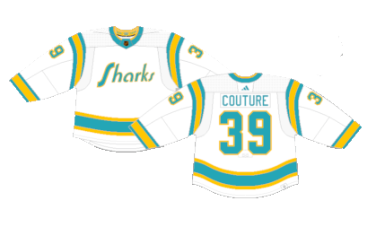
First: Reverse Retro 2.0 (2022-2023)
They’re just so good. There were a few occasions during the Reverse Retro gimmick where teams utilized versions of defunct teams jerseys, and the Sharks homage to the Golden Seals was just awesome.
By: Dan Esche (@DanTheFlyeraFan)
photo credit: nhluniforms.com
