

Like most original six teams, the New York Rangers have keep things status quo for a vast majority of their existence when it comes to their jerseys. With various tweaks, the blue and white jerseys they still don today are the jerseys they wore a century ago. But with the inclusion of alternate jerseys and a handful of outdoor games, the Rangers’ jersey history has become pretty extensive.
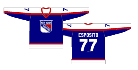
Worst: John Ferguson Away (1976-1978)
The story behind these jerseys is that then-GM John Ferguson made the change from their classic style to these. He was fired in 1978 and his vision for the jerseys were retired and the quintessential Rangers jerseys were brought back. If this style looks familiar, it’s because Ferguson took the design to Winnipeg with him when he got hired and the Jets franchise joined the NHL in 1979.
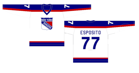
Number 13: John Ferguson Home (1976-1978)
The home white versions were slightly less terrible.
Number 12: 2014 Stadium Series (2014)
The theme of the 2014 Stadium Series games for all seven teams was a shimmery, holographic design, and the Rangers deployed it in an inoffensive way, mainly because they limited it to the numbers on the back and a thin outline on the “NEW YORK” on the front.
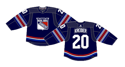
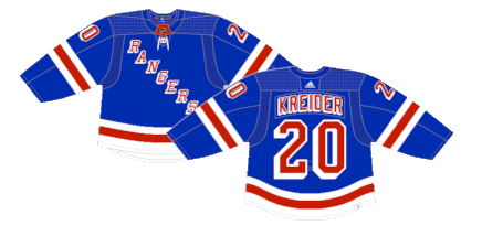
Number 11: Current Alternate (2023-Present)
The Rangers return a dark blue alternate to the mix after going six seasons without one. The full shield crest coming back is always a positive, but the striping on the sleeves and tail leaves something to be desired.
Number 10: Reverse Retro 1.0 (2021)
14 years after the Rangers retired the Lady Liberty jerseys, they made a comeback for the first Reverse Retro line. The crest was a win, but the rest of the jersey feels very dull due to the color choices.

Number 9: Reverse Retro 2.0 (2022-2023)
The Rangers called upon Lady Liberty once again for the 2.0 RR line, this time choosing to use the typical Rangers blue to recolor the jersey, and they are much better because of it.

Number 8: 2024 Stadium Series (2024)
This was one of those jerseys that we’re just unsure how to feel about. They’re not the worst jerseys of all time. They’re a decent one-off look for the Rangers, but they have that synonymous Stadium Series vibe- a wacky design with oversized features that is just missing… something to give them a bit of life.

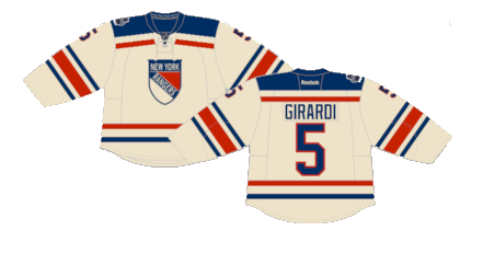
Number 7: 2012 Winter Classic (2012)
Just a beautiful creme jersey, perfectly nailing the vintage look they were going for.
Number 6: 2018 Winter Classic (2018)
Unlike the Stadium Series, which basically creates modern nonsensical alternate jerseys, the Rangers handed out another beautifully vintage design for their second Winter Classic appearance. These should’ve been their full-time alternates, but alas, they were just one-offs.

Number 5: White Lady Liberty (1998-1999)
Considering the white version of the Lady Liberty jerseys were wore for just ten games over the course of one season, it speaks to just how unpopular they were at the time. But with the benefit of hindsight (and the Reverse Retro line realizing what other redesigns of a classic could look like), these were pretty clean jerseys.

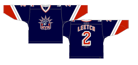
Number 4: Lady Liberty (1996-1998) (1999-2007)
The Classic Lady Liberty alternates have to be high on the list of best third jerseys of all time.
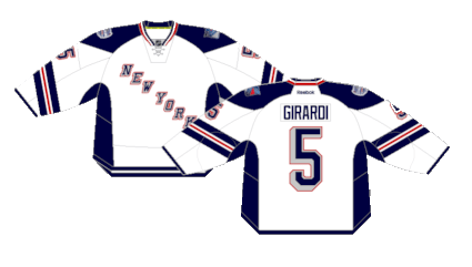
Number 3: Heritage Alternate (2010-2017)
A dark blue alternate returns three years after the Lady Liberty thirds went away, and the Rangers hit the nail perfectly on the head with a simplistic jersey possessing a vintage feel. Fun fact: all retired numbers (minus Lundqvist’s 30, who didn’t get the honor until these were abandoned) appear in numerical order on the inside of the jersey on the rear below the stripe
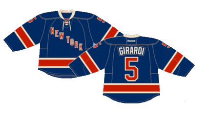
Number 2: Current Away (1951-Present)
Cool. Clean. Beautiful.
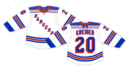
First: Current Home (1926-Present)
You don’t really need to make sweeping changes to a jersey when you knock it out of the park the first time, even if that first time was one hundred years ago.
By: Dan Esche (@DanTheFlyeraFan)
photo credit: nhluniforms.com
