

The key of success is iteration, something that the St. Louis Blues have found out when it comes to their jerseys. Different designs ranging from classic to crazy, different shades of blue from a dark navy to a light powder, and some of the best special event jerseys in the league. It may have taken decades, but the Blues have mastered the art of hockey jerseys.
Worst: Reverse Retro 1.0 (2021)
Spoiler alert: we’re not going to be very nice to any version of these jerseys, but the red incarnation in particular is all kinds of fugly. At least they adhered to the Reverse Retro stipulation, but just because they could’ve doesn’t mean they should’ve.

Number 12: Heritage Alternate (1995-1998) (2019-Present)
You know what color doesn’t go well with blue, white and yellow? Red. If Pennywise designed a hockey jersey this would be it.

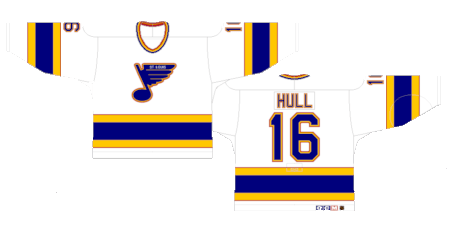
Number 11: 90’s Home (1995-1998)
The white version is the least offensive of the bunch.
Number 10: Dark Blue Home (1984-1994)
They tweaked this jersey design five different times between changing crests, adding red piping and updating the nameplates. It’s one of those jerseys that just screams vintage and not necessarily in a good way.
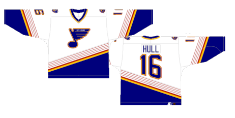
Number 9: Dark Blue Away (1984-1994)
The blue version feels like a completely different jersey and the color scheme is put to best use given the particular style.

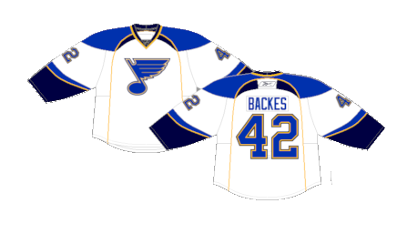
Number 8: Reebok Edge Alternate (2008-2016)
The Blues break out a new alternate jersey and crest under the Edge system. They’re not bad, they’re not great. They were a perfectly acceptable alternate jersey for a handful of games a season and somehow stayed in the rotation for a surprisingly long time.

Number 7: Reverse Retro 2.0 (2022-2023)
This was supposed to be the original St. Louis Blues jersey when the city landed a team in 1966 (albeit recolored) but they never saw the light of day. It’s a rather loud jersey and doesn’t quite hold the same mystique that the other versions of the light blue jerseys do, but for a one-off, they’re fun and certainly unique.

Number 6: Reebok Edge Away (2007-2014)
You can tell immediately these are Edge jerseys by the wacky shoulder yoke and vertical torso stripes, but on the whole, it’s not a bad jersey at all.
Number 5: Reebok Edge Home (2007-2014)
The Blues are high on the list of winners under the mostly disastrous Edge release.

Number 4: Current Away (2014-Present)
There’s a big difference in white away jerseys from bland and boring to clean and beautiful, and the Blues absolutely nailed the latter with their current kits.

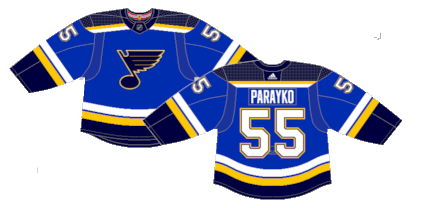
Number 3: Current Home (2014-Present)
Sometimes teams just land on a design choice that works for them, and the Blues found it when they tweaked their Reebok Edge release into these bad boys in 2014. The striping on the sleeves and tail isn’t overly original but displays all four of their main colors flawlessly and the inclusion of the yellow and white stripes on the shoulder yoke ties the color scheme together.
Number 2: 2022 Winter Classic (2022)
It’s hard to go wrong with a creme jersey. The yellow and powder blue are perfect secondary colors for the occasion.

First: 2017 Winter Classic (2017) (2018-Present)
Much like the creme versions they’d break out a few years later, the light blue base just works perfectly with the shade of yellow and the creme stripes. They’ve an homage to their original jerseys from the 1960s and they were so popular that they stuck around as their current day alternates.

By: Dan Esche (@DanTheFlyeraFan)
photo credit: nhluniforms.com
