

The Penguins have had four distinct eras of jersey- the powder blue originals, the first black and gold run, the Vegas gold era and the return to the classic black and gold. And each different incarnation had their hit and misses when it comes to the respective jersey designs. So let’s go through and rank the Pittsburgh Penguins’ jersey history!
Worst: Robo-Pen (1995-2002)
Are the Robo-Pen jerseys unique? Yes. Does that make them a good hockey jersey? Nope. The wacky design, the lack of symmetry, It’s actually kind of amazing they stayed in the Penguins’ rotation for seven seasons.

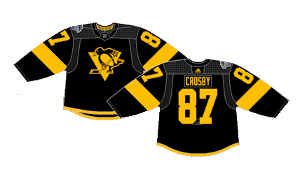
Number 16: Current Alternate (1992-1997) (2021-Present)
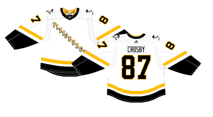
The basic design and color scheme is nearly identical to other entries higher on the list, but there’s something about a ten letter word used in the diagonal font that just doesn’t flow. They brought them back into the rotation in recent years after the Reverse Retro line, but it still just doesn’t work.

Number 15: Reverse Retro 1.0 (2021)
Again, nothing wrong with the jersey itself, and the white versions are slightly more pleasing to the eye, but 10 letter is just too much for the classic diagonal font.
Number 14: 2008 Winter Classic (2008-2011)
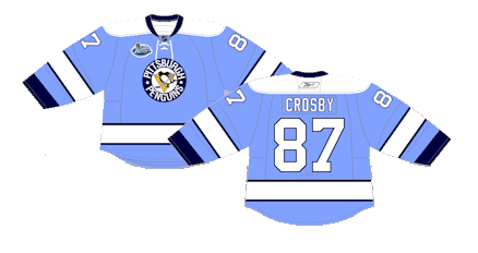
The original Penguins’ color scheme for the first decade of their existence was powder blue and white. When the Penguins were called to play in the first Winter Classic, they brought back a homage to their early 1970s design. They stuck around as alternates for a few seasons after, but it doesn’t quite fit in with the black and gold of their more current kits.
Number 13: 2014 Stadium Series (2014)
The holographic theme from the 2014 Stadium Series was maybe the least offensive on the Penguins’ jerseys, but that’s because there’s not much of a design choice to judge.
Number 12: 2017 Stadium Series (2017-2021)
The Stadium Series is known for their football-esque designs and the Penguins went with an homage to the Steelers for their contest at Heinz Field. The stripe on the sleeve is in a bizarre location, but other than that, they’re fine but not much to write home about. They would tweak them a bit, mainly fixing the sleeve stripes and reuse them as an alternate until 2021.
Number 11: 2019 Stadium Series (2019)
The Flyers wore a mainly black jersey during their first encounter with the Pens outdoors, so the teams swapped styles for their second meeting in Philly. They’re still on-brand Stadium Series jerseys with the oversized numbers and lack of white, but other than that, they’re pretty basic uniforms.
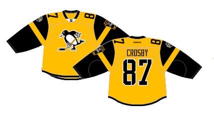
Number 10: Vegas Gold Road (2000-2007)
This style of jersey may pull some heartstrings as the later days of Mario Lemieux and the early days of Sidney Crosby, but the “Vegas gold” color scheme would get put to much better use when Reebok Edge took over in 2007.

Number 9: Vegas Gold Home (2002-2007)
Ditto for the white version.

Number 8: 2011 Winter Classic (2011-2013)
These weren’t drawn directly from their past jerseys like the 2008 Winter Classic were, but the reimagining of the dark blue with fancy powder blue and white stripes with the 3-D numbers and awesome throwback crest made them a beautiful vintage jersey.

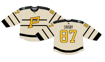
Number 7: 2023 Winter Classic (2023)
These jerseys were an homage to the Pittsburgh Pirates, the first NHL franchise in Pittsburgh in the 1920s. They were slightly tweaked and recolored with a creme base and left behind a flawless one-off vintage jersey.
Number 6: Reverse Retro 2.0 (2022-2023)
The “Robo-Pen” logo was originally used on a white jersey, so they used the retro logo on a reverse of the previous uniform for their… Reverse Retro… release. It was the first time they used the Robo-Pen logo since 2002, making it a fun stroll down memory lane, but the design and color choices didn’t leave much distinction between them and their current home jerseys.

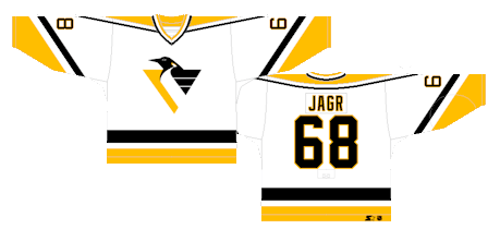
Number 5: Robo-Pen Home (1992-2002)
This is easily the best version of the Robo-Pen jerseys. They a clean design and have a vintage feel more so from the 1980s rather than the 1990s when they were actually used, but any jersey you can see and immediately identify with prime Jaromir Jagr and Mario Lemieux is a good jersey.
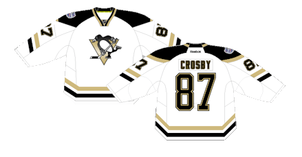
Number 4: Reebok Edge Home (2007-2016)
The Penguins kept the Vegas gold shade for their Edge release. While they’re unmistakably Reebok Edge based on the overthought design choice, they possess a modern-vintage feel given the less aggressive shade of gold and these are the jerseys on a post-Lemieux Penguins roster, leaving them tied almost exclusively to an up-and-coming Sidney Crosby.

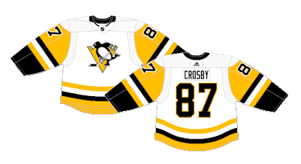
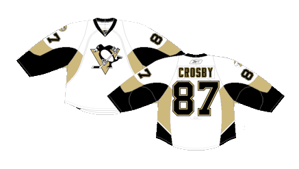
Number 3: Current Away (1980-1992) (2016-Present)
With the exception of a crest change and slightly different striping patterns or tweaked colors on the sleeves, the Penguins have worn a similar version of white jersey for a vast majority of their history. They dropped in 1980, lasted until 1992 when the Robo-Pen took over, which was a similar albeit dulled design, which lasted until 2002 and made a return in 2016 and has carried them to today. They’re clean and the limited black is enough to break up the gold. Just all around a great jersey that works in any era.
Number 2: Reebok Edge Away (2007-2016)
The white version of their Edge release is the best of their “vegas gold” era.
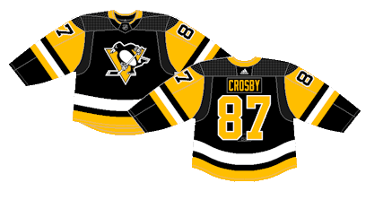
First: Current Home (1980-1992) (2014-Present)
Much like the white versions, the current home jerseys were just as crisp in the 80s as they are today. A real timeless look that now has the history of Sidney Crosby attached to it.
By: Dan Esche (@DanTheFlyeraFan)
photo credit: nhluniforms.com
