The second franchise to play in Winnipeg has certainly done their jerseys better than the first. The current incarnation of the Jets have kept things pretty simple and clean while continuing to pay homage to both the Canadian Air Force as well as their original Jets roots.
Worst: Reverse Retro 1.0 (2021)
What was this? They’re supposed to be an homage to the original Winnipeg Jets’ jerseys in the 80s and gray is technically one of their current secondary colors, so they kinda fit the Reverse Retro gimmick, but man, what a miss. they look like unfinished practice jerseys

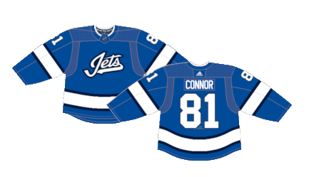
Number 7: First Alternate (2018-2021)
The jersey itself has good bones, but something is missing and it’s hard to put a finger on what exactly is lacking. The shade of blue is much nicer than the concept art suggests, the overall design is pretty standard, and while the wordart jersey isn’t great, it isn’t offensively bad either.

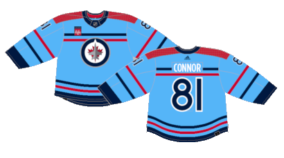
Number 6: Reverse Retro 2.0 (2022-2023)
The Jets did a much better job for their RR 2.0 release… even though “retro” may be a bit strong considering they’re just an inverse of the light blue alternates from just a few seasons prior. They once again returned to the original Jets logo on a clean, simplistic jersey.

Number 5: RCAF Centennial (2023-2024)
The Jets celebrate the Royal Canadian Air Force’s 100th anniversary with special jerseys with a design resurrected from the 1948 RCAF Flyers hockey team, the unlikely Olympic Gold Medal-winning team composed of the senior men’s hockey team at the RCAF base in Ottawa. The crest is updated to the current Jets logo and the jersey receives the Adidas treatment of design, but overall it’s the same jersey worn during the 1948 Olympics. A very fun one-off uni with cool ties to Canadian hockey history.

Number 4: 2016 Heritage Classic (2016)
The Jets were called upon for their first Heritage Classic in 2016 and used a mashup of the original Jets jerseys for reference. They darkened the blue, updated the striping pattern and added a shoulder yoke in what was a sleek tribute to their predecessor franchise.

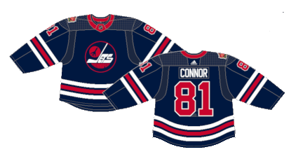
Number 3: 2019 Heritage Classic (2019) (2021-Present)
The Jets pay homage to their previous incarnation with a vintage crest, a darker blue base and updated red and white striping. They’re an inverse of their previous Heritage Classic appearance more so than a direct callback to the original Jets. They ended up as their current alternates with the red breaking up the monotony of their current overdose of blue in the regular rotation.

Number 2: Current Home (2011-Present)
The Jets’ return to Winnipeg saw a new-but-similar color scheme with a new crest designed with the RCAF in mind. The dark blue is a hard color to base a jersey on, but it also sets them apart from most other teams in the league.

First: Current Away (2011-Present)
These are just clean. Given their overall dark color scheme, the white away jerseys get a splash of all their full palette of colors with the white present enough to brighten the entire kit. They do have a very Reebok Edge 1.0 feel to them despite being a 2.0 release, but the uniqueness is an asset in this case.

By: Dan Esche (@DanTheFlyeraFan)
photo credit: nhluniforms.com

