

The Nashville Predators always tried to be on the cutting edge of hockey jerseys with unique designs. Rocking a navy blue, white, and gold color scheme, the Preds became known for their outlandish jerseys during the early days of their history. Lately, they have dulled their once offbeat sweaters, stemming from the Adidas takeover in 2017.
Worst: Chrome Alternate (2009-2011)
The Predators took a Terminator-esque approach that removed the minor hints of yellow that were on the regular home-away jerseys. This marked the first time they altered the sabertooth crest by making it chrome with a red eye. It’s not a bad attempt at being different, but there’s a reason they were only worn less than a couple dozen times for a few years.

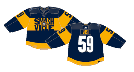
Number 13: 2022 Stadium Series (2022)
These jerseys were an homage to Hatch Show Print, an iconic print shop in Nashville that made posters for concerts. While the crest is certainly unique, and certainly fits the Stadium Series gimmick, the rest of the jersey is kinda bland with a style that has been beaten to death across the league in recent years.
Number 12: Reebok Edge Home (2007-2011)
You can always tell a Reebok Edge jersey by the overthought sleeve designs and random thin vertical piping on the torso. They tried to keep a similar feel to their original jerseys, but it was just enough change to bastardize a classic.

Number 11: Reebok Edge Away (2007-2011)
The white versions were slightly less overthought, but just as boring.

Number 10: Adidas Road (2017-Present)
When Adidas took over from Reebok in 2017, they redesigned a few jerseys with a minimalist approach, and Nashville were one of the team to suffer the most.

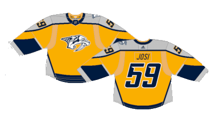
Number 9: Adidas Home (2017-2023)
Gold is a hell of a color choice to go overboard with.

Number 8: Mustard Cat (2001-2007)
It was the only time the Predators majorly altered their crest in franchise history, and they went all out on a new jersey design to accompany the change. Known as the “Mustard Cat” the jerseys drew split opinions from the fanbase, and NHL fans in general. The brownish-yellow color and the almost robotic look of the sabertooth tiger defined the new look and went down in history as one of the strangest jerseys in NHL history.

Number 7: Original Away (1998-2007)
The original Predators jerseys were a mix of distinctive design choices and a muted color palette. They’re not the greatest jerseys of all time, but they were certainly peculiar compared to most cookie-cutter NHL jersey motifs.

Number 6: Original Home (1998-2007)
The white home jersey gave a bit more of an opportunity to take in the uniqueness of the arrangement.

Number 5: Reverse Retro 1.0 (2021)
By the letter of the law of the Reverse Retro gimmick, these are nearly perfect. They’re the exact design of the original jersey recolored with the current gold palette. The abundance of silver and gold clash a bit, but on the whole, they’re solid one-off jerseys.
Number 4: Reverse Retro 2.0 (2022-2023)
After a decade of dormancy, the Mustard Cat rises from the grave, this time with a gold base. They’re definitely not as… memorable… as the originals, but it’s a far superior look with the current shade of gold replacing the mustard yellow.

Number 3: 2020 Winter Classic (2020)
The Predators used their first outdoor game to pay homage to the Nashville Dixie Flyers of the Eastern Hockey League from the 1960s. Their jerseys were gold with purple bands and white piping, so the Predators took some liberties to rearrange the colors as the “away” team, but they’re a fine one-off alternate for a Winter Classic with local ties to the history of hockey in Nashville.

Number 2: Reebok Edge 2.0 Home (2011-2017)
The Predators choosing to add gold to their color scheme and drop the navy blue to a secondary color was a great move to freshen up their drab kits. And there’s really nothing overly innovative when it comes to the layout of the jersey itself except for a few vertical white stripes and a splatter of navy on the shoulder yoke. Yet it’s that creative spin on an otherwise quiet jersey that made them great.

First: Reebok Edge 2.0 Away (2011-2017)
Much like the home versions, they’re simple with just enough variance to stand out. The home versions are similar enough to the Adidas uniforms, but these were lost to history when the new manufacturer took over.

By: Dan Esche (@DanTheFlyeraFan)
photo credit: nhluniforms.com
