
The splendor of the Detroit Red Wings jerseys. Like most original six teams, the Red Wings haven’t done much updating since they changed their name to the Red Wings in 1932. In fact, with only minor changes, they’re more or less rocking the exact same jerseys they did a hundred years ago. But with the outdoor appearances and throwback one-offs, the Red Wings do indeed have a few jerseys to rank.
Worst: Reverse Retro 1.0 (2021)
The Wings put some duct tape on an all white practice jersey and called it a day. The silver comes from their Centennial Classic jerseys, so it’s not out of complete nowhere, but it’s as boring and off-script as possible.

Number 8: Reverse Retro 2.0 (2022-2023)
The Red Wings did something innovative during their second Reverse Retro release- added a new color to their jersey mix after a hundred years. While there’s historical precedent for Detroit to break these out for the RR gimmick (an homage to their uniforms from the 1920s), the Chicago Blackhawks rolled out a very similar throwback of their own for the same release (again, with precedent) so it wasn’t a great look on Adidas’ part to drop very similar jerseys at the same time despite both teams owning the look at some point in history.

Number 7: 75th Anniversary (1991-1992)
The Red Wings celebrated the NHL’s 75th anniversary with a throwback jersey to their jerseys from the 1920s when they were known as the Cougars. It’s a fine jersey that screams vintage with the unique striping choices setting them apart from anything today.
Number 6: 2009 Winter Classic (2009)
The first outdoor game for the Red Wings saw them break out a reimagined version of their original jersey from 1926. It’s a simple but clean motif that has become a bit commonplace in recent years around the NHL, but it was a nice tribute to the past for the Winter Classic, and clearly Detroit did the look first.

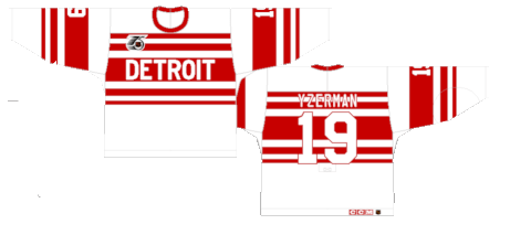
Number 5: 2017 Centennial Classic (2017)
The Red Wings squared off against the Toronto Maple Leafs to celebrate the 100th anniversary of the NHL with special jerseys for the outdoor event. It’s a fairly simple white jersey with red stripes, the splash of silver on the crest, number outline and sleeves was enough to give them a beautiful pop.

Number 4: 2016 Stadium Series (2016)
These were essentially a tweaked inversion of their 2009 Winter Classic jerseys done up with the classic Stadium Series oversized letters and numbers. That’s not a knock, however. The uncomplicated design with an alternate crest made for a fun one-off.

Number 3: Current Away (1956-Present)
The original Red Wings white jersey featured white sleeves with a red stripe, a design choice that was inverted for the 1956 season and hasn’t changed since. Just a pleasing, straightforward, uncomplicated, classically cool hockey jersey.

Number 2: Current Home (1932-Present)
It doesn’t really get any more classic than the Red Wings’ red jerseys. With the exception of minor movement of the tail stripe and slight changes to the nameplate and number font, the jerseys have gone untouched for nearly one hundred years. The beauty really is in the simplicity.

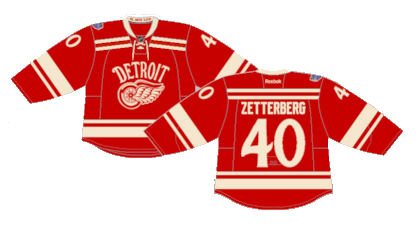
First: 2014 Winter Classic (2014)
These may be some of the most underrated hockey jerseys of all time. The have a vintage crest, numbers and letters plus the creme replacing the white is just a perfect mix for a perfect throwback jersey. It really is too bad they never made another appearance.
By: Dan Esche (@DanTheFlyeraFan)
photo credit: nhluniforms.com
