

There are few teams in the NHL who are as cavalier and innovative as the Vancouver Canucks when it comes to hockey jerseys. The various crests that have adorned the ever-changing color schemes on one-of-a-kind designs have left the Canucks with some of the best and worst hockey jerseys in the history of the NHL.
Worst: The V Home (1978-1985)
What… was this? Who thought this was a good idea? Why were they worn for almost a decade? It’s one of the ugliest jerseys in professional sports of all time.

Number 15: The V Away (1978-1985)
I guess the black version is slightly less terrible on the eyes.

Number 14: First Alternate (1995-1997)
When the NHL started their alternate jersey program in the mid-90s, it led to some of the more bizarre jerseys in NHL history, and the Canucks were no exception.

Number 13: Gradient Alternate (2001-2006)
It’s been nearly 20 years since the Canucks last wore these and I still have no idea whether they were not they were “good” jerseys. There’s no arguing they were unique and aggressive in a way only the Canucks know how to do, but it’s just not a color scheme that works well in the gradient realm.

Number 12: Reverse Retro 1.0 (2021)
These were certainly more pleasing and a better use of the gradient gimmick than the originals were. They probably shouldn’t be anything more than one-offs, but they are closer to a decent hockey jersey than their predecessors.

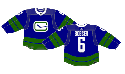
Number 11: Stick in Rink Alternate (2019-2022)
Their short lived alternates were a reimagined version of their original jerseys from the 1970s. The excess of green and lack of white upsets the balance of an otherwise decent palette from their classic home and away kits.
Number 10: Reverse Retro 2.0 (2022-2023)
These jerseys paid tribute to the original Vancouver Canucks of the WHL in the 1960s. “Johnny Canuck” adorns the front of a recolored jersey that has the color palette of the backwoods of Canada. They may not be the flashiest jerseys of all time, but they’re a perfectly fine one-off tribute jersey.

Number 9: Orca Away (1997-2007)
For fans of a certain age, like myself, this is the version of Canucks jerseys you grew up with. Losing the skate crest wasn’t great, but the orca was a fine replacement that lives to this day, but it’s otherwise a very drab color palette despite working well with itself in a bubble.

Number 8: Orca Home (1997-2007)
The home whites were a slightly better jersey despite an even duller color scheme than the road version.

Number 7: Original Away (1970-1978) (2006-07)
The Canucks’ current jerseys are very similar to their original jerseys, but feature the “stick-in-rink” crest. Because the stick breaks through the right side, it apparently also counts as making a “C” something I had never put together myself and had not known until researching this piece.

Number 6: Original Home (1970-1978)
The striping pattern on the original away jerseys were different and arguably better than the current pattern on an otherwise similar uniform.

Number 5: White Skate (1989-1997)
It’s not often that the white version of a jersey takes away from the intended spectacle, but they white skate jerseys just aren’t as solid as the black versions despite still being a clean and simple uniform.

Number 4: Current Away (2007-Present)
The white Canucks jerseys are simple, clean and really give the green secondary color a chance to breathe.

Number 3: Current Home (2007-Present)
The Canucks current home jerseys that were originally debuted during the Reebok Edge takeover in 2007 were a replica of their original jerseys from the 1970s. They have gone various tweaks over the years but the basic design has gone relatively unchanged since they returned to the rotation nearly two decades ago.

Number 2: Heritage Classic (2014)
The Canucks paid homage to the Vancouver Millionaires, a team that existed from 1911 to 1926, for their 2014 Heritage Classic appearance. The throwback color scheme, logo and design may be among the best vintage one-offs in NHL history.

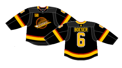
First: Black Skate (1989-1997) (2019-2020) (2022-Present)
There were various incarnations and tweaks to the skate jersey over the years but they were always a very cool concept. The unique crest with a one-of-a-kind color scheme made them a fan favorite decades ago, and were so popular that they won the fan vote for the 50th anniversary jersey as well as earning a space in the regular rotation starting in 2022.
By: Dan Esche (@DanTheFlyeraFan)
photo credit: nhluniforms.com
