

The NHL’s newest squad has already made an impact in the hockey jersey scene. Their unique logo and ocean-themed color scheme has led to some of the better and more unique kits in the game today, with plenty of potential for bangers in the future as well.
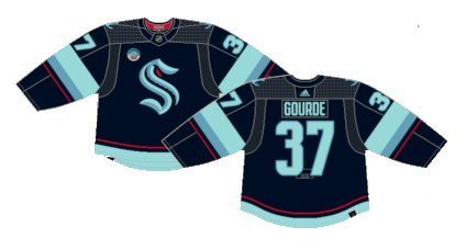
Worst: Current Home (2021-Present)
“Worst” is not fair, but when they’ve only had four jerseys, something had to fill the role. It definitely has that “deep sea” vibe to it that makes the crest pop like an actual Kraken emerging from the dark of the ocean.
Number 3: Reverse Retro 2.0 (2022-2023)
The second of the RR line dropped during Seattle’s second season in the league, which leaves very little room for the whole “retro” gimmick. So, the Kraken decided to draw from Seattle’s hockey history with an homage to the 1951 Seattle Ironmen of the PCHL. The striping pattern is among the most unique in league history and the use of the Kraken’s “deep sea blue” and “ice blue” makes for a beautiful one-off jersey.
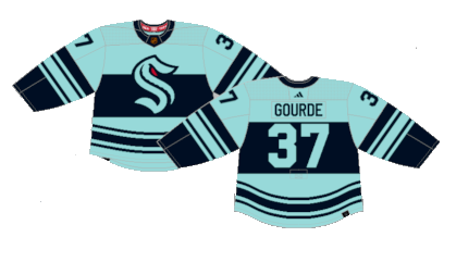
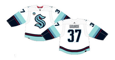
Number 2: Current Home (2021-Present)
The home jersey has the deep sea feel to it, and the white version of their current rotation works much better with the icy blue on the sleeves. It may not have the same menacing feeling the crest brings on the home version, but these are absolutely elegantly clean hockey jerseys.
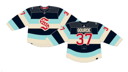
First: 2024 Winter Classic (2024)
The Kraken pay homage to the 1917 Seattle Metropolitans with yet another updated vintage masterpiece for their first outdoor game. The barber pole striping pattern with the Kraken’s color scheme is awesome and the slight bit of red of the crest and numbers ties the vintage look all together.
By: Dan Esche (@DanTheFlyeraFan)
photo credit: nhluniforms.com
