

Unlike most of the original six teams, the Boston Bruins haven’t been afraid to tweak their jerseys over the years. While the classic black and gold has been a constant, the design choices have not. Throw in a whole bunch of alternates and outdoor game appearances and the Bruins have quiet the jersey repertoire to rank.
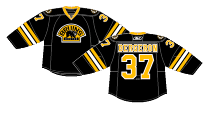
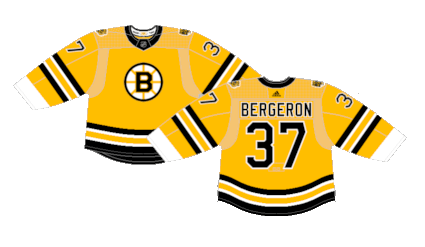
Worst: Reebok Edge Alternate (2008-2016)
Moving a shoulder patch to serve as the main crest is a relatively typical look for an alternate jerseys. But removing a tail stripe from a Bruins jerseys just doesn’t feel right.
Number 18: 1940s Heritage Alternate (2019-2023)
The Bruins love to go in the wayback machine for inspiration for alternate jerseys, so they repurposed their kits from the 1940s to serve as their thirds for a few years. There’s nothing wrong with these, and it’s virtually impossible to screw up this color palette, but simplicity doesn’t always make for the best jersey.
Number 17: 2016 Winter Classic (2016-2017)
Of their four Winter Classic jerseys, these were the one’s that they tried the least on.
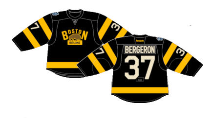
Number 16: 2019 Winter Classic (2019)
These were kind of a mishmash of various designs from the 1930s when they were still using brown in their uniforms. It definitely hits the mark for the throwback look and may be among the most unique striping patterns in the history of hockey jerseys… but they’re kinda ugly.
Number 15: Reverse Retro 1.0 (2021)
The Bruins went a little overboard with the use of gold on their first Reverse Retro kits and it washed away whatever else they were going for on the entire jersey.
Number 14: 2023 Winter Classic (2023)
The Bruins took inspiration for the striping pattern from the 1950s with a logo that is seemingly if Cocaine Bear got made into a cartoon. It’s not an uncool jersey, and with a different crest may have been higher on the list.

Number 13: 2010 Winter Classic (2010)
The Bruins’ first outdoor appearance gave them a chance to roll out some vintage jerseys that were an homage to their jerseys from the late 1920s and 30s. It’s a fun vintage uni that is just ugly enough to fit the Winter Classic vibe.
Number 12: 75th Anniversary (1991-1992)
The Bruins throw it back to 1936 to celebrate the NHL’s 75th anniversary. I’m a sucker for barber pole sleeves and you should be too.

Number 11: Vintage Away (1967-1995)
You can’t look at this style of jersey and not think Bobby Orr. They underwent some tweaks and changes over the nearly 30 years they were in the rotation, but they’re the most classically cool jerseys the Bruins have.

Number 10: Vintage Home (1967-1995)
Ditto for the white versions.

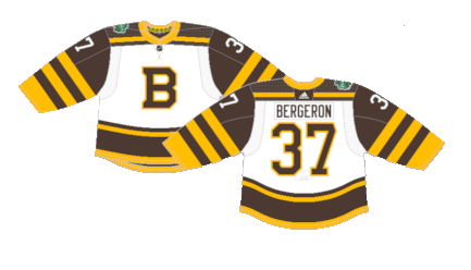
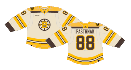
Number 9: 100th Anniversary (2023-2024)
The creme and brown alternate for their 100th anniversary season has a familiar inversion vibe to the 2010 Winter Classic kits. Hard to go wrong with a creme base for a jersey and is the best way to incorporate the brown with the gold.
Number 8: 100th Anniversary Home (2023-2024)
The one season only 100th anniversary jerseys were pretty sleek. A vintage feel with that modern Adidas cut turned out great.

Number 7: 100th Anniversary Away (2023-2024)
Much like their Reverse Retro 1.0 jerseys, they went too hard on one color which downplayed the overall striping, but the excess of white also made them a crisp, clean hockey jersey. Some white pants to tie the centennial idea together would’ve been preferred to the black ones they wore.
Number 6: FleetCenter Home (1995-2006)
The opening of the FleetCenter (now known as TD Garden) brought new jerseys to the Bruins rotation. They were an updated version of their previous uniforms, mainly in the sleeve-to-shoulder yoke and updated striping on the tail.

Number 5: FleetCenter Away (1995-2006)
The extra thick tail stripe can be appreciated better on the black version. They reek of the 90s in the most glorious way.

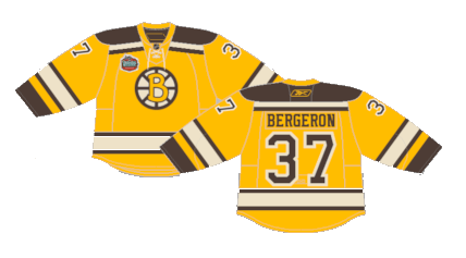
Number 4: Pooh Bear (1995-2006)
The Pooh Bear is high on the list of best alternate jerseys of all time. They don’t need a fancy description, just appreciate it’s glory.

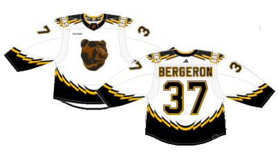
Number 3: Reverse Retro 2.0 (2022-23)
Any alteration to the legendary Pooh Bear jerseys seems unthinkable… until they were brought back for the Reverse Retro 2.0 release and they were done up with a white base. It’s an ultra clean look that may be even better than the originals.
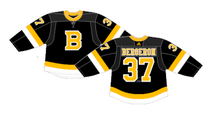
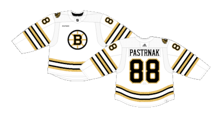
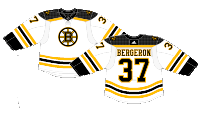
Number 2: Reebok Edge Away (2007-2023) (2024-Present)
The Bruins had to be the winner of the Reverse Retro release, right? A team that redesigned their jerseys and they didn’t completely suck and stayed as the regular kits for nearly two decades and counting. They survived the Edge 1.0 and 2.0 release, the Adidas takeover and both versions of jersey they brought, and it sure seems like they’ll be back in all their glory for the first year of Fanatics as well.
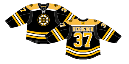
First: Reebok Edge Home (2007-2023) (2024-Present)
The Bruins’ Reebok Edge release encapsulated the Bruins’ look from the 1960s with the slightly higher tail stripe from the 50s all modernized into a quintessential jersey that has stood the test of time in the current day NHL.
By: Dan Esche (@DanTheFlyeraFan)
photo credit: nhluniforms.com
