

Not every NHL team changes their color scheme even once in their history, but most teams aren’t the LA Kings. They’ve had three different incarnations of color palette spread over the course of four different generations of jersey designs. Purple and gold, black and white, purple and black, then a return to black and white. They have one of the more extensive jersey histories in the league, and with all the variations in mind, let’s rank ’em!
Worst: Burger King (1995-1996)
What was this? Who designed this? Who ok’d this? An absolute abomination of a hockey jersey.
Number 19: Purple Legends Night (1967-1980) (2010-2014)
When the Kings joined the league in 1967 they brought the purple (officially forum blue) and gold scheme to the NHL, borrowed from their arena mates the LA Lakers of the NBA. The jerseys would return for Heritage night one-offs in the early 2010s, but probably should’ve just remained lost to history.

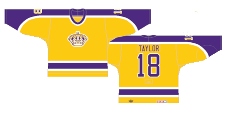
Number 18: Yellow Legends Night (1967-80) (2014-2017)
The gold base is far more aggressive on the eyes, but somehow less vexing than the purple versions.

Number 17: 1980s Away (1980-1988)
That shoulder-to-sleeve yoke design is far more recognizable as the Flyers’ main look around the same time, but debuted two years after the Kings wore these for the first time. The color scheme still isn’t great, but considering there’s actually some design elements here, they’re better than the original attempt at the forum blue jerseys.

Number 16: 1980s Home (1980-1988)
Ditto for the yellow versions.
Number 15: Reverse Retro 2.0 (2022-2023)
The long lost white versions of their uniforms from the 80s debuted for the second version of the Reverse Retro line. The purple and gold taking a back seat as secondary colors make the jersey and its color scheme far more palatable.
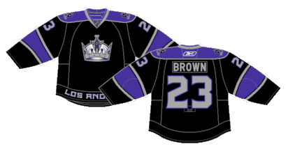
Number 14: Return of Purple (1998-2007)
After the Gretzky years came to an end, the Kings reintroduced purple to their palette but kept the black and white elements as well instead of the yellow.
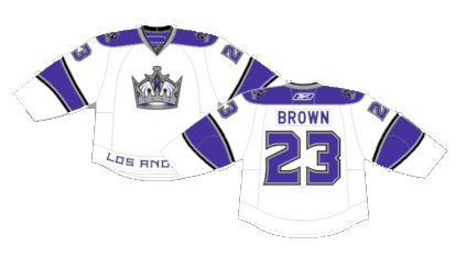
Number 13: Return of Purple Away (1998-2007)
The black versions with purple as the secondary color were a fun but rather dull jersey.

Number 12: Reebok Edge Home (2007-2013)
It’s not often Reebok Edge jerseys were better than the jerseys they were based off, but the removal of the tail stripe in this case was an improvement.
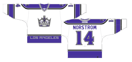
Number 11: Reebok Edge Away (2007-2011)
The white away versions were probably the cleanest version of their purple era.
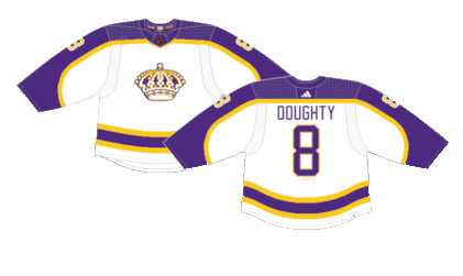
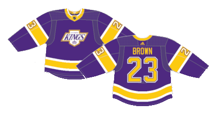
Number 10: Return of Purple Alternate (1999-2007)
These were probably the best use of the purple and black color scheme. If you’re going to do something, go all out, and that’s what the Kings did.

Number 9: Reverse Retro 1.0 (2021)
The Kings used their Gretzky-era design with their original purple and gold color scheme for the first Reverse Retro release. Even though they’re similar to the legends night jerseys we ranked last, the white striping does a lot of heavy lifting when it comes to breaking up the intenseness of the two-tone motif.
Number 8: 2014 Stadium Series (2014)
This was the first time the Kings brought their tertiary color gray to the forefront in some simple but sleek Stadium Series unis.

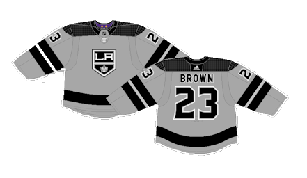
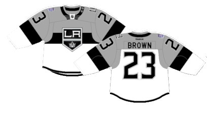
Number 7: 50th Anniversary (2016-2017) (2018-2021)
These jerseys were originally serving as their 50th anniversary uniforms with gold-trimmed letters and numbers, then they’d return to the rotation a few years letter with normal silver outlines. Historically, jerseys with a gray base tend to be a bit bland, and maybe these are, but the lack of another color shoved into the kit makes all the difference.
Number 6: 2015 Stadium Series (2015)
These much closer resemble the zany Stadium Series template than their previous unis. It feels almost impossible to screw up a jersey design with a black, white and gray color palette, and seeing the Kings take a step outside their comfort zone ended up making for a great one-off jersey.
Number 5: 2020 Stadium Series (2020)
Is it a hot take to like these jerseys? They’re more than a little whacky, but it goes to show that it’s hard to screw up the black and white palette even on the most bizarre of jerseys.
Number 4: Reebok Edge 2.0 Home (2008-2024)
The black and white jerseys returned to the rotation as an homage to the Gretzky years. They won two Cups wearing these jerseys, so they’ll always have a place in franchise history, even if they decided to move on from them.

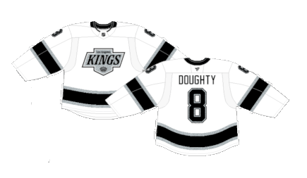
Number 3: Reebok Edge 2.0 Away (2011-2024)
With the exception of the black pinstripe and the little gray on the cuffs and of course the crest change, they’re virtually identical to the Gretzky-era kits. It’s a simple, clean and timeless like for a hockey jersey.
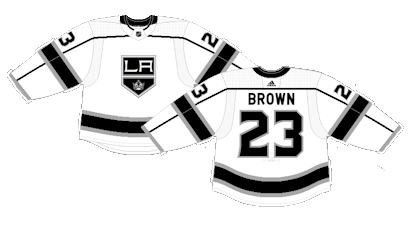
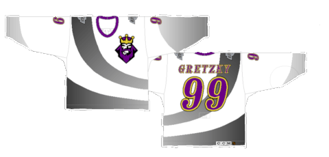
Number 2: Current Away (1988-1998) (2024-Present)
The Kings switch up their modern away jerseys with a throwback feel of the Gretzky-era jerseys. Considering the white versions are virtually the same today as they were then giving today’s generation a chance to appreciate the vintage cool feels the originals had back then.
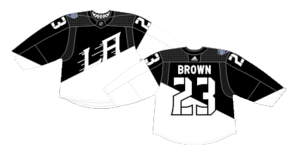
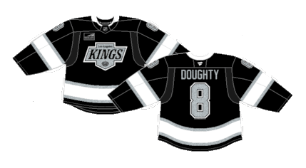
First: Current Home (1988-1998) (2024-Present)
The Kings change up their jerseys in time for the Fanatics takeover, opting for a throwback to their Gretzky-era jerseys from the 80s and 90s. The return of the tail stripe and the vintage logo is all simple but very effective, something the Kings have done very well over the last few decades since they ditched the purple.
By: Dan Esche (@DanTheFlyeraFan)
photo credit: nhluniforms.com
