

Ah, the Atlanta Thrashers. The NHL’s bastard child for pretty much their entire existence led to the second Atlanta-based franchise getting removed back in 2011. Their jersey history closely resembled their own, an underwhelming run overall but still had an occasional bright spot.
Worst: Red Alternate (2008-2011)
The last jersey the Thrashers added to the rotation were… a choice. The jersey design themselves are very distinctive and still a painfully obvious Reebok Edge motif. They resemble football jerseys more so than hockey, which makes sense, since the city of Atlanta cared more about the Falcons than they did the Thrashers.

Number 5: Reebok Edge Away (2007-2011)
The epitome of a Reebok Edge cookie cutter jersey. The wacky sleeve arrangement, the vertical stripes on the torso, the razor thin cuff outline, it’s all there.
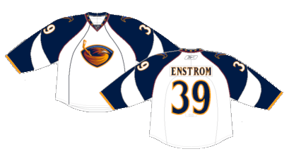
Number 4: Reebok Edge Home (2007-2011)
The Thrashers blue jerseys were among the most unique in the league, and while the Edge system kept the non-symmetrical sleeve design, the removal of the tail stripe is a serious net-negative.

Number 3: Original Home (1999-2007)
The took the shoulder-to-sleeve yoke of the Kings and Flyers and left it out in a storm to be struck by Lightning. A tried and true look with enough changes to make it their own is a good benchmark for any jersey.

Number 2: Original Away (1999-2006)
The pop of color on the away kits brings some life to the template, even though their alternate logo isn’t nearly as cool as their main.

First: Original Alternate (2003-2007)
The opinions from NHL fans on these jerseys appear to be split. The non-symmetrical sleeves are enough to upset any purist, but any time there’s a jersey that stands out from the crowd, it will always have a cult following. Considering the rest of their jersey history wasn’t much to write home about, their blue alternates go down as the best the Thrashers could muster during their existence.

By: Dan Esche (@DanTheFlyeraFan)
photo credit: nhluniforms.com
