

Like most original six teams, the basics of the Toronto Maple Leafs and their jerseys have stayed the same over most of their history- a blue and white color palette and a Leaf crest. However, they have tried many different patterns, designs and even occasionally added a new color to the mix. They have one of the largest jersey histories in the league, so let’s get to ranking!
Worst: Reebok Edge Away (2007-2010)
Leave it to the Reebok Edge release to bastardize the classic Maple Leafs look. It was the only version in their history that did not feature any stripping on the torso or tail. It’s still just the classic blue and white, but a minimalist approach to a jersey that was never overly flashy to begin with.
Number 19: Reebok Edge Home (2007-2010)
Ditto for the home version of the Edge release.

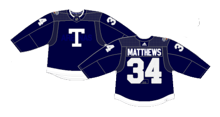
Number 18: Reverse Retro 1.0 (2021)
Using gray as a main color was a recurring choice under both versions of Adidas’ Reverse Retro release, but it does absolutely no favors for this jersey… or most of them, for that matter.

Number 17: 11-Point Leaf Away (1970-1992)
These jerseys were the debut of the modern Maple Leafs crest, but the sleeve-to-shoulder yoke definitely has a vibe from the 1970s.

Number 16: 11-Point Leaf Home (1970-1992)
The white versions are at least a bit more pristine.
Number 15: St. Pats Heritage (2002)
That’s an aggressive amount of an aggressive shade of green. They may have been an homage to a pervious version of the Maple Leafs franchise, but that doesn’t always equate to a good jersey.

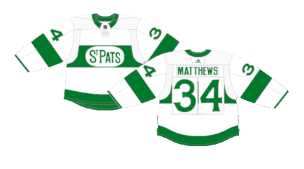
Number 14: St. Pats Heritage Night (2019-Present)
In 2019, the Leafs started to pay homage to the Toronto St. Patricks, the previously named incarnation of the franchise before a sale in 1927, on, well, St. Patrick’s day. The white body is much easier on the eye than the all green jerseys.
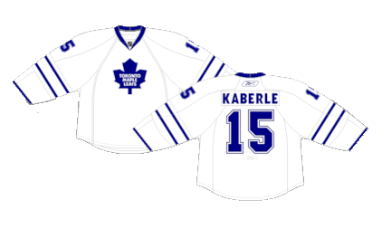
Number 13: Vintage Alternate (1958-1970) (2000-2007) (2008-2011)
The Leafs have worn versions of this jersey three separate time throughout their history, originally as the road jerseys in the 60s, then returning as alternates in the early and late aughts.

Number 12: 2017 Next Century Game (2017)
Barber pole sleeves are a positive in virtually every occasion.
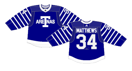
Number 11: 2022 Heritage Classic (2022)
The Leafs broke out versions of their original jerseys from 1917 for their Heritage Classic appearance in 2022. There’s not exactly much to write home about, but the darker shade of blue is a nice change of pace. It’s one of those simple but very effective jerseys.
Number 10: 90s Home (1992-2007)
This is the particular version of Leafs jersey that I grew up with, so it holds a special place amongst the sea of blue and white. The silver outlines on the numbers with that wacky font of the nameplates and the stylized deep V of the collar make the jersey stand out even if the striping is rather vanilla.

Number 9: 90s Away (1992-2007)
Same goes for the blue versions. They would return to a similar style (minus the white cuffs) during their Reebok Edge 2.0 update.

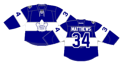
Number 8: Reebok Edge 2.0 Alternate (2011-2016)
The Leafs opted for an alternate jersey in homage to their 1967 motif, worn during their last Stanley Cup victory in what was their fourth jersey to roll out under the Reebok brand.

Number 7: Drew House Alternate (2021-Present)
With the exception of the St. Pats heritage jerseys, this was the first time the Maple Leafs wore a different colored jersey other than blue or white. They’re also reversible with yellow trim on the inside for some reason. It’s a cool concept and anything to change up the pace is a positive.

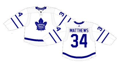
Number 6: Current Home (2016-Present)
There’s not much difference between the modern day Leafs jerseys and the typical home and away kits of the past, but the vintage crest and the tightness of the Adidas construction made for a great look.

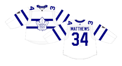
Number 5: Current Away (2016-Present)
The Leafs white jerseys are among the cleanest in the league today.
Number 4: Reverse Retro 2.0 (2022-2023)
The Leafs broke out a reverse of their retro alternate jerseys (number 13) and they somehow looked cleaner than the originals.

Number 3: 2017 Centennial Classic (2017)
While the thick striping across the torso and sleeves is a gimmick that has been done to death in recent years across the NHL, it looks magnificent with the Maple Leaf blue and white and served as a perfectly fine one-off jersey.
Number 2: 2018 Stadium Series (2018)
The striping pattern isn’t exactly unique or innovative, but the whiteout look (including the pants, socks and helmets) is a fresh, underutilized design in the modern NHL.
Number 1: 2014 Winter Classic (2014)
The Leafs used a reimagined version of their original jerseys from the 1920s for their first Winter Classic appearance. Much like their Red Wing counterparts, the kits were absolutely spectacular. The barber pole sleeves, the vintage crest, the white shoulder yoke and the double stripe on the tail ties together the busiest, but also the best, Leafs jersey.

By: Dan Esche (@DanTheFlyeraFan)
