

Very few teams have stayed on the straight and narrow on jersey designs like the San Jose Sharks. Rocking the same color scheme since day one, the have only changed their setup four times in their almost-thirty year history.
WORST: Number 12- Current Home (2013-present)
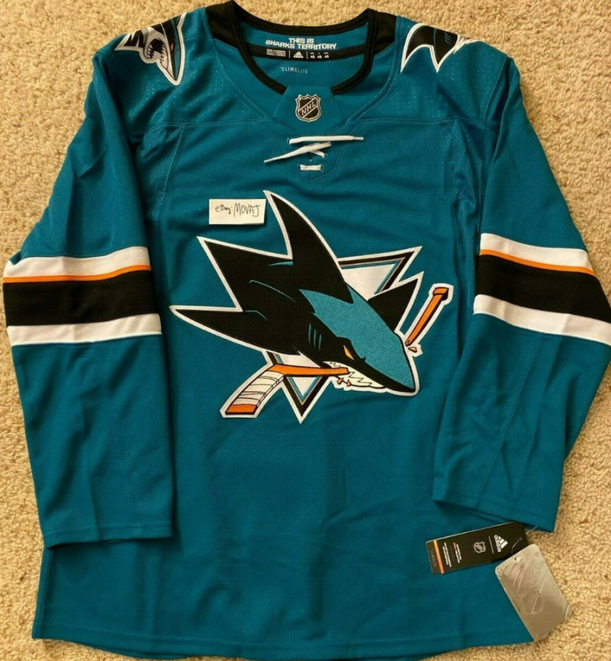
The Sharks current home jerseys have been in the rotation since 2013 when the team removed the stripe on the waist and the shoulder yolk. The teal saves it from being a complete bust, but it is easily the most boring jersey in the Sharks’ history.
Number 11- Current Away (2013-present)
The current away jersey is from the same bland thought pattern as the home jerseys, though the white is just a tad more pleasing to look at. The stripes on the arms as well as the solid teal collar fit well on the solid white jersey.
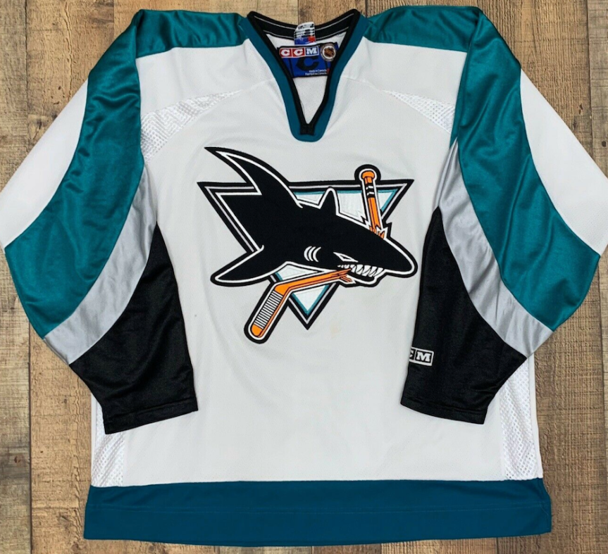
Number 10- Original Away (1991-1998)

The San Jose Sharks borrowed their first jersey design from the Hartford Whalers. The huge stripe pattern on the lower torso and waist, only the sleeves were slightly different. The teal, black, and white color scheme and Shark logo eating a hockey stick has been the basis of the franchise since the beginning, only undergoing sight changes over the years.
Number 9- Original Home (1991-1998)

The Sharks entered the league in 1991 and brought a very 90’s looking jersey with them. With a large stripe pattern on the lower waist, rising up to the mid-torso with the sleeves to match, the teal jerseys were a change of pace in the NHL. much like most of their setups, the white jerseys seem to bring out the teal much better than the solid color jerseys.
Number 8- Current Alternate (2018-present)

The Sharks third attempt at a black alternate jersey saw the organization break out a monochromatic look. Opting for an all black jersey with only small amounts of teal on the sleeves, and slighting tweaking the logo so the stick is teal, it’s a futuristic take on a long-standing Sharks style. The futuristic style was further promoted when you realize the black bar inside the two teal stripes actually has a circuit board pattern embossed in it.
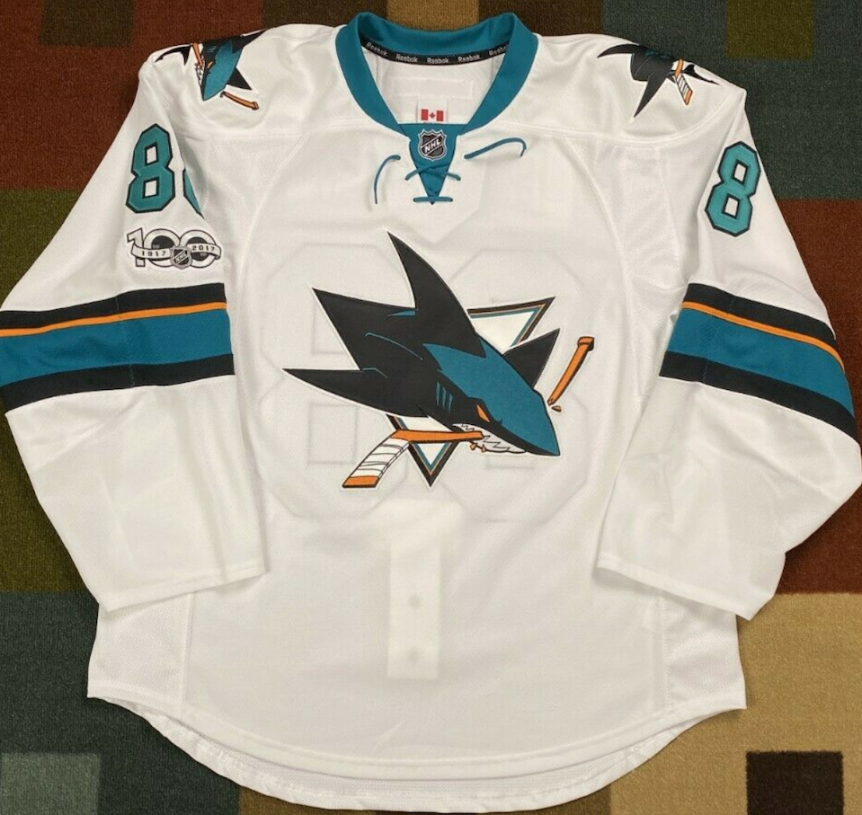
Number 7- Reebok Home (2007-2013)

When Reebok took over in 2007, the Sharks were one of the teams that totally redesigned their uniforms. Ditching their popular late-90s design in favor of a solid teal jersey with black, white, and orange stripes on the sleeves, waist, and collar, they also followed the Sabres lead by adding numbers to the right chest. These jerseys stayed in the rotation until 2013 when they removed the stripe on the waist to, and I’m not kidding, make the jersey lighter to promote a better on ice product.
Number 6- First Black Alternate (2001-2007)

I’m rather torn on these jerseys. The simple, all black jersey with a slightly larger logo is a cool look. On the other hand, an all black jersey with two seemingly random white and teal stripes on the sleeves has an unfinished look that leaves more to be desired.
Number 5- Reebok Away (2007-2013)

Just like the two previous white jerseys on this list, they are just more visually pleasing to look as with the teal as the undertones rather than the standout color. The orange trim gave the jerseys an extra bit of life, and in turn giving the whole jersey a pop.
Number 4- 2015 Stadium Series (2015)
The Sharks represented at their lone outdoor game in style. Stacking the teal over black, with a white stripe on the chest, it gives the jerseys a very old school feel, yet with the Sharks color scheme it felt brand new. The back of the jerseys were solid teal and had extra large numbers on the sleeves. Somehow the Sharks never wore the jerseys again, probably afraid all the different colors made the jerseys too heavy.
Number 3- Second Black Alternate (2008-2017)

The Sharks second attempt at a black alternate jersey ended up being their best. They stuck with the simple black jerseys much like their first try, but the stripes on the sleeves look complete this time. Two small white stripes encapsulating a large blue bar is the most satisfying version of stripe pattern they tried. These stayed in the rotation until Adidas took over in 2017.
Number 2- Second Home (1998-2007)
The second incarnation of the Sharks home jerseys were a tad less flagrant than the aways, but were close enough to be a perfect contrast. Dulling down the use of black on the sleeves, it really made the silver and teal stand out.
FIRST- Number 1- Second Away (1997-2007)

What originated as an alternate jersey in 1997, they became their regular roads in 1998. The shade of teal is darker than the original home jerseys and the arching black and silver design on the sleeves gave the jerseys a unique look. Black mesh on the underarms and sides paired with a single gray bar on the bottom of the waist is just a glorious design that should still be worn to this day.
By: Dan Esche (@DanTheFlyeraFan)
photo credit: nhl.com
