

In the early days of their existence, the Tampa Bay Lightning tried to be original, with some illegible fonts for the nameplates and hands down one of the most offbeat jerseys in NHL history, they have taken a much more relaxed, basic approach to hockey jersey in recent years, maybe overcorrecting too hard from their rebellious youth.
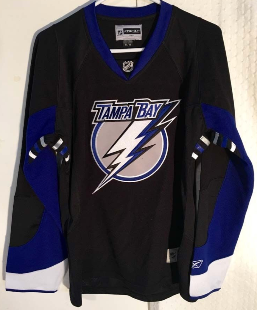
WORST: Number 10- Current Alternate (2018-present)

A solid black jersey. That was the Lightning’s genius solution for an alternate sweater under Adidas’ watch. Technically the black sleeves fade to a gray, but it’s hard to distinguish the difference from a distance. The white logo gives these things a practice jersey feel and leaves a lot to be desired, especially since the Bolts have knocked black jerseys out of the park in the past.
Number 9- Current Home (2011-present)

The Lightning went to a blue and white scheme in 2011, essentially removing black from their color scheme except a minor part of their alternate jersey. The design itself, a blue jersey with a solid white stripe on the waist and sleeves is about as basic a design as you can think up. It’s hard to believe the organization has stuck with this bland setup for almost a full decade.
Number 8- Current Away (2011-present)

The third of three of their current rotation fills out the drab setup for the Tampa Bay Lightning. As an invert of the home jerseys, the plain white sweater with a single blue stripe on the waist and sleeves just screams uncreative.
Number 7- Original Away (1995-2001)

The Bolts entered the league in 1992 and brought a blue, black, and white color scheme with them. The rather basic design of the jerseys was muted by the absolutely wacky numbers and nameplate, which went through three unreadable rebirths until 2001 when they finally used a normal font.
Number 6- Original Home (1995-2001)
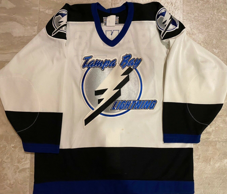
Some jerseys just look better in white, and that goes for the original Tampa home jerseys. The white base breaks up the monotonous, robotic look of the black away jerseys.
Number 5- Thunderstorm (1996-1999)

A candidate for the strangest jersey in NHL history, the Bolts introduced a sublimated jersey featuring a thunderstorm in the ocean. With rain, lightning, waves, a crazy font, and a gray shoulder yolk presumably meant to represent the clouds, it’s a beautiful disaster of a hockey jersey that was only worn a couple dozen times over three seasons.
Number 4- Reebok Edge Away (2007-2011)

When Reebok took over production in 2007 the lightning used the opportunity to simplify their setup. opting for a solid white torso, the sleeves featured an underlying blue and black design that did inject some life into an otherwise nothing happening jersey.
Number 3- Black Bolts Alternate (2014-2017)

When the Bolts switched their home jerseys to blue in 2011, they decided to swap their alternate blues out with a black jersey. Keeping the diagonal BOLTS logo, they dumbed down the color scheme a bit, maybe a precursor to their current black alternate. The main difference is the white inlays on the waist and sleeves and blue collar give the jerseys a nice pop, and just enough of a spice to break up the solid black.
Number 2- Bolts Alternate (2011-2014)
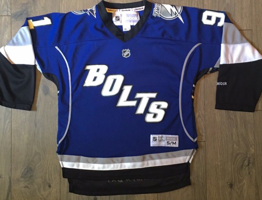
The Lightning broke out these blue alternates in 2008 and introduced a new logo. In terms of colorful, well designed jerseys, these are at the top of Tampa Bay’s list. They eventually opted to go with a black alternate in 2014 so they didn’t have two blue jerseys, but in the process left one of their best jerseys in the past.
FIRST: Number 1- Reebok Edge Home (2007-2011)
Reebok taking over was one of the short-lived best things that happened to the Lightning. Opting for a black torso with blue and white sleeves and a new look logo made the jerseys pop, unlike anything they’ve done before or since. The victory stripes under the arms were actually always a feature for the Bolts jerseys, but they were best seen on these. For some reason the Bolts abandoned these after just three seasons and went with the blue home jerseys, a critical mistake if you ask me.
By: Dan Esche (@DanTheFlyeraFan)
Photo credit: icethetics.com
