
The 2021 NWHL season is in the books. Unfortunately, it didn’t end the way everyone wanted, but it was a great few weeks and not only did I get to take in their on-ice play, I got to get a front row seat to their badass hockey jerseys. Any time I get to break out the Worst to First series and put my jersey critique skills to the test I’ll gladly do it. Worth noting, the NWHL doesn’t have a bad jersey. Unlike their male counterparts, the Women’s league seems to take extreme pride in their uniforms and each and every one has a distinctive look.
Number 13- Connecticut Whale White
The Whale changed up their white jerseys and that alone drove them to the bottom of the league. The sleeves are reminiscent of the current Philadelphia Flyers setup, but for whatever reason the classic blue and green just doesn’t fit the design. The crest is still great, but they can definitely find a better setup that compliments the color scheme.

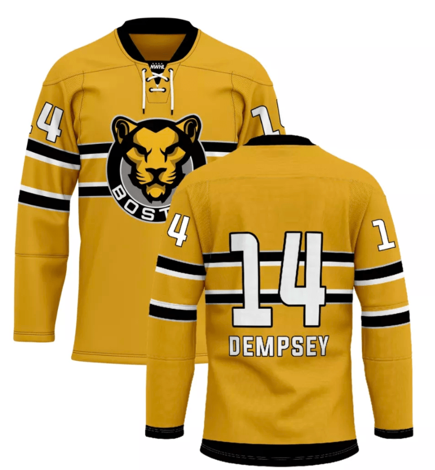
Number 12- Boston Pride Yellow
This jersey isn’t here because it is bad, but it isn’t as good as past incarnations of the Pride yellow jerseys. Boston opted for a Montreal Canadiens-esque stripe on the chest of the jersey and sleeves versus past jerseys where they had black undertones on the sides and sleeves with lion prints on the forearms. Not bad, just too stale in a league of dynamic jerseys.
Number 11- Metropolitan Riveters Blue
The Rivs abandoned their red jerseys in favor of a navy blue color scheme. It’s more or less the same jersey just inverted and the tail stripe was moved up a bit. It has a Captain Marvel feel to it, which suits the Riveters well. It’s a cool concept for a jersey that fits the theme of the team, but it doesn’t stand out from the crowd either.

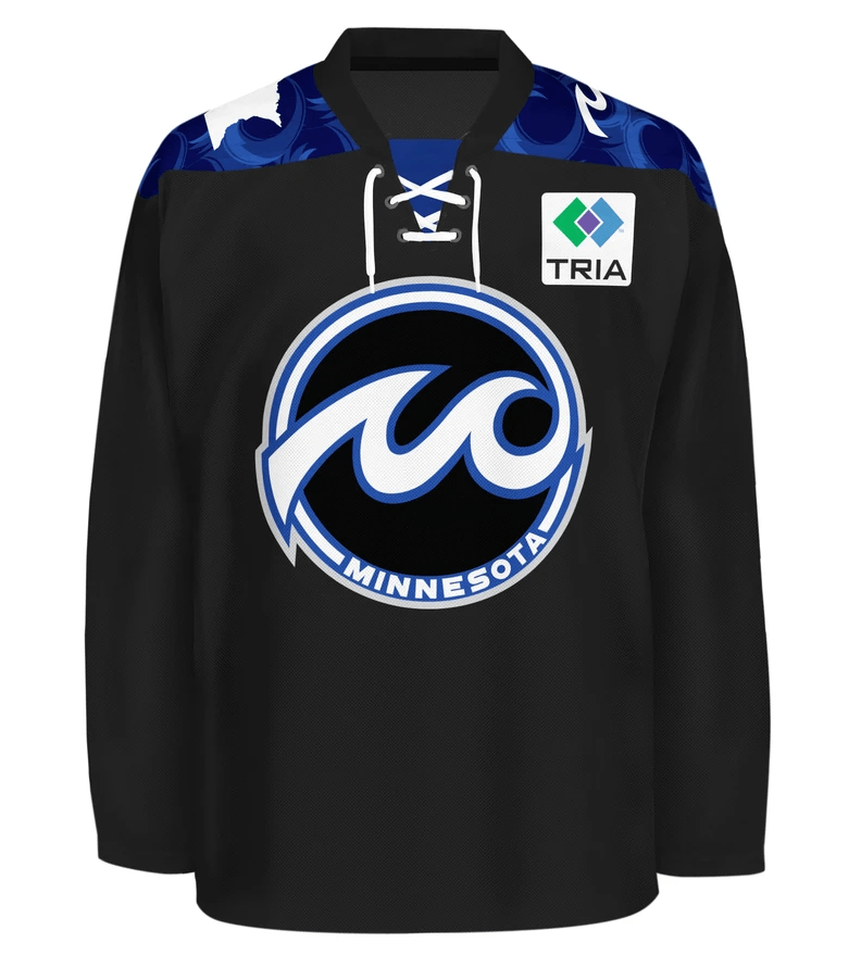
Number 10- Minnesota Whitecaps Black
Not a whole lot to judge here as it’s just a solid black jersey with wispy blue shoulder yoke. The little blue that is on the jersey does stand out well during the games, but there isn’t much else to say about these.
Number 9- Buffalo Beauts Black
If I’m going to damn the Whitecaps for a solid black jersey, I have to do it for the Beauts too. These jerseys are a cool concept and a big change from their usual powder blue unis, but they’re relatively bland and the stripe design on the sleeves didn’t come across well during the games. A little bit more color splashed on the crest, or the widening of the stripes on the sleeves could go a long way to make these awesome.

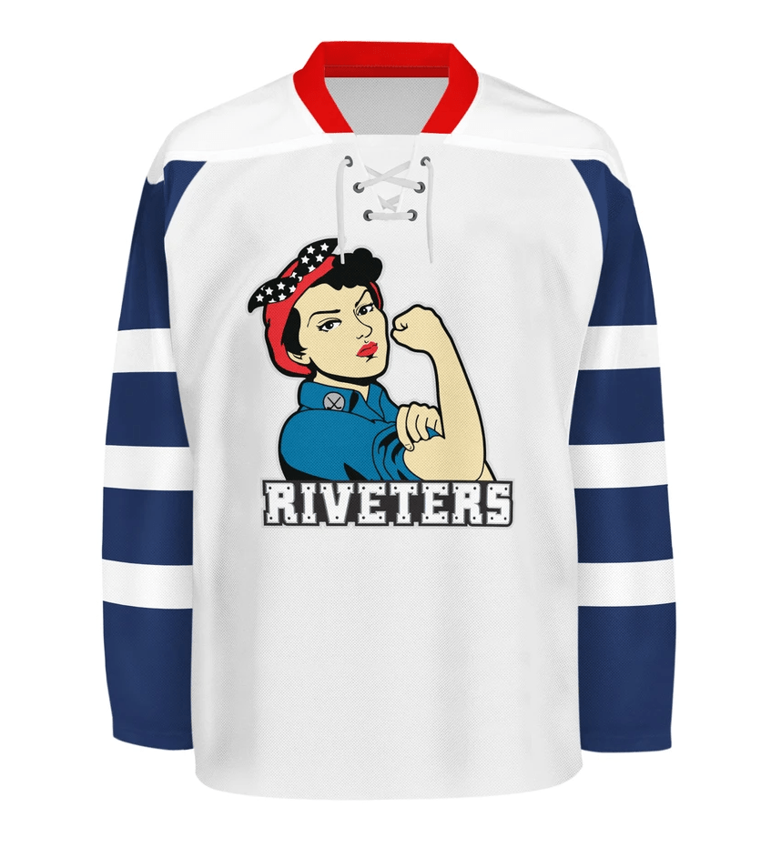
Number 8- Metropolitan Riveters White
The classic Riveters jersey features the striped sleeves and military stencil font for the name and numbers on the back. It fits the Riveters gimmick and breaks out a rarely used jersey design with the stripes on the sleeves most notably used in the very early days of the Toronto Maple Leafs. It’s a cool design but falls in the middle of the pack.
Number 7- Minnesota Whitecaps White
The Whitecaps debuted a white jersey to the rotation and even though they looked great on the ice, the true beauty of the jersey can’t be truly appreciated during the games. It was apparent there was some kind of design on the tail of the jersey, but the lake-scape and trees were hard to distinguish during the games. It wasn’t until looking for pics of the jersey for this piece that the full design could be appreciated.

Number 6- Toronto Six Black
The Six debuted three jerseys for their inaugural season, with the black jerseys being their main uniforms. In the pictures, these definitely seemed to have the most potential of the three, but upon their debut they were a tad underwhelming. The gold sleeves didn’t really pop, it was a muted shade and thus it turns into a pretty standard black jersey. It’s still a great look, but had the gold been a bit more obnoxious, they would’ve been higher on the list.
Number 5- Buffalo Beauts Blue
The Beauts have rocked the powder blue scheme since their first season and have made several tweaks to their design over the years. The tail stripe is now black highlighted by two white stripes and the design continues onto the sleeves that used to be barren. It’s just about a perfect jersey with a color scheme that is all their own. Definitely a classic jersey in the NWHL.

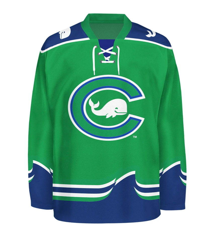
Number 4- Connecticut Whale Green
The Whale completely redesigned their white jerseys, which used to look just like these, but they also made some tweaks to their green jerseys as well. The shoulder yoke was retracted a bit, as it used to dip a little lower resembling a sailors uniform. The waves cresting on the tail stripe is a subtle design on their jersey that sets them apart from everyone else. It’s a clean jersey that is unique enough to separate themselves from the crowd.
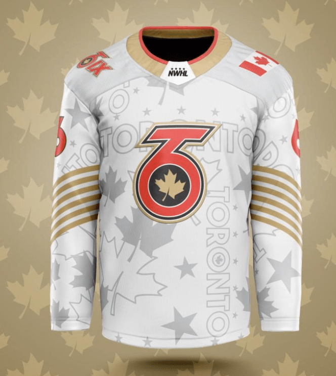
Number 3- Toronto Six White
Up close, these jerseys look awesome. Having faded stars, leaves, and “Toronto” adorn the sweater along with the six golden stripes on the sleeve make a one-of-a-kind hockey jersey. The minor details were much harder to see during the games, but the creativity alone makes these stand out in the otherwise humdrum world of hockey jerseys.
Number 2- Boston Pride Black
These jerseys came across so much better in person than the picture gives them credit for. Much like their male Boston counterparts, you really can’t go wrong with a black and gold color scheme. Going gradient is always a risky move with hockey jerseys, a trick usually reserved for Vancouver teams, but it worked well for the Pride. If they had their normal crest in the jersey, or something more than just “Boston” these might have been enough to take the top spot.

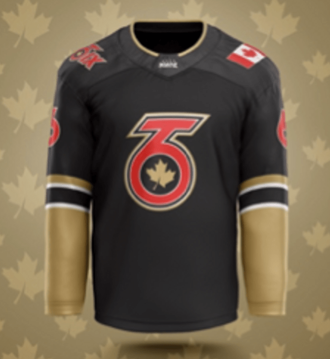
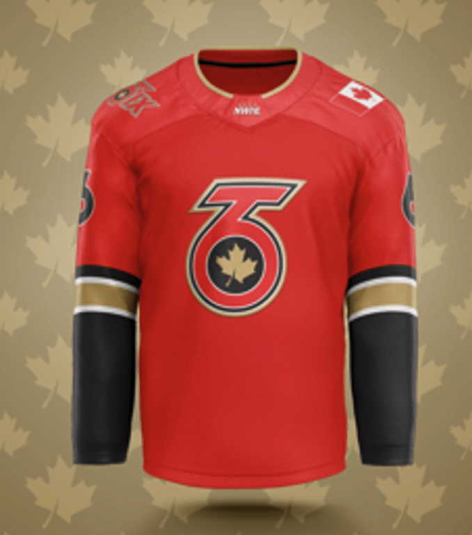
Number 1- Toronto Six Red
Take notes, Vegas, this is how you do a red, black and gold color scheme. It follows the design of their black jersey and the simple, classy design not only makes the three colors work together, they translated well on the ice.
.
By: Dan Esche (@DanTheFlyeraFan)
Photo credit: nwhl.zone icegarden.com
