

The Phantoms franchise has had tenures in three different cities throughout their 25-year history and the imagination and creativity that has gone into the jerseys over the years is next to none. With an amazing logo and a fascinating color scheme, the concepts that have emerged from the Phantoms makes them some of the most recognizable hockey jerseys of all time.
Worst- Philadelphia Phantoms white
Let’s get the unpopular opinion out of the way first- I really dislike the old school Philadelphia Phantoms jerseys. The shoulder yoke that creeps down the sleeves is a unique look that just doesn’t do it for me.

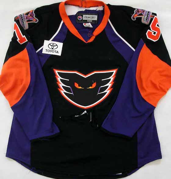
Number 18 – Philadelphia Phantoms purple
If I’m going to damn one, I’ll damn the other. The purple jerseys are a bit less obnoxious because the deep yoke isn’t as vivid thanks to the purple base.

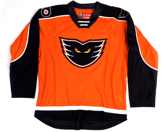
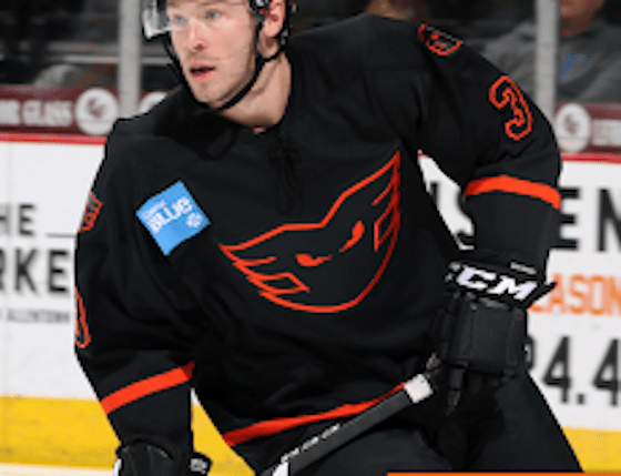
Number 17- Lehigh Valley orange
The Lehigh Valley Phantoms ditched their original kits and opted for a very bland orange and black setup similar to the modern day Flyers jerseys. Regardless of feelings on any previous Phantoms setup, they were always unique, whereas these are about as bland a hockey jersey as possible.
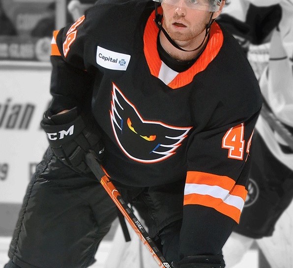
Number 16- Lehigh Valley new black
I always thought a black base suited a Phantoms jersey well to make the logo a little more intimidating, which makes these a little better than the orange ones, but still a boring hockey jersey.

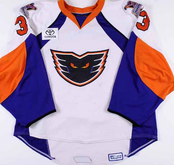
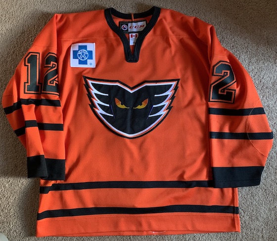
Number 15- Lehigh Valley original white
The original white jersey that debuted upon the team’s move to Allentown seriously lacked in creativity. Solid white jerseys with orange shoulder yoke and a little bit or orange at the end of the sleeves, highlighted by electric blue, their new third color. Just a bland, boring jersey, and not an inverse of their home jerseys of the same era, which is unusual.

Number 14- Philadelphia black alternate
The black alternate of those ugly Philadlephia-era setups are the best of three. Using the purple as a secondary color and orange for the trim is probably the best way to salvage the fugly shoulder yoke.

Number 13- Philadelphia Phantoms original purple alternate
The Phantoms ran with these purple alternates with white sleeves for a few years and underwent various tweaks, including a similar style in which they won the 2005 Calder Cup. Unlike the other purple jerseys, black is not a secondary color, instead opting for white and using orange as the trim color. It’s an iconic look given the victories these jerseys have seen.

Number 12- Philadelphia new black
Just like the OG Phantoms jerseys, black as a base color helps conceal what otherwise is a ridiculous concept. They were on to something with the style, something Adirondack would later improve on, but forcing the purple into a scheme where it just doesn’t belong just doesn’t work.
Number 11- Philadelphia new white
There’s something about these jerseys that just scream FAKE, but they were very real and worn in the dying days of the Philadelphia Phantoms. The purple was dialed back compared to past incarnations of Phantoms jerseys, but yet it is somehow more obnoxious. The white shoulder pads, a trade mark the Flyers would borrow around the same time is an interesting choice as well. I’ve never been able to get it out of my head that these are actual hockey jerseys and not something you’d buy for 15 bucks on DH Gate.
Number 10- Adirondack orange
Look familiar? The Phantoms adopted the same alternates the Flyers did upon their move to Adirondack in 2009. This style of jersey was an alternate for their parent club for two seasons before ultimately becoming their full-time home jerseys in 2010.
Number 9- Leigh Valley new white
I don’t think I’ve ever been quite as indecisive on a jersey quite like the current Phantoms white setup. It’s their second crack at a white jersey and is certainly interesting. They opted to avid symmetrical stripes on the sleeves and tail which isn’t typical. They look much better in real life than the concept art suggests, but there’s something about them that just feels wrong and I’ve never been able to put my finger on it.

Number 8- Philadelphia new purple alternate
This is a very unique design for a hockey jersey. Vertical stripes are not a common look. They were a shirt-lived look during the Philadelphia era, but if you’re going to utilize purple in a hockey jersey, you may as well go all out with it, and that’s exactly what these are.

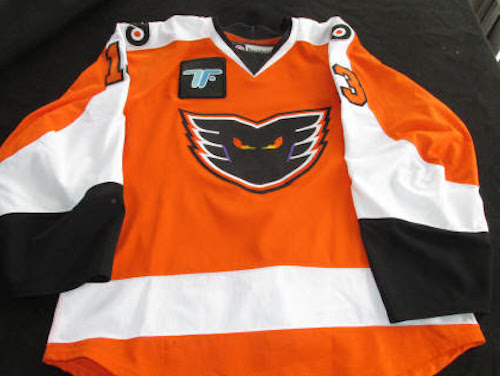
Number 7- Lehigh Valley original black
The original black jerseys debuted when then team moved to Lehigh have fallen in and out of favor with me over the years. It’s a unique style of jersey with an intricate design on the under side of the sleeves and the trim in their new third color electric blue. I’m a fan of any jersey that breaks the mold and bring something visually different to the table, thus, these are high on the list.

Number 6- Lehigh Valley new black alternate
The Phantoms have worn a few different incarnations of black alternate jerseys over the years that don’t get released to the public, and this happens to be the most recent 2021-22 style. Based on their “race car” alternates worn during theme nights, The all black jerseys with three stripes on the sleeves and tail is a much improved look from their standard black jersey in entry number 16.
Number 5- Lehigh Valley black alternate original
The “black out” jerseys were retouched a few times during their short run, mainly redesigning the numbers from an orange outline and black numbers to just solid orange numbers. They were never released to the public and have seemingly been shelved in favor of the black jerseys in the last entry, but the black and neon orange colors are amazing despite the overall simplicity of the jersey.
Number 4- Lehigh Valley color rush
These color rush jerseys were made for the 2018 AHL Outdoor Classic and made semi-regular appearances as an alternate after. The full uniforms are incredible and really make the jersey. A new, dark shade of orange with blacked out letters and nameplate. The darker orange really works well with the Phantoms logo.
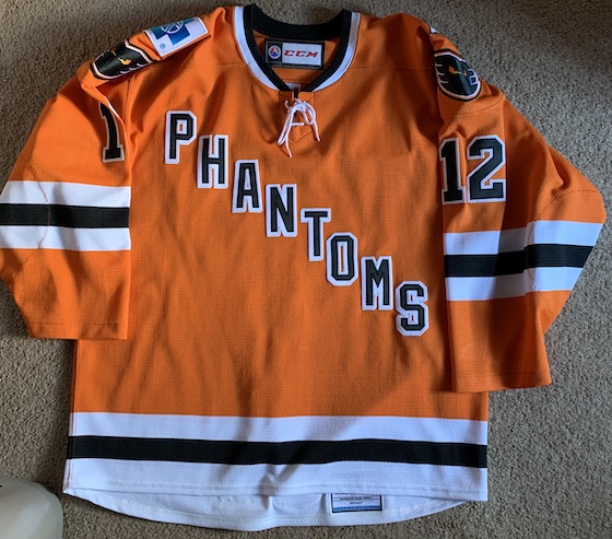
Number 3- Lehigh Valley vintage
I’m typically not a fan of the diagonal lettering. It’s a trope that has been done to death over the last handful of years, but these are absolutely awesome. the orange is a slightly lighter shade than their normal home and away kits, and a reflective nameplate just elevates these above the rest. It’s a pretty standard scheme otherwise, three stripes on the sleeves and tail, but its positives far outweigh the otherwise simple jersey.
Number 2- Adirondack black
For the most part, a black and white color scheme is pretty hard to screw up, and there’s something beautifully simplistic about the Adirondack-era black jerseys. A solid black jersey broken by only two thin white stripes and a little bot of orange on the elbows. Sometimes stripping a jersey down to the bare bones can be a bad thing, but not these. If anything it makes the logo that much more intimidating.

First- Adirondack white
Not only are these my favorite Phantoms jerseys, they very well be my favorite hockey jerseys of all time. They are based on the Philadelphia-era jerseys of the same basic design, but the purple is removed completely and replaced with orange. It’s a one of a kind jersey design that really brings out the best of the orange, black and white color scheme. If the Flyers ever want to steal these for an away jersey in the future, mark me down for a couple dozen.

By: Dan Esche (@DanTheFlyeraFan)
