
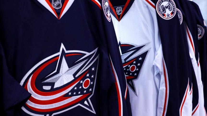
The Columbus Blue Jackets are now in their 22nd year of operations and have been stuck in hockey jersey purgatory for well over half of that time. There are few teams in more desperate need of an upgrade than the Blue Jackets as they’ve gone with the same presentation for 15 years now.
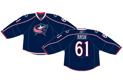
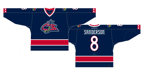
WORST- Number 7: Current Home (2007-present)
The Blue Jackets indeed have a blue jacket. Somehow these boring, run-of-the-mill, nothing happening jerseys have been a staple in the Blue Jackets’ organization for 15 years now. No color, no creativity, no fun.
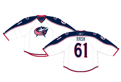
Number 6: Current Away (2007-present)
At least the road white jerseys have a bit more color to them than the home jerseys, but it’s still as basic a jersey as you could design.
Number 5: Reverse Retro (2021)
The Blue Jackets… Blue Jackets… Blue Jackets opted for a red jersey for their reverse retro release. Now, they brought back their awesome original logo, but the jersey itself was just too loud for the stuffy organization. If a team like the Capitals adopted this jersey style, it may make more sense, but the Blue Jackets first attempt at a different style jersey in over a decade was a horrible failure.

Number 4: Original Alternate (2003-2007)
I dunno, if your main color is dark blue, maybe don’t make an even darker color the accent of the jersey. It was the only time in the organization’s first ten years of existence they tried something different than red, white and blue and it was not a success. This was the debut of the Ohio state flag wrapped around a star, the logo that would eventually become their main crest when Reebok took over.

Number 3: Original Home (2000-2007)
The original Blue Jackets jerseys were simple, yet so much better than the current version. The tail stripe adds a splash of color and the stars on the cuffs are a subtle but noticeable pop unseen on the modern jersey. Columbus doesn’t have to get crazy, but a little extra goes a long way in this case.

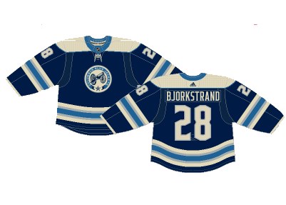
Number 2: Current Alternate (2010-present)
These jerseys are so unique and have had fans clamoring for them to be the full-time home jerseys for a decade now, but the pleas have fallen on deaf ears. Utilizing a slightly different color scheme to bring the vintage feel, to the awesome secondary crest, to the funky nameplate lettering, this jersey has it all. It’d be a perfect way to keep the Columbus theme but make significant enough change to give the team a much needed upgrade.
FIRST- Number 1: Original Away (2000-2007)
I don’t know what it is about these jerseys, but I’ve always absolutely loved them. The navy blue broken up by a single red stripe and minimal white piping just works. Not to mention the original Blue Jackets logo was awesome. It’s nothing overly groundbreaking, but there’s enough life that gives the jersey some character.
By: Dan Esche (@DanTheFlyeraFan)
photo credit: nhl.com / nhluniforms.com
