

Adidas’ Reverse Retro line was deployed for the first time in 2020 and for the most part, the release was a success. With Adidas set to step away as the NHL’s jersey producer, they are leaving the fans with one last parting gift by once again bringing back the RR line with plenty of new and interesting designs, so let’s rank the 2022 Reverse Retro line!
Worst: Florida Panthers
What.. What is this? They’re colorful, they’re fun, they’re different, they’re very Florida, but I just can’t tell whether or not they’re the good or bad kind of ridiculous. Either way, after much deliberation, I’ve decided just can’t get into them.

Number 31: Winnipeg Jets
Gotta give it to the Jets, they got rid of the grey they chose the last time around, so it takes the jersey from negative stars to just simply “meh.”

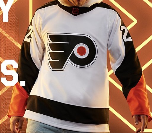
Number 30: Philadelphia Flyers
The Flyers chose a boring, bland, complete wet fart of a jersey. How apropos.
Number 29: Columbus Blue Jackets
There’s something about these that just scream Chinese knockoff jersey. The weird shade of blue on the shoulder yoke and tail stripe are just too harsh of a contrast to the typical dark blue. They didn’t even break out their vintage CB logo. Better than the red Reverse Retros from last time, I suppose.

Number 28: Toronto Maple Leafs
The Leafs released a Leafs jersey. Whoopty doo.

Number 27: St Louis Blues
The Blues are unafraid to go down whacky routes when it comes to alternate jerseys, so you have to admire the creativity of these, but they’re a bit bland and at first glance appear to be Bruins jerseys. Cool concept, just not great execution.

Number 26: Seattle Kraken
Typically speaking, I’m a fan of jerseys that aren’t cookie cutters, and this certainly isn’t that. If there was just a slight bit of white or even red in the tail stripes, it would go a long way to making these better.

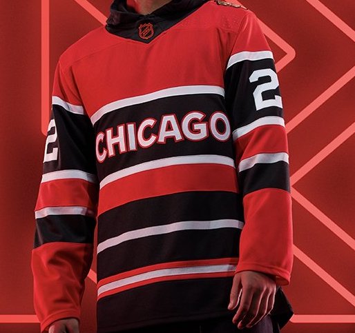
Number 25: Chicago Blackhawks
A throwback to their jerseys from the 1950’s is pretty cool. It’s certainly a unique design, albeit being a bit bland from a crest perspective. If they used the old Black Hawks logo on the original jerseys, these may be a bit higher in the rankings.
Number 24: Detroit Red Wings
“Hey Chicago, can I copy your homework?” “Sure just change it up a bit.”

Number 23: Vancouver Canucks
These certainly nail the retro vibe. It feels like a jersey ripped right out of the 1960’s. They’re perfectly fine jerseys, but the damp colors just don’t make it stand above the crowd.

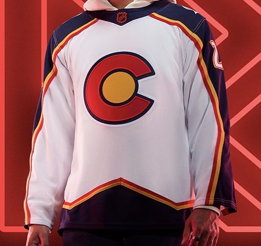
Number 22: Colorado Avalanche
The old Colorado Rockies logo and color scheme on vintage Avalanche style jerseys. It fits the Reverse Retro gimmick perfectly, but the white torso’d jerseys just don’t stand out as much as typical home jerseys would. Let’s be honest, anything the Avalanche were gonna do this year wouldn’t live up to their Nordiques version of the Reverse Retros.
Number 21: New Jersey Devils
It seems odd to bring back the same vintage color scheme for two separate teams, but the organization is paying homage to their roots. It’s better than those Christmas color Devils jerseys, that’s for sure.

Number 20: Dallas Stars
Another jersey that nails the retro idea, but isn’t overly appealing to look at. The old school Stars logo will always be awesome, though.

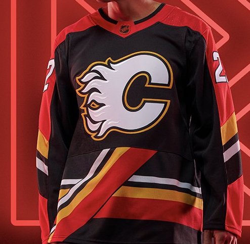
Number 19: Calgary Flames
In terms of sticking to the reverse retro gimmick, the Flames certainly knocked this one out of the park. It’s an homage to their jerseys from the late 1990’s, but like most styles from the late 90’s it’s ugly and should’ve stayed buried.
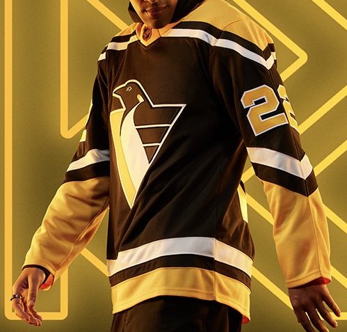
Number 18: Pittsburgh Penguins
Robo Pen is an awesome tribute to bring back, but with the Penguins already using their vintage color scheme for their current home/away kits, it does take away some of the appeal these should hold.
Number 17: Arizona Coyotes
Tan is a… choice. It’s the same desertscape they used last time just with a lack of purple, or any color for that matter. Honestly can’t tell if I like it or not.

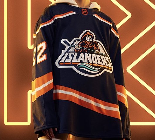
Number 16: New York Islanders
Hey look at that, the Islanders actually understood the assignment this year! Fans have been begging for the fisherman to return for years now and they finally get their wish. They’re not quite as over-the-top as they were in the 90’s, but the grown up design actually works well.
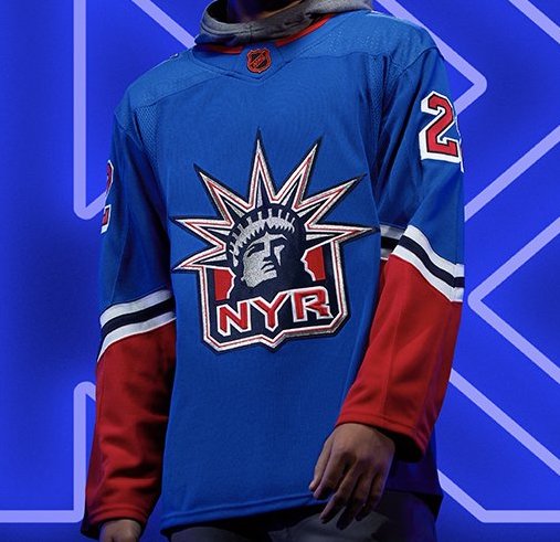
Number 15: New York Rangers
The Rangers opted to once again bring back Lady Liberty, but use a much more refreshing blue this time. It’s always hard to hate the crest, but freshening up the style of the jerseys themselves would’ve gone a long way.
Number 14: Edmonton Oilers
The Oil Drip is one of the coolest jerseys that has been buried for almost 20 years now. The orange is going to take some getting used to, but I’m just happy such an awesome logo is brought back for a new generation of fans to enjoy.

Number 13: Carolina Hurricanes
Is it really a retro if it’s based on a jersey they’re still currently wearing? Either way, it works. Yeah, it’s a bit bland, something the Canes have become too comfortable with lately, but it’s a pleasing jersey to look at all things considered.

Number 12: Minnesota Wild
The Wild broke out the North Stars colors last time, but based it on a road white look. This time, the North Stars colors take precedence and they’re even better. Anything tops the current Wild color scheme. The Reverse Retro designs should take over as the full time home/away kits in Minnesota ASAP.

Number 11: Buffalo Sabres
These would’ve been really cool if they didn’t just bring back the real goat head jerseys as an alternate, but using the blue and yellow is a fresh take on an old favorite.

Number 10: Vegas Golden Knights
These are worlds better than their red Reverse Retro from the last go around. Vegas’ color scheme is hard to screw up and opting for a black torso with gold highlights is a solid outing. The stylized “VEGAS” diagonal just fits perfectly with their knight and fort home game environment.

Number 9: Montreal Canadiens
Any time the sacrality of the Candiens jersey gets touched, it’s always a risk, but these are absolutely awesome. The powder blue, paying homage to the Expos, works well on the jersey, and it’s not nearly as harsh on the eye as the dark blue’s from the last RR series was.

Number 8: LA Kings
These aren’t quite as crisp as the purple base the Kings broke out last time, but the Lakers color scheme and crown crest is just a unique look.

Number 7: Ottawa Senators
Paying homage to the old school Sens jerseys but removing the white and gold was an smart decision. These jerseys define the Reverse Retro concept by keeping an old design but sticking to the blacked out current style of jerseys the Senators are rocking.

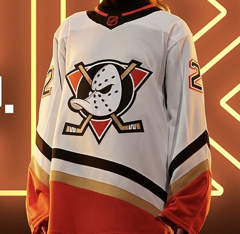
Number 6: Anaheim Ducks
Not gonna lie, I’m digging these. The fact the Ducks organization continues to dance around bringing back the actual Mighty Ducks jerseys is perpetually annoying, but the style brought back with the current day color scheme works much better than you’d expect it to.
Number 5: Nashville Predators
Kinda wish the Predators would give up their obsession with that shade of yellow/gold, but anytime the vintage Mustard Cat logo rears it’s beautifully ugly head, I can’t complain. Do kinda miss the mustard color, though.

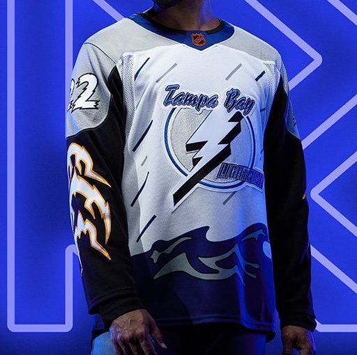
Number 4: Tampa Bay Lightning
This in the second time in a row where the Bolts’ RR jerseys are significantly cooler than their current home/away/alt setup. The white torso with blue seas is where the “reverse” lies, but overall it may be better than the originals.
Number 3: Boston Bruins
The Pooh Bear jerseys were awesome and for some reason the Bruins never brought them back until now. Choosing a white jersey instead of the classic yellow was a risk, but they still turned out great.

Number 2: San Jose Sharks
The Golden Seals have been dead for almost 50 years now, so it’s about time someone finally attempted to bring that style back. These feel like they’re ripped right out of the 70’s, yet that classically cool vibe they give off meshes perfectly with the Sharks name and new teal color scheme.

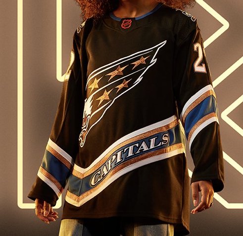
Number 1: Washington Capitals
What is there to say about this one? The Screaming Eagle is just a beautiful hockey jersey. The fact they meshed the black from the Capital crest days with the Screaming Eagle is a perfect blend of retros, yet is just so damn slick.
.
By: Dan Esche (@DanTheFlyeraFan)
photo credit: adidas hockey
