Season Eight of the Premier Hockey Federation starts this weekend which means the return of some of the best jerseys in the sport. Some teams are trying new things, while some classic favorites are returning as well, so let’s rank all 18 jerseys across the seven teams of the PHF!
Worst: Toronto Alternate
The Six white alternate jerseys have seemingly been placed on the back burner, only broken out four times last season. They’re a cool jersey in concept, and unique when they were first released a few years ago, but a white jersey with gray undertones isn’t exactly eye catching when there’s no time to appreciate the fine detail during a game.

Number 17: Whale Blue
The Whale are one of the teams who change up their jerseys pretty much every season. After zeroing in on a cool concept last season featuring waves and tails, they opted to drop the sea theme in favor of a more classic hockey jersey design. The early pictures of these jerseys in real life are much more pleasing than the concept art suggests, but abandoning a unique setup in favor of a vanilla jersey style is very rarely a positive thing across the entire sport.

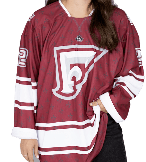
Number 16: Montreal White
The Montreal Force debut three jerseys for their inaugural season, and the white jerseys are by far the weakest of the three.

Number 15: Boston Black
Gradient is always an interesting choice for a hockey jersey. The Pride have been rocking these for three seasons now and the black and gold color scheme actually work well together in gradient form, but man, the BOSTON work mark in plain, bold letter across the torso is such a missed opportunity. If they put their main lioness head logo on these or create a new alternate logo instead, these could easily be higher on the list.

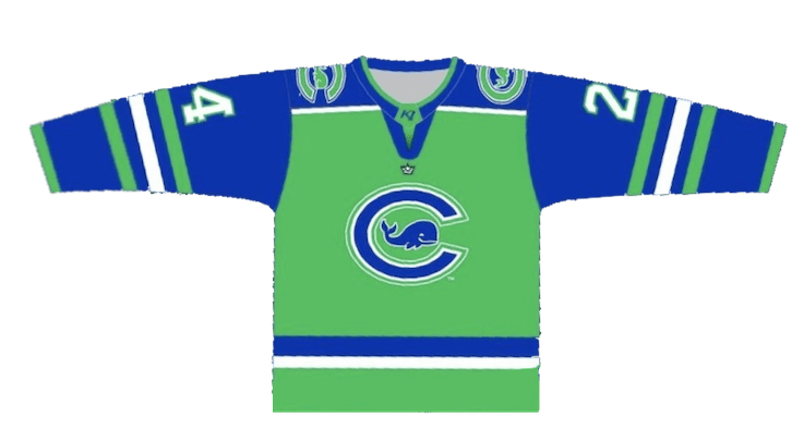
Number 14: Whale Green
The green, blue and white color scheme the Whale deploy can be lead to a very loud hockey jersey. The green base is certainly a bit more visually pleasing than the blue jerseys, but the same complaint can be had for these as well; why get rid of all the cool stuff?
Number 13: Whitecaps White
The Whitecaps got ride of their sweet white jerseys which featured a lakefront forest scene along the tail of the jerseys in favor of a mature rather bland white jersey. It’s a hard color scheme to screw up, and they’re all in all fine, but man, why get rid of such a unique predecessor?

Number 12: Montreal Maroon
You can’t be a hockey team from Montreal and not pay homage with the maroon, right? The sublimated inlays of fleur-de-lis give a rather basic jersey a pop.
Number 11: Buffalo White
The Beauts ditch their black alternates in favor of white jerseys with a slightly tweaked logo. It feels like a much more on-brand color palette than the black jerseys were, but also relatively lacking when it comes to perfectly meshing the black and powder blue to the mix. We’ll see how the full unis turn out, but the concept is cool, albeit a bit underwhelming.

Number 10: Metropolitan Blue
The Riveters changed their logo last season, and with it came new jerseys. They stuck to the navy blue base, and the IRL jerseys are much brighter than the concept art suggests. The silver Rosie ties in well with the rest of the uni and they stick with the silver/chrome for the numbers and name plate as well which is certainly a unique idea.

Number 9: Whitecaps Black
The Whitecaps make a change to their black jerseys for the first time since joining the NWHL/PHF back in 2018. It’s certainly more colorful than the previous incarnation, but it’s just about as basic a hockey jersey can be. Not good. Not bad. Just fine.
Number 8: Montreal Black
The black jerseys that will serve as alternates for the Force have a different stripe patter on the sleeves than the base home and aways, plus the maroon plays nicely with the black base. It certainly makes the crest more intimidating as well.

Number 7: Boston Yellow
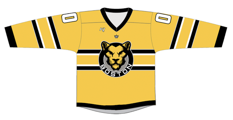
The back-to-back Isobel Cup champions don’t change what’s working for their yellow jerseys. The horizontal stripes across the sleeves and torso add an uncomplicated design to a yellow base. Nothing overly crazy, nothing too bland. Just a perfectly fine jersey.
Number 6: Minnesota Blue
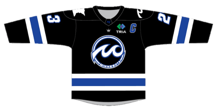
The Riveters broke out the diagonal design last season, and the Whitecaps have opted to try them out this season. It’s a simple, tried and true design made even better by the Whitecaps color scheme. It’s a visually pleasing blue that plays well with the white and black stripes. Not a bad first venture for change for the Whitecaps.

Number 5: Toronto Red
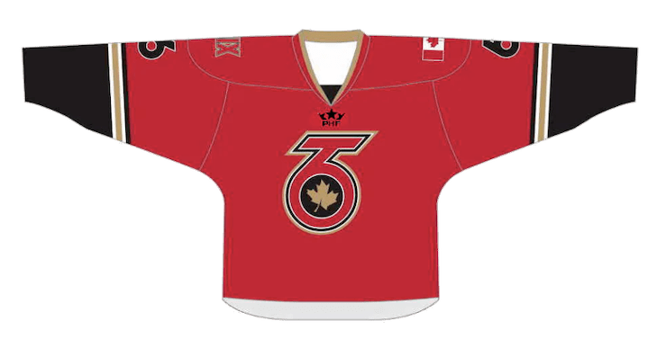
Toronto’s red uniforms are an example of less is more as long as the right colors are used. Red jerseys with white and black secondary colors are a relatively common feature in hockey sweaters, but the Six’s use of gold as a highlighter and fourth color is just hockey jersey excellence.
Number 4: Buffalo Blue
The Beauts power blue jerseys have undergone minor tweaks over the years, but still remain true to their simple perfection. A visually pleasing color, a unique crest, two fun shoulder yoke patches and solid complimentary hues of white and black compose a can’t miss hockey sweater.

Number 3: Toronto Black
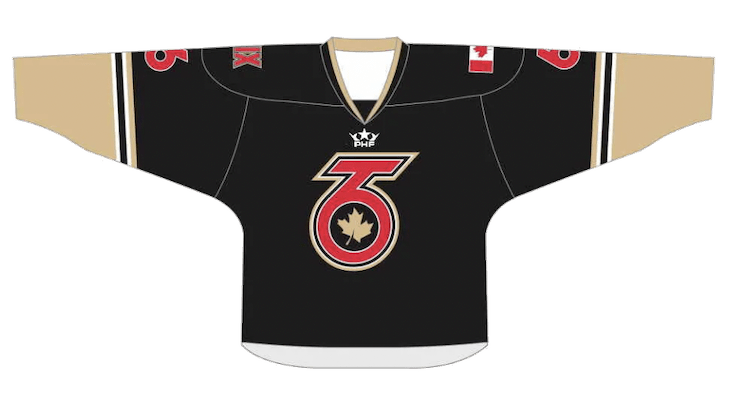
The Six keep their black jerseys for their third season in the league. The black, gold and red color scheme is one that’s hard to screw up, and the beauty is in the simplicity. The black on black full uniforms highlighted by gold sleeves and socks with just enough red to pop makes it a quintessential hockey jersey.
Number 2: Riveters Red
The concept art does nothing to showcase how awesome these Rivs jerseys are. These jerseys originally appeared as alternates last season and quickly won the hearts of jersey fans across the league. The jersey design itself is nothing overly groundbreaking, a relatively standard sleeve design with extending shoulder yokes, but the main shade of red plays nicely with the white and the new Rivs script logo is so simple yet so effective.

First: Buffalo Alternate
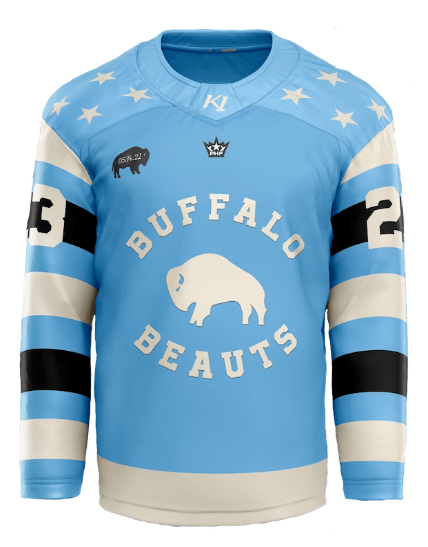
The Beauts jerseys that were made for their 2022 Buffalo Believes Classic outdoor game became an immediate hit, and they return as the alternates for the 2022-23 season. Not only are they the best jerseys in the PHF, but they are high atop the list for greatest hockey jerseys of all time. The powder blue and cream are a phenomenal mix, the black stripes on the sleeves are a great eye-popping feature, and the alternate logo is just classically cool.
.
By: Dan Esche (@DanTheFlyeraFan)
photo credit:

