

The Philadelphia Flyers have one of the most recognizable logos in professional sports. The “Winged P” has remained largely unchanged since the team’s founding in 1967, one of the very few teams that can say they never altered their primary logo in their entire history. And because of that, the Flyers’ jerseys are some of the most popular uniforms in the league. From the legendary Lindros-era jerseys to the not exactly legendary traffic cones, let’s go through and rank every Flyers jersey in history.
Worst: Reverse Retro 2.0 (2022-2023)
By the letter of the gimmick, the Flyers’ Reverse Retro 2.0 jerseys were a reverse of their retro jerseys from the 1970s. But that doesn’t mean they’re good jerseys. The drab lack of color coming during one of the worst stretches in franchise history is apropos.

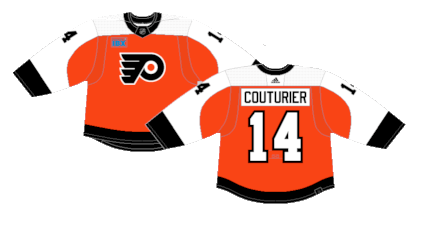
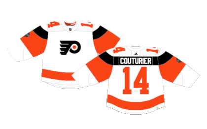
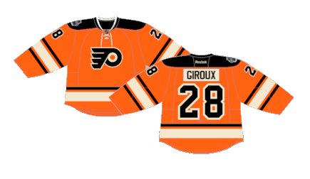
Number 16: New Era of Orange Away (2023-Present)
When the organization broke out new jerseys for the first time in over a decade, they attempted to mash various styles from the past into one jersey and ended up with these. They have a similar look to the beloved white jerseys from the 80s and 90s but with two major differences- the single-stack numbers on the sleeves and the lack of piping separating the orange and white on the torso and sleeves. While the initial shock of the choices has worn off, they still look unfinished. Leave it to the Flyers to have a chance to do something cool and whiff.

Number 15: New Era of Orange Home (2023-Present)
The same complaints linger for the new orange jerseys as well, but the lack of piping isn’t quite as aggressive on these as it is the white unis. The single-stack numbers on the sleeve, however, are more prominent. The word “unfinished” still fits.
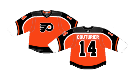
Number 14: Reverse Retro 1.0 (2021)
What was originally pure disgust has simmered into simple distaste when it comes to their Reverse Retro 1.0 jerseys. It does follow the guidelines of the RR gimmick well, but there’s still something about the color inversion that doesn’t sit right at a glance. But hey, at least they put the white stripe on these, so at least they are better than the “new era of orange” look.
Number 13: Chrome Alternates (2002-2007)
These are the jerseys that stick out as the “love it or hate it” unis among the fanbase. As is the case with other jerseys from across the league of the era, they just feel dated. Even though they debuted in the early aughts, they have a look that screams “that’s so 90s” and have not held to the test of time, despite being a new, unique design when they dropped.
Number 12: Reebok Edge Home (2007-2010)
The Reebok Edge era started in 2007 and saw the Flyers completely re-engineer their setup for the first time since the early 80’s. As is the case with a majority of the Edge designs from across the league, these were a pretty big miss.

Number 11: Reebok Edge Away (2007-2010)
Ditto for the Reebok Edge away jerseys. They did wear these during their 2010 Cup run, so they at least have a bit of history to them, but it’s not a coincidence they were short lived and haven’t been tapped for any of the reverse retro to throwback jerseys since.

Number 10: 50th Anniversary Alternates (2016-2017)
Ya know, when the 50th anniversary jerseys dropped they were resoundingly hated. But with the benefit of hindsight, they’re not that bad. Yeah, the base jersey is a bit bland and the gold doesn’t necessarily flow with the color scheme, but the overall product is a totally fine one-off jersey.

Number 9: 2010 Winter Classic (2010-2023)
What started as the 2010 Winter Classic jersey morphed into their away jerseys for 13 years. They’re a modern design of the original Flyers home jerseys worn during the 70s. They’re simple and painless jerseys that aren’t particularly loved but aren’t insulting in any way either.

Number 8: 2017 Stadium Series (2017-Present)
The Flyers’ Stadium Series jerseys which would later become their alternates is their most recent attempt at adding a black uniform to the rotation. The oversized nameplates and numbers were a fun attraction for the event and are inoffensive as an alternate, but in the grand scheme of things, we’ve been there and done that with these jerseys and it’s time for a new crack at a black alternate.

Number 7: 2019 Stadium Series (2019)
This was yet another kit that was not well received when they dropped, but as time goes on, they were actually pretty cool jerseys. The shade of rusty orange is significantly better in person than the concept art suggests and the 1D blackout crest (only the second time in history they altered the winged P) is still used in various aspects of the Flyers’ branding today. It’s almost too bad these jerseys were never used again, because they’d certainly be a unique alternate.

Number 6: 2024 Stadium Series (2024)
These are undoubtedly the most out-of-the-box jerseys in Flyers’ history. The black stripe that doubles as the nameplate, the numbers on the shoulder yoke, the fine mix of white and orange. They’re just pleasing jerseys to look at. Time will tell if these are utilized again, but as far as special event jerseys go for both the Flyers and the rest of the NHL, these are high on the list of best kits.
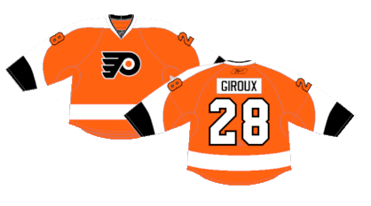
Number 5: Orange Home (2010-2023)
The traffic cone orange jerseys definitely overstayed their welcome and are associated with a not great era of Flyers hockey, but the bright orange jerseys were all their own for a brief time. The Ducks and Oilers have since borrowed orange for their jerseys, which feels like gimmick infringement, but on the whole, there’s nothing wrong with these jerseys, even if the shade of orange was stolen from a construction site.
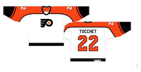
Number 4: White home (1982-2007)
Who doesn’t feel all warm and fuzzy looking at these jerseys? They’re the most iconic look in franchise history. It’s no surprise they were a staple for over 20 years and should’ve never been removed from the rotation, especially for those awful Reebok Edge shoulder pad jerseys. It’s the black stripe that makes all the difference when it comes to separating the beauty of these versus the bland nature of the “new era of orange” jerseys.
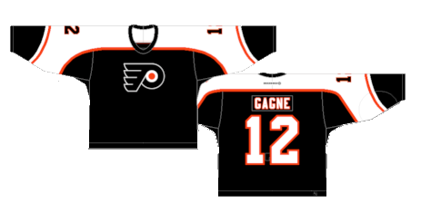
Number 3: Black Away (1997-2007)
The black version of these jerseys is actually a pretty controversial, and admittedly the entire black-out uni was rather dull, but man, as standalone jerseys they’re pretty awesome. Maybe it’s because of the fond childhood memories associated with these, or the fact they they’re a cool, edgy change of pace from the shades of orange from other eras, but the black version of these jerseys were perfection.
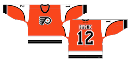
Number 2: Orange Away (1982-2001)
Stop me if you’ve heard this before, but the black stripe separating the orange and white is crucial to the success these jerseys had. You can’t look at this jersey specifically and not think Eric Lindros and the heyday of the Flyers organization.

First: 2012 Winter Classic (2012, 2014-2016)
These jerseys were just beautiful. The darker shade or orange works perfectly with the creme and the black shoulder yoke with felt numbers and nameplates ties the vintage look together. It’s inconceivable that these didn’t become the permanent home jerseys for the rest of time.
By: Dan Esche (@DanTheFlyeraFan)
photo credit: nhluniforms.com / bleacherreport.com / nhl.com
