

For a vast majority of their existence the (Phoenix) Arizona Coyotes were not very good. But in a complete 180, they had some of the best jerseys in the league. Embracing local culture to reinventing classics, let’s rank the worst to first Arizona Coyotes jerseys.
Worst: Reebok Edge Away (2007-2015)
The Coyotes had shifted towards their brick red color scheme a few years previous, and there weren’t an abundance of changes minus the tail stripe when Adidas Edge took over. The red and while still look decent, but it’s a very barren hockey jersey.

Number 10: Reebok Edge Home (2007-2015)
Much like the road whites, the Reebok Edge home jerseys were very similar to their predecessors with the exception of the missing tail stripe.

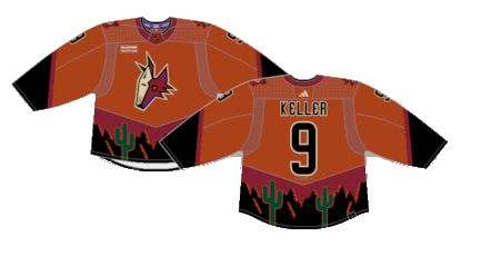
Number 9: Desert Nights (2022-2024)
The last new jersey that entered the Coyotes’ rotation was their “desert night” design that brought back their brink red with a kachina pattern. They weren’t the most popular kit the Coyotes had, but they’re certainly unique and embrace the southwest and native cultures the franchise was known for doing. Plop a reimagined Kachina crest on the front of these instead of the Arizona wordmark the looks like it came off a cheap motel and they’d be cooking with fire.

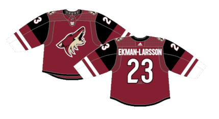
Number 8: Arizona Coyotes Home (2015-2022)
In a lot of ways, these felt like a perfect evolution for the Coyotes brink red era. A wiser, more mature design and use of the color scheme. The addition of black on the sleeves with a new striping pattern of burgundy and white with the return of a tail stripe makes for a pretty clean hockey jersey.
Number 7: Arizona Coyotes Away (2015-2021)
The newly designed sleeves get shown off a bit more on the white road versions.

Number 6: Desertscape (1998-2003)
When team started exploring alternate third jerseys in the late 90s, it led to some of the most memorable whacky jersey designs in NHL history. Things like the “thunderstorm” jerseys in Tampa Bay, the “Pooh Bear” jerseys in Boston, the “Wild Wing” in Anaheim, and the green “desertscape” in Phoenix. These jerseys stayed in the rotation for five seasons before being retired when the brick red re-design came along in 2003.

Number 5: Reverse Retro 2.0 (2022-2023)
The Reverse Retro lined retuned, and for the Coyotes, they got a recolored version of their 1.0 jerseys. The “desertscape” made an encore, this time with a shade of “desert sienna” serving as the main jersey color. The real life versions were a much lighter shade of tan than the concept art suggests and managed to tie the vintage look in with their typical sandy color scheme.
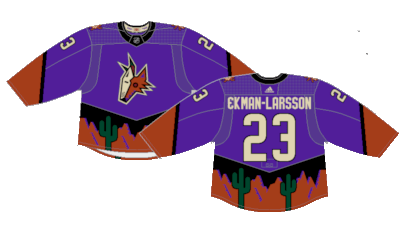
Number 4: Reverse Retro 1.0 (2021)
The Coyotes brought back a reimagined version of their original “desertscape” jerseys for the first version of the Adidas’ Reverse Retro line. The purple is vivid and works perfectly with the desert color scheme. If it wasn’t for the Colorado Avalanche breaking out the Nordiques jerseys, the Coyotes would’ve been the winners of the entire first run of the Reverse Retro concept.
Number 3: Running Yote (2008-2014)
A black alternate with a full body coyote as the crest is kinda brilliant. It makes perfect use of the red and sand on the sleeves, torso and numbers. It’s simple, yet unique with a brilliant color palette and perfect alternate crest. What more could you want from an alternate jersey?
Number 2: White Kachina (1996-2003) (2021-2024)
The black version of the Kachina may be the more iconic version, but it’s impossible to ignore just how clean the white versions of the Kachina were. The same design with a color palette swap on the sleeves and tail from the black versions gives them their own life.

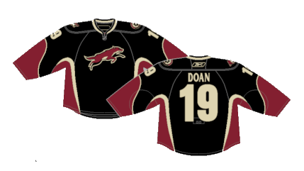
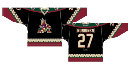
First: Kachina (1996-2003) (2018-2024)
When talking about the best jerseys in NHL history, the Coyotes Kachina jerseys have to be close to the top of the list. The black jerseys with intricate sleeve designs paying homage to the local naive American culture with a subdued burgundy, sand and green with an iconic crest are just perfection.
By: Dan Esche (@DanTheFlyeraFan)
photo credit: nhluniforms.com
