

As a man who has owned well over 500 hockey jerseys in my life (which you can buy here) November 16 was like Christmas come early when Adidas finally released their new Reverse Retro line. Now that all the jerseys are out in the public and official, it’s time to revive the Worst to First series and review each team’s new threads!
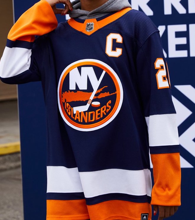
Number 31- New York Islanders
Leave it to the New York Islanders to release yet another lackluster jersey. This is a callback to their jerseys from the late 90’s through mid-2000’s when they wore navy blue as their primary color. Flat, boring, and bland. Three adjectives that fit the Islanders well, actually.
Number 30- Chicago Blackhawks
This is what happens when you get an outdoor game every year and re-use a jersey from the past for it. Realistically the Blackhawks didn’t have many options to go for here, but they could’ve still gotten a little more creative.

Number 29- New Jersey Devils
This one may be a personal taste kinda thing, but I never really cared for the green Devils jerseys from back in the day. Another team with a limited history to draw from, the Devils remixed their red and green jerseys from the 80’s, but went with green as the primary color this time, certainly sticking with the “reverse retro” theme.

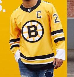
Number 28- Boston Bruins
The Bruins have had a couple third jerseys over the past few seasons that are already based off one of there retro designs. This one is based off their jersey from the mid-50’s which was basically solid yellow. Why didn’t they bring back the pooh bear?
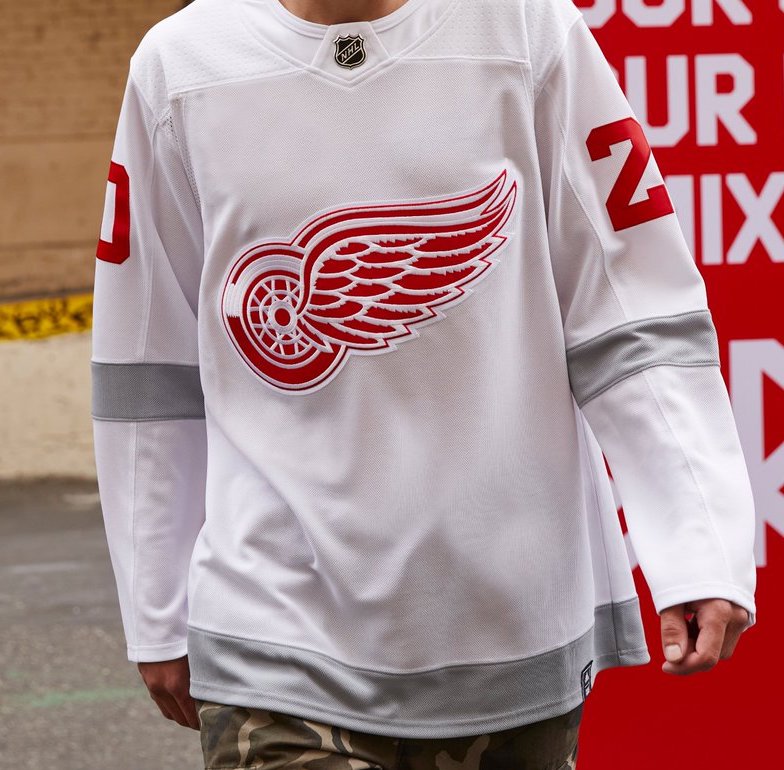
Number 27- Detroit Red Wings
Much like the Blackhawks, The Red Wings have a small jersey history to pick from and have exhausted most options on past outdoor games. An all-white approach with grey stripes is a new look for the Wings, but the lack of red kinda kills the gimmick. As fellow Brotherly Puck contributor, Jesse, said – “Wings put some ducktape on an all white practice jersey and called it a day.”
Number 26- Toronto Maple Leafs
Ever since the Leafs went to an all blue jersey in 1934, their jerseys have only undergone subtle changes, with the exception of the 70’s through 90’s when they used more white on the sleeves, and that’s what they chose to draw from here. Considering they already brought the St. Pats and Arenas jerseys back in recent years, they picked the only other different jersey they had.

Number 25- St. Louis Blues
The St. Louis Blues…. Blues…. BLUES. This is a call back to their jerseys from the late 90’s but, ya know, reversed. An all red jersey for a team called the Blues. Move over Red Wings, somebody else killed their own gimmick too.

Number 24- Florida Panthers
Much like their on-ice play, the Panthers jerseys were never known for being great. This is a revival from their home jerseys from the mid-2000’s almost to the T, with only minor changes in the shade of gold on the trim and the number of tail stripes. All in all, not too shabby.

Number 23- Edmonton Oilers
These jerseys are far less impressive since the Oilers essentially brought their vintage look back on a full-time basis in 2011. The color order is changed on the sleeves, going orange blue orange, rather than the vintage blue orange blue, but other than that, nothing new here to report on the Oilers.

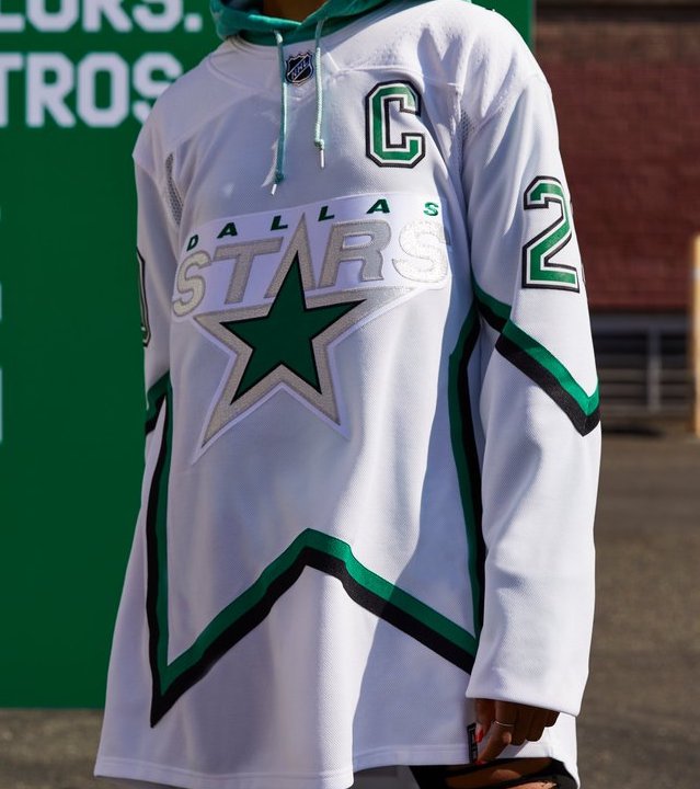
Number 22- Dallas Stars
Imagine you’re at a baseball game and it’s the bottom of the 9th inning. The bases are loaded and the batter sends one sky high deep into center field. It looks like it’s gone but somehow the outfielder jumps and grabs the ball right before it’s out of the field. That’s the Dallas Stars’ jerseys. C’mon guys, you had the right idea, but an all white take just defeats the purpose of the star cutout.
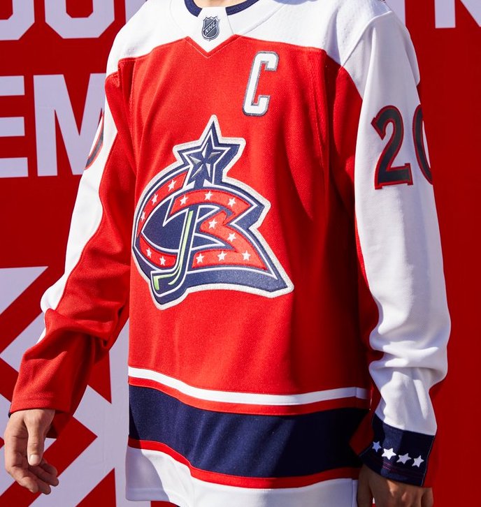
Number 21- Columbus Blue Jackets
The original Blue Jackets logo is vastly superior to their current one, but I’m not sure they needed so much red. Once again the idea of “reverse retro” hits its mark, but is it really that good?
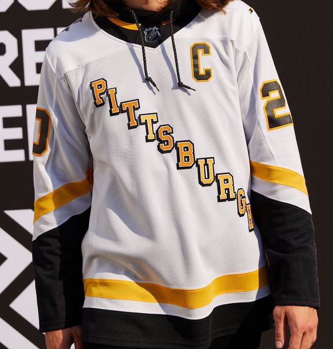
Number 20-Pittsburgh Penguins
The Penguins kinda opted for an under-the-radar vintage look, taking inspiration from their away jerseys from the 90’s. It’s a simple scheme and fits the reverse retro theme. No harm, no foul.
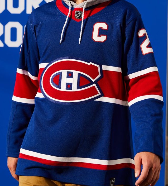
Number 19- Montreal Canadiens
Hey, look at this, an original-six team that isn’t afraid to make a big change! The Habs have been working with their same jerseys more or less since they debuted in the league in 1917. This is the first time they take a reverse look, opting for a blue jersey with a red stripe. They took a risk and it looks perfectly fine.
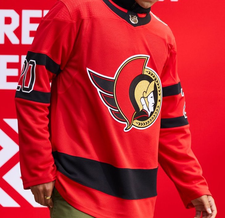
Number 18- Ottawa Senators
This one kinda felt telegraphed after the Sens revived their original jerseys for the 2020-21 season. Their new alternate is a clean, simple red jersey that is the reverse of their current set up. While they have a few beauties from their history they could’ve brought back, the all red everything look works just as well.
Number 17- Vegas Golden Knights
Fans were in an uproar last month when the Knights dropped new alternate jerseys that ended up being all gold. Well they finally get their wish as the Golden Knights finally have a jersey featuring and all red jersey with the alternate logo as well. The jerseys themselves may be a bit of an eyesore, but it’s safe to have faith that the Knights will knock the full unis out of the park.

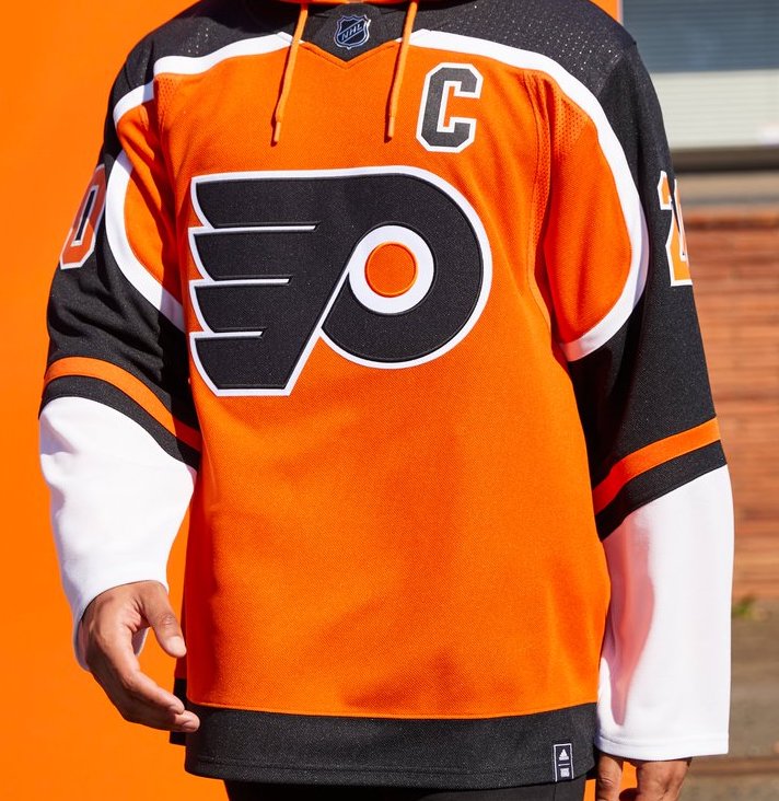
Number 16- Philadelphia Flyers
Why? I guess they stayed within the lines of the reverse retro gimmick, but… why? The black on the shoulders doesn’t seem right and the white sleeves just look weird. Maybe some day they’ll grow on me, but for now they’re just average.
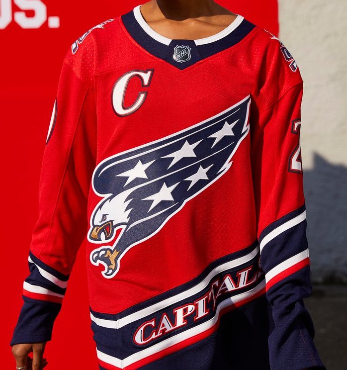
Number 15- Washington Capitals
The Screaming Eagle is back, sort of. The Caps followed the same train of though that the Blue Jackets were on in changing the primary color to red and calling it a day. Overall it is still a nice jersey, but a breakup from the same Caps red and blue would’ve gone a long way.
Number 14- Nashville Predators
The Preds were one of the teams that got butchered by Adidas when they originally took over in 2017, and they still got caught up with their new alternates. While it is a step in the right direction by paying homage to the jerseys from the early 2000’s with the layout and slight logo change, it feels half assed and kinda disappointing.

Number 13- Winnipeg Jets
The beauty is on the simplicity for the new Jets throwbacks. It’s a modern day tribute to the original Jets and looks perfectly fine doing so. It just feels like even a drop or two of red would’ve gone a long way.

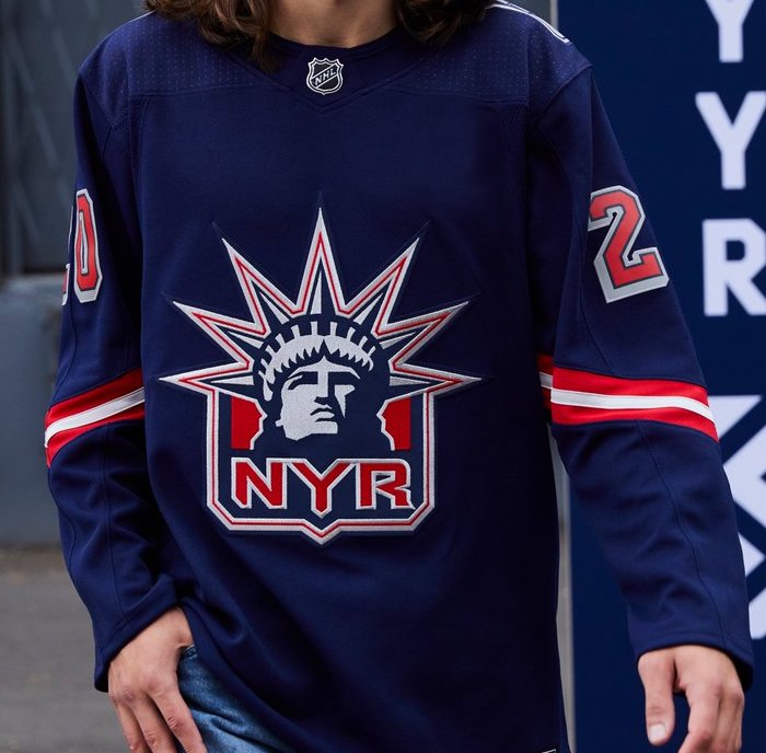
Number 12- New York Rangers
The Lady Liberty logo is back in most of it’s glory. Easily the best logo they’ve ever had re-enters the league and takes center stage on a relatively bland jersey other wise. A little bit of red, or even white, on the cuffs would’ve made these one of the best in the league.
Number 11- Anaheim Ducks
I… Don’t hate these? While it was speculated that the “wild wing’ look was returning, the original leaks were that of an orange jersey. These, however, look so much better. The original wild wing from the late 90’s goes down as one of the worst jerseys in the history of the NHL, but the revival, going with a white jersey rather than a teal, feels so much more natural. It’s still whacky, but a good kind of whacky.

Number 10- Tampa Bay Lightning
Thank God the Bolts finally changed their look. Their current setup, both home and alternate are very boring and bland with a bland logo. The reverse retros, however, look great. It’s still the same color blue but with some white and black to break up the overall design and the return of their original logo helps big time. They’re a winner simply based off the massive improvment from their current jerseys.

Number 9- Minnesota Wild
The Wild have a history of horrible jerseys, yet this one feels fresh. The color is obviously a nod to the Minnesota North Stars color scheme, and it gives the Wild a brand new look to break up their monotonous dark green and red scheme they’ve had since their inception. A big W for Minnesota hockey, which is good because it might be one of the few wins they see this year.

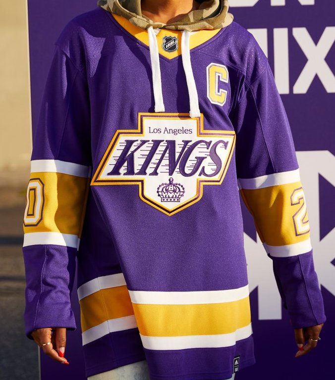
Number 8- LA Kings
The Los Angeles Lakers roll onto the list with a new look jersey… oh, it’s the Kings? The Kings kill two birds with one stone here as they pay tribute to their original purple away jerseys, and the black Wayne Gretzky-era Kings logo. It’s a really slick looking jersey that breaks up the Kings current black and white scheme.
Number 7- San Jose Sharks
Reverse retro: achieved. There has been some negative feedback on the Sharks’ social media about these jerseys, but I really like them. The Sharks jerseys from the 2000’s were my personal favorite and this is a fresh take on that look. Opting for an all-gray torso rather than the classic blue or white, it also gives the black on the sleeves more space to shine. Overall a very well done jersey that fits the reverse retro idea perfectly.

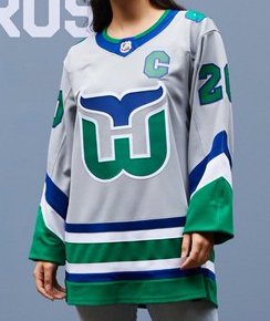
Number 6- Carolina Hurricanes
The Hurricanes already brought back the green Whalers jerseys in 2018 for Heritage Night, so it only makes sense to adopt the silver jerseys as well. While the originals were white, it’s a subtle enough change to silver that does pay homage to the last few years of the Whalers jerseys when they used silver as an undertone for the cuffs and tail stripes.
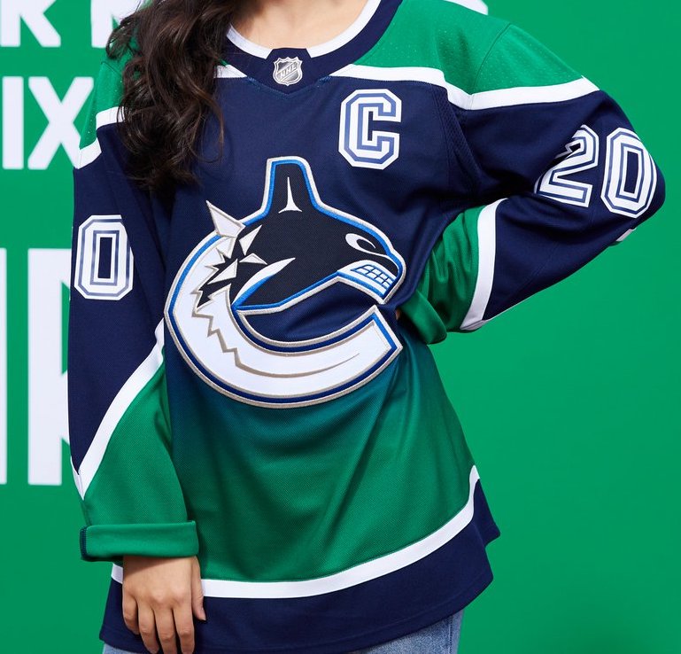
Number 5- Vancouver Cancuks
I love them and I don’t care what anybody thinks. This is a reimagined version of their alternates from the mid-2000’s when the fade went from dark blue to red. New with a new color scheme, the Canucks once again return to the two-tone jerseys with rousing success. They may not be Twitter’s favorite jersey, but they might be mine.
Number 4- Buffalo Sabres
The surprise was kinda spoiled when the Sabres released their teaser pics and the Buffalo Head was on the shoulder while alerting us that the jerseys were from the 2000’s. They bring back the famed “dinner plate” jerseys that were originally worn during their red and black color scheme days. The red jerseys were cool, but the same design in their fresh white and royal blue is just beautiful. Maybe the first time ever the Sabres have released a good hockey jersey.

Number 3- Calgary Flames
Unlike Nashville or Boston that stayed away from their famed alternate jersey, the Flames embraced the return of the flaming horse head. Worn throughout the early 2000’s, these are almost identical, with the main exception coming on the waist, which is black instead of the original red. A cool jersey, a simple redesign, and a new alternate to match their new throwback main home and away jerseys. Just perfect.

Number 2- Arizona Coyotes
The Coyotes are bringing back their Kachina jerseys full time during the 2020-21 season, so it’s only appropriate that their reverse retro look digs up the desert-scape look from the late 90’s. The originals were green with purple trim. These are purple with purple trim and I love them. They’re just crazy enough to work perfectly, and the return of the kachina head as the main logo is the piece de resistance.

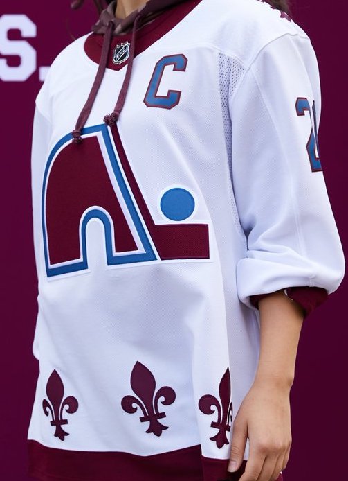
Number 1- Colorado Avalanche
I honestly can’t believe this setup hasn’t been done before. A Quebec Nordiques themed jersey with the modern day Avalanche colors. Not much else to say here. Just sheer perfection.
By: Dan Esche (@DanTheFlyeraFan)
photo credit: Adidas hockey
