

Now that the dust from the release of the Reverse Retro jerseys has settled and the Worst to First series has returned, it’s time to take stock of the current home jerseys across the NHL as well. For the first time since Adidas took over in 2017, there have been multiple changes to home jerseys throughout the league, some teams bringing back nostalgic favorites, and others trying something new all together. Where does your favorite fall on the list?
Number 31- San Jose Sharks
The Sharks have slowly but surely dumbed their jerseys down over time and Adidas loves them some dumbed down designs. The story is the Sharks removed the stripe on the waist to make the jerseys lighter, thus increasing the on-ice performance. If you say so. All it really did was take away any sense of uniqueness the Sharks jersey had left.

Number 30- Nashville Predators
Speaking of dumbed down jerseys, hello Nashville. They wanted to focus on the gold, which they certainly did, stripping almost all the purple trim off the shoulders and back. Their gold helmets don’t help their case either. Far too much of one color, and that one color isn’t that great.

Number 29- New York Islanders
The Isles will always be in the bottom of the league when the topic of hockey jerseys gets brought up. They’ve pretty much been rolling with this style for the past decade now, with the only significant change coming under Adidas was the orange on the sleeves shrinking a bit. As long as Lou Lamoriello is at the helm, don’t expect any major changes, either.

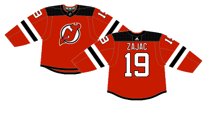
Number 28- New Jersey Devils
With the exception of switching their accent color from green to black in 1992, the Devils jersey have remained relatively untouched until Adidas took over in 2017. The tail stripe on the waist was removed and replaced with a thin black trip in the bottom of the jersey, and the white stripes on the sleeves were enlarged. They changed a perfectly fine classic look to a copy-and-paste boring red jersey.
Number 26- Tampa Bay Lightning
Blue. It’s just blue. The Lightning have never had the most creative setup throughout their history, but their current home jerseys, and really their entire home/away/alternate set is just bland and boring. These have been their primary home jerseys since 2011 and it’s desperately time for a change. Their reverse retro setup is much better and hopefully they eventually take over as the full-time home jerseys.

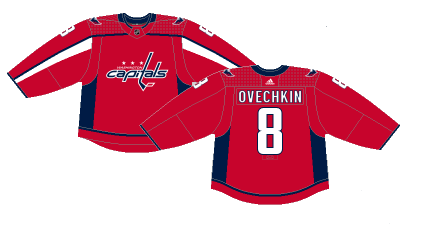
Number 27- Washington Capitals
The Caps switched to these jerseys when Reebok took over in 2007 and for some reason haven’t made any changes since. To be fair, I think these jerseys look better in person than the pic gives them credit for, but they are long overdue for a change of pace from this plain, stale red setup. Not saying they should bring back the screaming eagle, but they should definitely bring back the screaming eagle. Maybe the success of their reverse retros will help change the minds of the organization.
Number 25- Columbus Blue Jackets
Much like the Caps, the Blue Jackets changed their setup under Reebok and for some reason just never changed anything since. Considering it’s been 20 years and they have only had two different home/away kits, maybe it’s time for a fresh jersey in Columbus. By all accounts the organization and players really like their alternate blue cannon jerseys, but so far they haven’t overtaken the navy blues as their full-time home jersey.

Number 24- Toronto Maple Leafs
Aside from some subtle variations over the years, the Leafs have had the same jerseys since the early 1990’s. While the “beauty is in the simplicity” rule applies for some teams, to me, it always felt like the Leafs jerseys could’ve been updated to something incredible, but alas, that never happened.

Number 23- Minnesota Wild
The Wild jerseys have never done anything for me. These were actually a new design under Adidas, stealing a look from the Panthers and Habs and, while it’s probably the best jersey they’ve had in the rotation since their original jerseys in the early 2000’s, it just isn’t that great. The dark green is unique to Minnesota which is the only distinct feature of the kit.

Number 22- Edmonton Oilers
The Oilers changed to a full-time orange look under Adidas in 2017 after having similar jerseys as an alternate since 2015. These always felt like a desperate reach for the Oilers to change up from their classic blue blue jerseys for no real reason. One of the few teams who continue to devolve in the jersey department.

Number 21- Chicago Blackhawks
Here’s my “I don’t care for this setup but most people do” entry. It’s a longstanding look for an original-six team but just never sat well with me. Quite frankly, I’ve never been enthralled with any of the Blackhawks’ jerseys, including any of their outdoor games or reverse retros.

Number 20- Detroit Red Wings
There is something special in the simplicity of the Red Wings’ red and white jerseys. They have been in Detroit’s arsenal since their inception in 1932 and quite frankly have nothing to gain trying to change. The Wings have had some awesome alternate jerseys prepared for Winter Classic’s and other outdoor games, but nothing will beat the originals.

Number 19- Anaheim Ducks
The Ducks adopted this style in 2014 after wearing them as alternates since 2010 and have stuck with it even through the Adidas takeover. Fans will always clamor for the classic Mighty Duck look, the organization doesn’t seem interested in changing their look. It’s not a bad jersey, but it is tired and could use a change.

Number 18- Montreal Canadiens
If it’s not broke, don’t fix it. The Habs have rolled with some version of the same jersey during their entire hundred year history and it’s a classic look that doesn’t need much tinkering.

Number 17- New York Rangers
Ditto everything that was just said about the Canadiens.

Number 16- Boston Bruins
The Bruins adopted these designs when Reebok took over in 2007 and have been their primary setup ever since. The Bruins have had many alternates for outdoor games and special events, but none have come close to overtaking their mainstay home jerseys. It’s a pretty hard color scheme to screw up, but the Bruins have kept the same look long enough with no signs of changing.

Number 15- Buffalo Sabres
After almost 40 years of failed re-design after failed re-design, the Sabres finally accepted defeat and brought back their original royal blue jerseys for the 2020-21 season. The striping is a bit different than the jerseys from the 70’s, but the sentiment it there. The new color has taken some time to get used to on the ice, but the right call was definitely made bringing back the royal blue.

Number 14- Pittsburgh Penguins
The Penguins re-adopted these retro setups full-time in 2016, but they originally made their debut in Pittsburgh in 1980. When the organization brough them back as an alternate in 2014 they were so popular amongst the fan base that they became their full-time home jerseys in 2016. Left untouched when Adidas took over, they’ll probably be a mainstay in Pittsburgh for the foreseeable future. Even though it’s kinda busy, it’s still a decent hockey jersey.

Number 13- Winnipeg Jets
Even though their light blue alternates may not be great, the Jets have a simple but effective home jersey. Paying homage to the RCAF, their logo is the mainstay on a dark blue jersey with two white stripes on the sleeve and a light blue tail stripe and blue collar. Sometimes simple jerseys can be boring, other times the beauty is in the simplicity.

Number 12- Los Angeles Kings
It’s hard to screw up a black and white color scheme. A black jersey with white stripes on the sleeves with silver trim throughout. A simple yet amazing look the Kings have kept in the rotation in some form since 2008. Don’t change what works.

Number 11- Florida Panthers
The Panthers finally broke free of the Reebok Edge cookie-cutter scheme in 2016, redesigning their jerseys with their logo and patches paying homage to the 101st Airborne Division. The jersey itself borrows the stripe across the chest idea from the Canadiens, but the red/white/gold scheme fits well and is visually pleasing to look at. It was a much needed change and stands out from the rest of the NHL’s red jerseys.

Number 10- Vancouver Canucks
The concept of the Canucks jerseys have remained relatively unchanged for well over a decade now. The main change the organization made for the 2019-20 season was removing the “Vancouver” marking on the crest. It’s a color scheme that works well together and sometimes that is enough to overtake a simple jersey design.

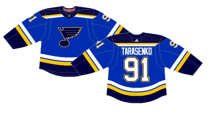
Number 9- St. Louis Blues
The Blues originally wore this design from the late 90’s to mid-2000’s before Reebok made alterations in 2007. Luckily the Blues ditched those ditched those in 2014 and went back to the classic Blues design. Adidas left good enough alone when they took over, only changing the color of the numbers from gold to white.
Number 8- Colorado Avalanche
The Avs finally returned to their jersey roots in 2017 when Adidas took over, but they made a few changes which watered down the originals. The original black and white trim was replaced with grey, and the whacky numbers were changed. That being said, the Avalanche jersey is still a classic and in the upper echelon of current NHL jerseys. Their new blue helmets and pants, however, are a totally different conversation.

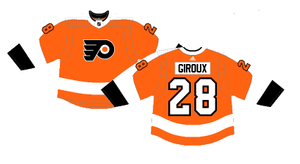
Number 7- Philadelphia Flyers
Simple. Sleek. Classic. Those are fair adjectives to describe the current Flyers home jerseys, which have been in the rotation since 2008. A new take on the Flyers’ original jerseys from the 1970’s, it is a clean and easily recognizable jersey. Given the Flyers tend to roll with one style of jersey for many years at a time, it may be awhile before the Flyers change up their look again, and that is just fine by me.
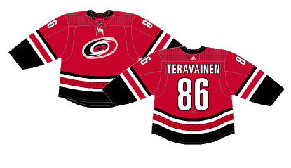
Number 6- Carolina Hurricanes
While the Hurricanes’ jerseys aren’t quite as good as their originals from back in the day, Adidas sure helped breath some life into their look. The later incarnations of the Reebok jerseys stripped the black from the waist and it left a very bland red jersey with two white stripes. Adidas restored the warning flag design on the tail stripe and added some color on the sleeves. There’s still improvements to be made, but it’s much closer to the jerseys I remember from watching the Canes when I was a kid.
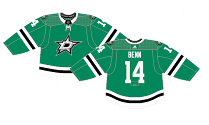
Number 5- Dallas Stars
While their new whacky black and neon green jerseys have gotten much attention lately, their home jerseys remain the green jerseys. These were released in 2013 and, while they’re not as great as the old school green and black star jerseys, these are pretty solid in their own right. The color is unique and just annoying enough to make them stand out for the better. While the overall setup is rather bland, with just white and black stripes on the sleeves and tail, the logo and color more than makes up for any design flaws the jersey may have.
Number 4- Vegas Golden Knights
While the Golden Knights new gold helmets are the talk of the NHL, they don’t diminish their grey jerseys at all. The grey jersey has just the perfect amount of black and gold to compliment the Knight’s logo and the red bands on the sleeves tie the entire uniform together. The magic of these unis haven’t worn off yet and they probably never will.

Number 3- Ottawa Senators
One of the many teams that discovered the “what’s old is new again” idea that has been making it’s way around the league pays off big time for the Senators. Ever since Reebok took over in 2007 the Sens have had a very cookie cutter design for their jerseys but that gets thrown out in 2020-21 as they embrace a fresh take on their original jerseys. These are modeled after their, at the time, away jerseys from 1993 to 1995 with the only difference being the red stripe on the bottom goes all the way to the bottom, whereas on the originals it was higher on the waist. Not only do the jerseys look great, but the entire uniform flows seamlessly as well. Just an overall great kit.

Number 2- Calgary Flames
The Flames are one of those organizations that really haven’t had a bad jersey in their history, but they definitely made the right call going back to their simple bright red throwbacks as their main home jerseys. The deep red jerseys the Flames have used since the early 2000’s get relegated to the alternate role for this season. It’s a color and style that sets the Flames apart from everyone else in the league and they translate well on the ice as well.

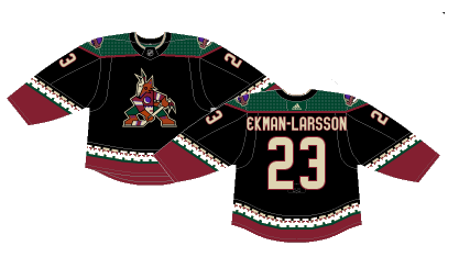
Number 1- Arizona Coyotes
You can make a lot of negative claims about the Coyotes these days, but they made a great decision in bringing back the Kachina jerseys on a full-time basis. They’ve teased a possible return for the past few seasons as they broke out the look for Heritage Nights since 2015 and were their alternates since 2018. Their maroon jerseys take a back seat as an alternate and the beauty of the black, green and red gets to be put on full display.
By: Dan Esche (@DanTheFlyeraFan)
photo credit: shop.nhl.com
