

The new NWHL… er, PHF season is right around the corner and there are once again some new jerseys on the scene. Overall, the creativity displayed around the league is very strong. Unique color schemes, innovative designs and homages to old favorites lead to the Premier Hockey Federation having some of the best jerseys in hockey today!
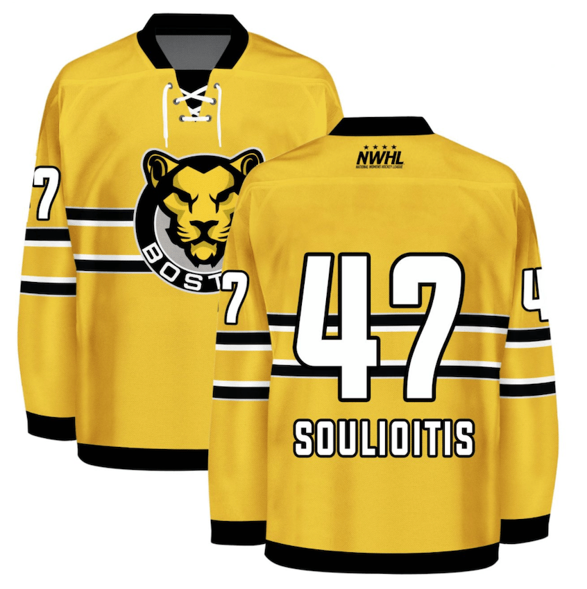
Worst- Boston Pride Yellow
Didn’t care for these jerseys last year, and don’t care for them now. The black and gold color scheme runs deep in Boston hockey, and for the most part seems like a hard scheme to screw up. The gold to black ratio is all off and the subdued design is just too bland. The Pride have never had the most creative jerseys, but a shakeup from the solid yellow is much needed.
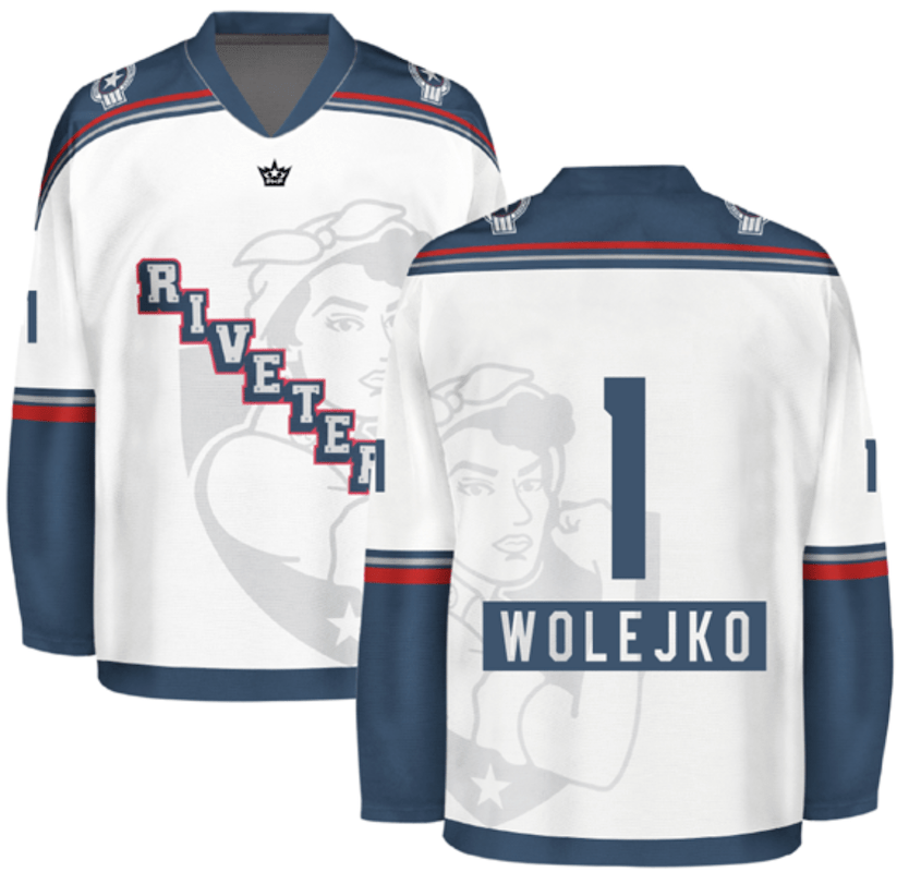
Number 12- Metropolitan Riveters White
The old Rivs white jerseys were awesome, ditching the military-stenciled font and stripes up and down the sleeves is a horrible downgrade. The Riveters went for a logo rebrand during the offseason and released two new jerseys to go along with it, and they’re both a real disappointment. They’ve borrowed idea from the New York Rangers in the past, and they paid homage to them once again with the diagonal “Riveters” instead of a crest. Other than that it’s a pretty boring, run of the mill jersey. The exception being the sublimated, off centered new-look Riveters logo, which is sure to trigger some OCD out there. It does look like they’re keeping the striped socks, which helps, but unfortunately this is ranking just the jerseys.
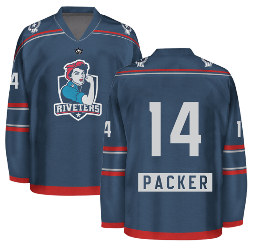
Number 11-Metropolitan Riveters Blue
Their blue jerseys from last season were already dull, but these are somehow worse. They ran heavy with their new secondary color silver and, although unique, isn’t exactly a stand out color. They at least attempted to sprinkle some red throughout the jersey, but it just isn’t enough to break up the monotony of the dark blue and silver.
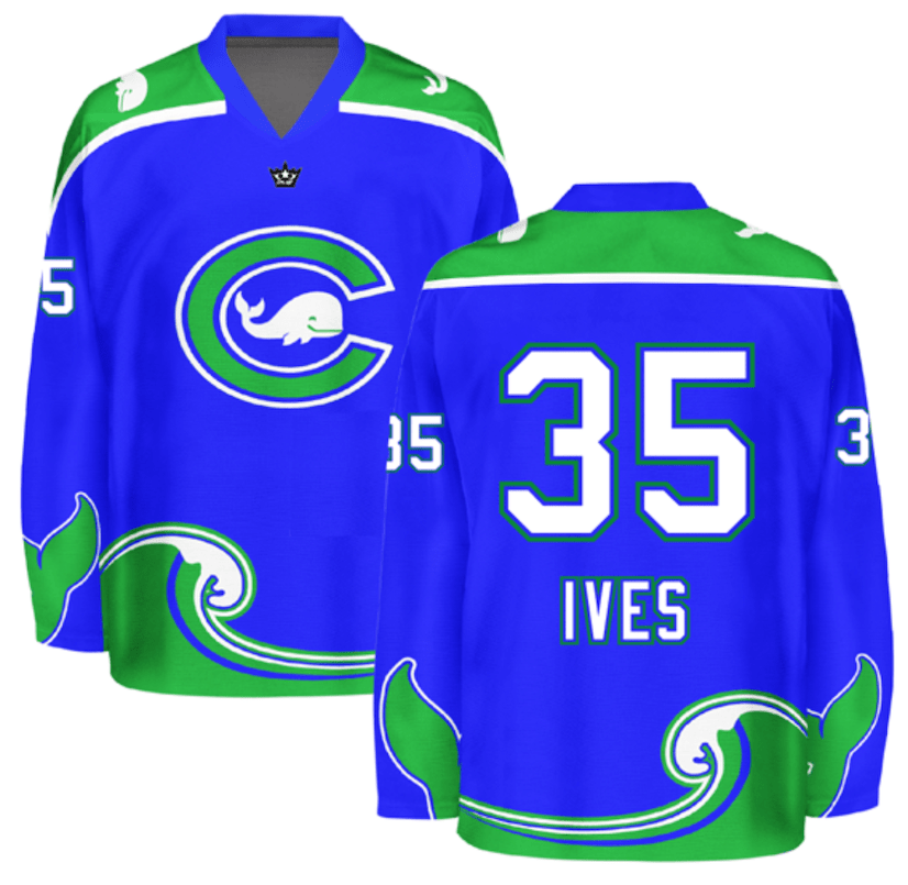
Number 10- Connecticut Whale Blue
The Whale ditched their ugly white jerseys after one season and opted to go back to a blue alternate. There’s a good chance these jerseys aren’t as saturated in person as they are in the pictures on their website, but they’re just the inverse of the new-look green unis, and the green works much better as the base color than the blue.
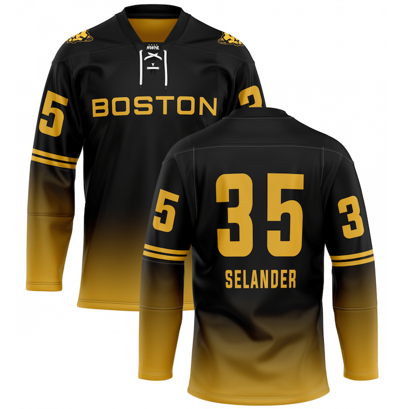
Number 9- Boston Pride Black
These have fallen furthest in the rankings from last season and it’s mainly just because they’re missing… something. It’s hard to go wrong with a gradient jersey, and the yellow is much brighter in real life than the pictures suggest, but the plain “Boston” across the chest and basically no flair on the sleeves or shoulders just feels like an incomplete jersey, but one with much potential if they could make minor tweaks.
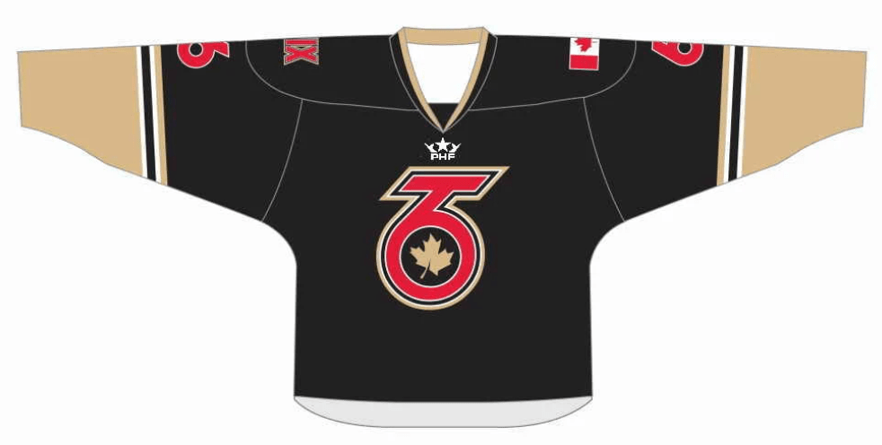
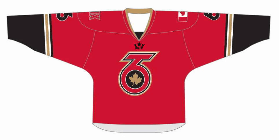
Number 8- Toronto Six Black
A perfectly fine basic hockey jersey. Not great. Not terrible. The main complaint is that the sleeves aren’t really gold in real life, but more like a dirty yellow.
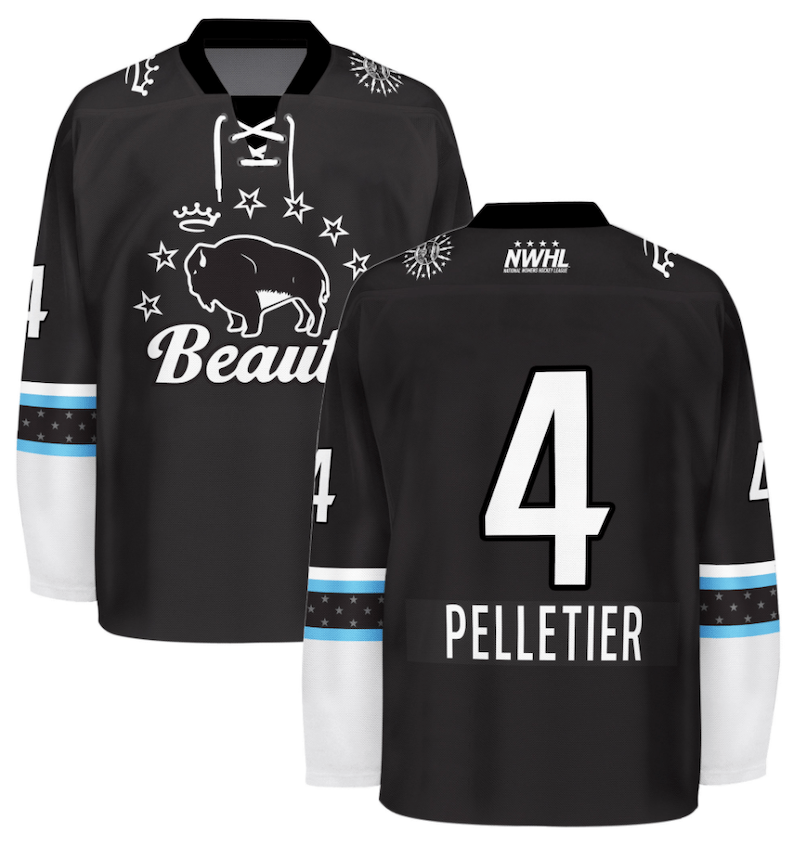
Number 7- Buffalo Beauts Black
The Buffalo Beauts broke out a black alternate last season and they’ll return for season 7. A black and white color scheme always seems to work well for a hockey jersey, and the Beauts knocked these out of the park. The two powder blue bands holding their star pattern is an eye catching standout accent that completes the whole jersey.
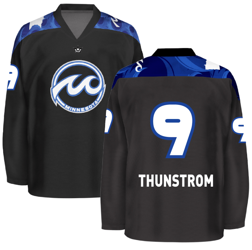
Number 6- Minnesota Whitecaps Black
The tried and true Minnesota Whitecaps black jerseys are a classic. There’s not much to them, but there doesn’t have to be. In some cases, simple isn’t always better, but in Minnesota’s case it absolutely is.
Number 5- Toronto Six White
Take notes, Rivs, this is how you do a sublimated jersey. While these seem to be the third jerseys for the Six, they’re simple yet totally different from just about any other hockey jersey. The white jersey with grey shoulder yoke and grey running down both sides of the jersey is a unique enough look, but the splattered background of leaves and “Toronto” is a one of a kind look.
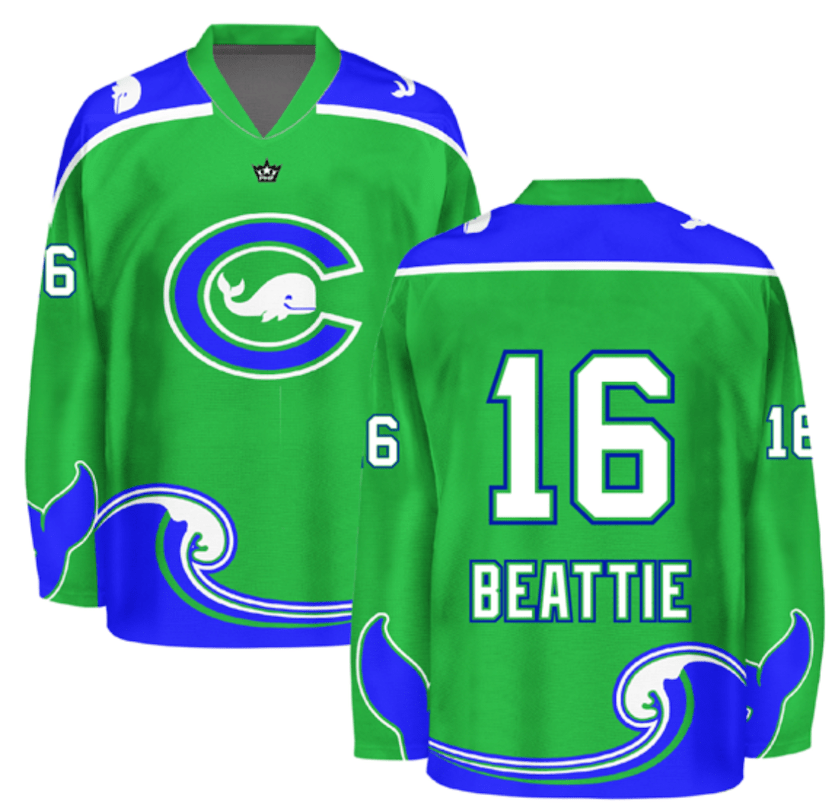
Number 4- Connecticut Whale Green
The Whale shifting from a dark green in the early years to a much lighter green was a step in the right direction they took last season. This year they redesigned the wave cresting on the tail stripe to an actual wave versus just a disruption in the pattern. The tail on the sleeve is a nice touch, changing the “C” on the crest to blue from it’s original green is an upgrade and outlining the numbers in blue compared to their solid whites from last season go a long way too. The Whale continue to make better tweaks every year.
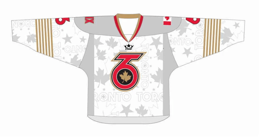
Number 3-Toronto Six Red
The Six don’t really have a bad jersey, but their red alternates rose to the top. they’re the only team to use red as a primary color in the PHF, and it helps what would be an otherwise ordinary jersey stand out. The red as the main color works the best with the gold and black.
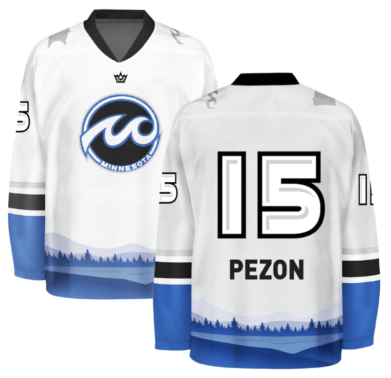
Number 2- Minnesota Whitecaps White
These were not given the proper credit in last season’s list. The Whitecaps white alternates are just awesome. A white base with black bands on the sleeves and blue cuffs and a blue tail stripe is as simply elegant as it comes. The same complaint stays though- from afar, you can’t appreciate the true beauty of the forestscape along the bottom of the jersey, but up close it’s hard to find a single flaw with these.
First- Buffalo Beauts Blue
The powder blue jerseys have been a staple in the Beauts repertoire for years and, with minor tweaks, have carved out a great hockey jersey. The jersey is a bit barren, but color is unique and incorporating a star pattern within the striping on the sleeves and tail is a nice touch.

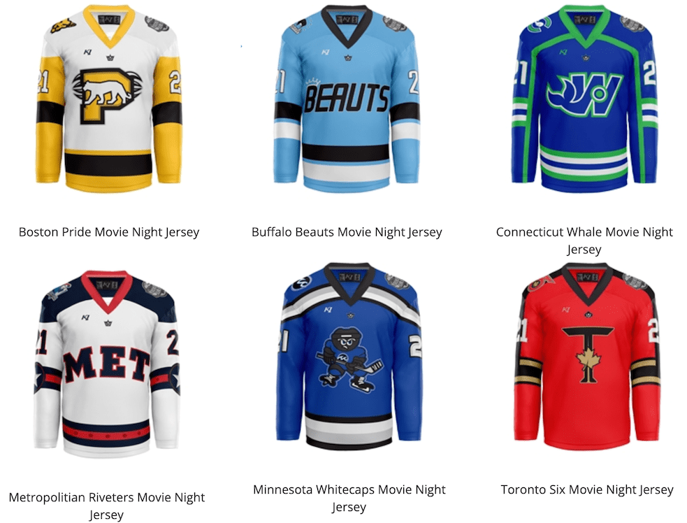
Honorable Mention: The Movie Night Series
During the offseason the PHF teased a series of jerseys based on famous movies, and with the launch of their new PHF shop, the dreams became a reality. While it’s unknown if they’ll break these out in game action, they are some absolutely beautiful hockey jerseys that deserve to at least be mentioned on this list.
By: Dan Esche (@DanTheFlyeraFan)
photo credit: PHF store
