

When Adidas announced the return of their Reverse Retro line, it’s like a kid on Christmas morning as the mind runs wild with what kind of whacky design they could possibly pull out of their hats this time around. The original Flyers reverse retros weren’t bad, but they weren’t great. Just a middle of the pack design that made everyone slightly nostalgic without giving us the true throwback designs we really want.
The Flyers don’t exactly have a ton of variation throughout their jersey history. To date, only three different schemes have be used as full-time home and away jerseys with minor tweaks, and a handful of alternates have been rolled out for a few years at a time but not sticking long-term.
So to decipher what the newest editions could look like, I put my elite photoshop skills to good use and mocked up some potential designs for the 2022 Reverse Retro jerseys!
Number 5: Chrome
The Flyers wore their original chrome jerseys from 2002 to 2007 as an alternate. It’s one of the few looks that could be something different for the club as it’s the only time their logo that was altered over the years. This qualifies as both reverse and retro, but don’t look nearly as good as the original chrome design, but because of the throwback logo, it may be in the running for the new reverse retro setup.

Number 4: Shoulder Pads
I was not a fan of the original Reebok takeover in 2007, and considering the originals were out of the rotation in just a few years, clearly the organization didn’t care for them either. Now, the shoulder pad jerseys are 15 years old and could very well be the inspiration for this go around of the reverse retros. In my mind when dreaming these up, they would’ve been the worst of the bunch, but I don’t hate these? They’re a little…. much… but could be tweaked with some white piping along the torso and collar to breakup the orange, a design feature that was not apart of the original setup. These are certainly better than either of the Reebok Edge cookie cutter paint-by-number designs which featured a black or white home/away base.

Number 3: Reverse Reverse Retro
With the limited options to select from, it’s very possible they just invert the colors they used on the 2020 reverse retro. They already look much better than the original RR design, even keeping the stupid white sleeves, but in terms of creativity, it would definitely be a disappointing release.

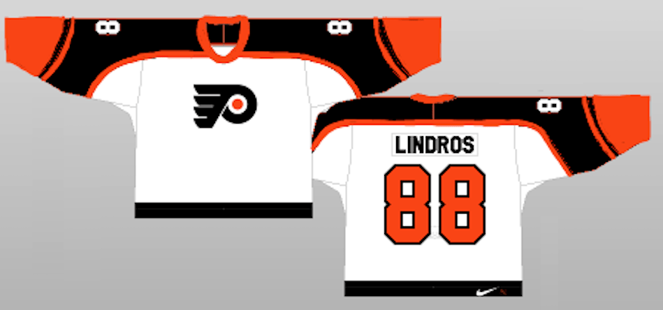
Number 2: Inverted 90’s
If they’re intent on keeping the vintage Flyer look but not directly ripping off their previous idea, they could always keep the body white like the original jerseys from the 1990’s but invert the shoulder yoke to black and sleeves to orange. Not sure if these are better than the last entry, but this one at least looks like it holds to the reverse retro stips while actually maintaining the retro feel.
Number 1: 2012 Winter Classic
This idea is by far my favorite and I don’t even have to subject you to my photoshop skills, because the Phantoms already wore jerseys very similar to this during their 2011 Outdoor Classic. They are inverted jerseys to that which the Flyers would wear a year later during the 2012 Winter Classic. They have a perfect vintage look yet are pleasing to look at and also fit the reverse retro gimmick. These jerseys would sell by the metric ass ton if they went this route, hell, I’d already have a dozen pre-ordered.

.
By: Dan Esche (@DanTheFlyeraFan)
photo credit: Getty images / nhluniforms.com
