

When the new Adidas Reverse Retro jersey line dropped in November, I ranked them with my first impressions. Now, after a full season to mull over the concepts, seeing the full uniforms, and even owning quite a few, let’s revisit the Reverse Retro jerseys and re-rank them!
Number 31- New York Islanders original 31
Most jerseys on the list shifted at least a few spots except the Islanders. I will admit I do like the dark blues much better than whatever their current shade is, but when an organization has the fisherman style lingering in history and choose against wearing it and disappoints everybody, they deserve to be dead last. Thanks. Lou.

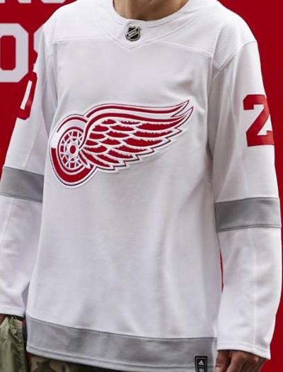
Number 30- Detroit Red Wings original 27
The Red Wings jerseys were a stupidly boring concept to begin with, but the overall uniform is even more ridiculous. They have red helmets and red pants with the white jerseys with grey stripes and white socks with a single grey stripe as well. they look like practice jerseys. There may not be a super diverse history of Red Wings jerseys, but they could’ve tried harder than this.
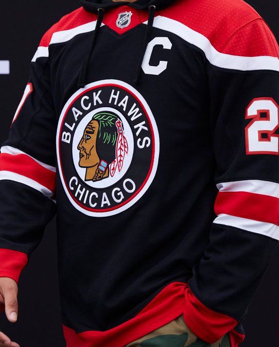
Number 29- Chicago Blackhawks original 30
It’s no secret that I’m not the biggest fan of the Blackhawks current home jerseys, but they look great in comparison to their reverse retro unis. The Blackhawks have had some creative outdoor jerseys over the years and I guess they opted to not draw from them but rather go for a bland, typical Adidas jersey with red shoulder yoke and stripes on the sleeves and tail. It is a throwback to their logo from the 40’s which feels more offensive than their current logo. Just a disappointing look from a team that could’ve done so much more.
Number 28- Toronto Maple Leafs original 26
The Leafs have caught some flack for their reverse retros mainly because their numbers are almost impossible to see from far away, thus making calling games difficult. Considering they already brought back the St. Pats and Toronto Arenas gimmicks over the past few years, I guess they left themselves with little choice as far as a callback is concerned, but these just fail to hit the mark.

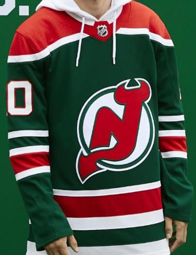
Number 27- New Jersey Devils original 29
I’ll gladly admit these do look better on the ice than the pics give them credit for, but I will also stand by the fact that the green Devils jerseys are atrocious. It’s like christmas in hell.
Number 26- Edmonton Oilers original 23
A full look at these jerseys and uniform as a whole and whatever benefit of the doubt I gave them the first time is gone. The numbers are the same awful shade of orange.This is one of those jerseys where the “reverse” gimmick of the reverse retro did more harm than good. The original blue Oilers jerseys from the 80’s are still the best Edmonton has ever had and changing them is a sin.

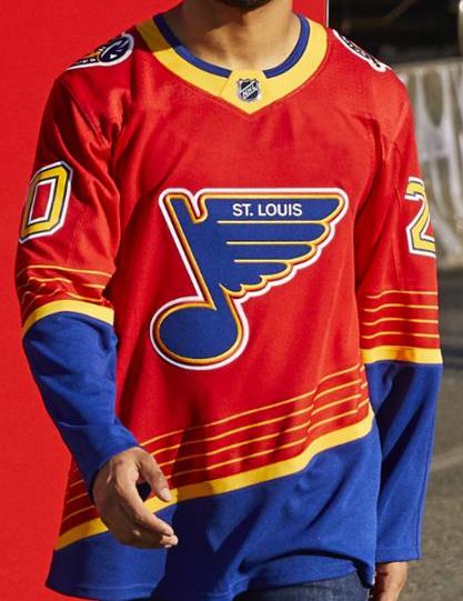
Number 25- St. Louis Blues original 25
I originally criticized these jerseys for being red when the team is called the Blues, but this time around I’m just going to criticize them for being incredibly ugly. It looks like something a cheap party clown would wear to a kids birthday. I was never a fan of the original Blues’ alternates to begin with and adding more red didn’t do them any favors.
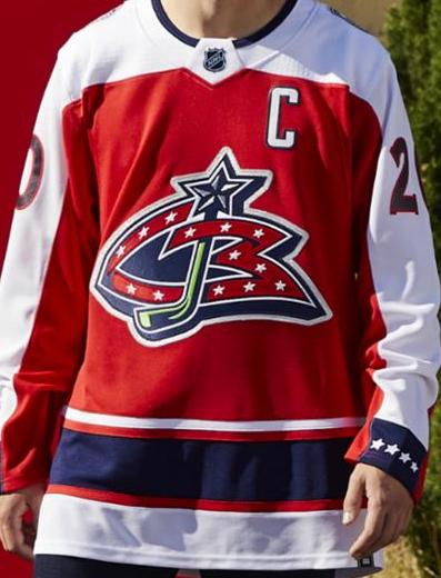
Number 24- Columbus Blue Jackets original 21
Just between us, I really like the old school Blue Jackets logo, but these jerseys just aren’t it. the red isn’t flattering and there’s far too much white. It certainly hit the reverse retro gimmick because there is barely any blue on the jersey, but it feels like a big brain move that backfired for the Blue Jackets. Keep that vintage logo, though.
Number 23- Dallas Stars original 22
The all-white approach the Stars took to their reverse retros are certainly unique, yet the jerseys themselves are underwhelming. They got the idea right with the star outline from the 90’s and 00’s but without any colors to fill out either side of the outline it’s just totally lost on the jersey. That old school stars logo was great and the whiteout idea is kinda cool, but a little bit of green to define the star would’ve been a much better approach.

Number 22- Boston Bruins original 28
The Bruins jerseys have jumped quite a few spots since the original ranking, but that is more by default as others have fallen. There’s nothing wrong with these per say, as it’s damn near impossible to screw up a black and gold color scheme, but they are a bit disappointing. It’s a look ripped right from the 50’s but with better options in Bruins history to draw inspiration from, these were probably better left in the past.

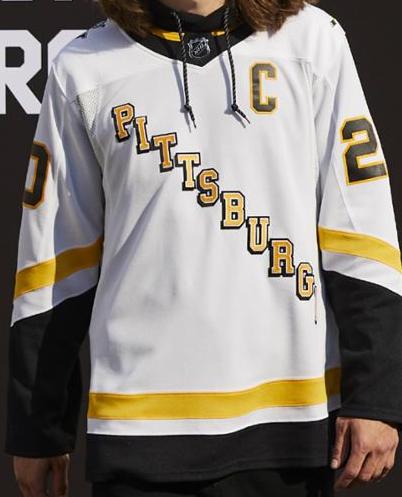
Number 21- Pittsburgh Penguins original 20
Speaking of underwhelming disappointments, the Penguins roll on up. To be fair, the Penguins already reclaimed one of their vintage jerseys from the 80’s as their current home and away setup, but there had to be a better option available than this. These are the reverse style of their early 90’s which were the same, but black was the main color instead of white. The robo-penguin from the same era would’ve been the better inspiration to draw from here.
Number 20- Winnipeg Jets original 13
The Jets jerseys took quite a tumble down the lineup. Originally my main complaint was the lack of red on the jersey, but with time to reflect, the overall bland, stale look is just not great. Too much grey with no color to break it up, then the sleeves are dark blue with no color to break it up, all highlighted by a thick white line running from cuff to cuff. They tried something new and fell flat. Just bring back the original Jets jerseys already.

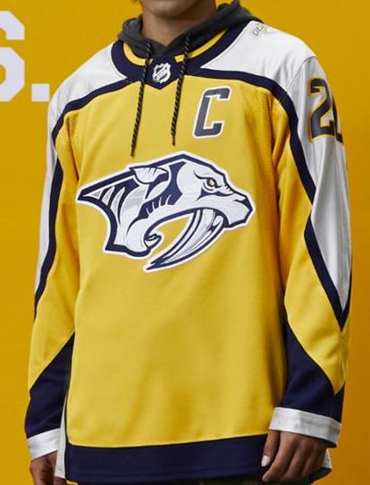
Number 19- Nashville Predators original 14
The Predators have had some of the most creative jerseys in the NHL since their introduction to the league in the late 90’s and these reverse retros felt like a hodgepodge of previous designs that just didn’t work. The base design is kinda like their first jerseys from the early 2000’s with modern colors and their chrome era Reebok logo. The Preds jerseys have slowly been dumbed down over time and these feel like a way to be trendy without a true throwback. Not terrible, but there was much better inspiration to draw from.
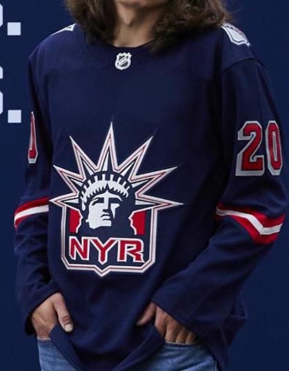
Number 18- New York Rangers original 12
The original Lady Liberty Rangers jerseys are pretty high on my personal all-time favorites list, but the new reverse retros are just a bit too dull for my liking. A little bit of red on the sleeves, like the originals, would’ve gone a long way. They really haven’t gotten worse from the first time I laid eyes on them, but others have improved greatly.
Number 17- Vegas Golden Knights original 17
Vegas fans were ready to storm the front office when they released a gold alternate because for some reason all they wanted was a red one instead. Well, they got their wish for the reverse retro line and it’s… something? It’s certainly a unique color scheme and their alternate logo is pretty cool, but everything combined is just a weird mix that seems unflattering. I don’t hate them, but I don’t really like them either.

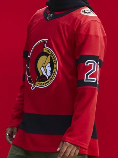
Number 16- Ottawa Senators original 18
The Senators knocked their jersey rebrand out of the park this year and their reverse retros are a continuation of that. While the red is still a bit strong, those old school Sens jerseys are the perfect example of beauty in the simplicity.
Number 15- Philadelphia Flyers original 16
Now that we’ve had the ability to see these during game action, it’s safe to say these pics don’t really tell the whole story of the jerseys. The orange is much darker than the picture suggests and those white sleeves will be ugly ’til the end of time. They’re not bad, if anything they’ve grown on most fans, but any other combination of this layout and color scheme would have been so much better.

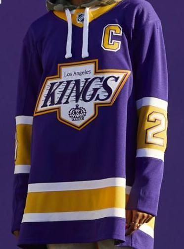
Number 14- Los Angeles Kings original 8
These were critically acclaimed for the most part, but they never tickled my personal fancy. To me, the current Kings jerseys are some of the best in the league. The black and white scheme is almost perfect. The old school Kings logo is superior to their current, but slapping that on an even older purple design just doesn’t seem right. Like I said, they’re fine, just not for me.
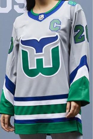
Number 13- Carolina Hurricanes original 6
These are one of the few jerseys that fell from their original rankings based on their design versus others rising. The Whalers jerseys are sacred and really shouldn’t be messed with, and the grey torso just didn’t work out well in this case. The Hurricanes already brought back green Whalers jerseys as an alternate, and the ideal of these being that the silver/grey is the color that unites the two franchises. I get the theory, but taking a risk and adding so much grey really brought the overall mood down. A nice try, but a hit and a miss.
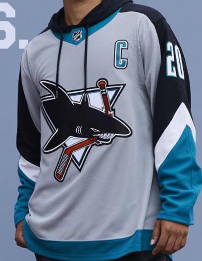
Number 12- San Jose Sharks original 7
I loved the Sharks jerseys from the early 2000’s and the reverse retro mix the best of both worlds from that era. The main color on the jersey is grey, which was my primary concern, but it limited the black and blue and is a case of “less is more.”The full uniforms are damn near perfect and I am absolutely kicking myself I didn’t pick one of these up.
Number 11- Washington Capitals original 15
The Caps absolutely nailed their reverse retro with the return of the screaming eagle. The originals from the late 90’s were some of the best jerseys in NHL history and the obvious worry was that these wouldn’t live up to the blue screaming eagles, but the same design in the current Caps red and dark blue meshes great. Washington desperately needs to shake up their home jerseys, so let’s hope these stick around.

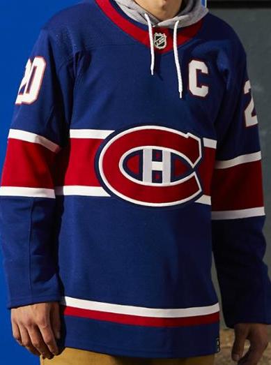
Number 10- Montreal Canadiens original 19
It’s a jersey concept that feels sacrilegious but is pleasing to look at. It’s one of the rare times in the reverse retro collection that inversion worked out for the better.
Number 9- Anaheim Ducks original 11
It only makes sense that 25 years after the “wild wing” jerseys debuted and were one of the most hated jerseys in NHL history that they make their return and are beloved. To be fair the reverse gimmick works incredibly well with these, as the original had the teal as the main color on the jersey. It’s the perfect mix of simplicity and crazy that meshes superbly.

Number 8- Vancouver Canucks original 5
The picture doesn’t give these jerseys the proper respect they deserve. The shade of green is just beautiful and the gradient works well. Hopefully these stick around in some capacity in Vancouver, because they are gorgeous.

Number 7- Tampa Bay Lightning original 10
The Bolts don’t exactly have a sparkling track record as far as jersey history goes, but good lord did they ever do something right with their reverse retros. It’s a callback to their original jerseys, which were black instead of blue. The blue is pleasing to look at and that original crest is great. Just an awesome setup which better be their regular home jerseys ASAP.

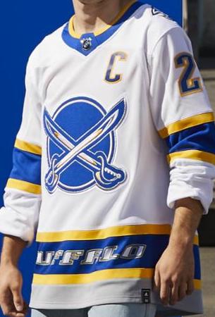
Number 6- Buffalo Sabres original 4
The Sabres may be a disaster on the ice, but they certainly hit their reverse retros out of the park. The return of the royal blue works well with the dinner plate design from the early 2000’s. It’s one of those looks that didn’t need to be exuberant to be amazing, just the perfect mix of modern and past.
Number 5- Florida Panthers original 24
The Panthers made the biggest jump because good Lord was I wrong about these the first time. The Panthers haven’t exactly had the best jerseys in their history, but bringing back their mid-00’s home jerseys with a modern twist has resulted in an almost perfect hockey jersey. The color scheme is easy to look at, and the jersey has a busy design without being ridiculous. I would’ve bought a dozen of these had I shown them the proper respect the first time around.

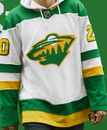
Number 4- Minnesota Wild original 9
As a man who isn’t a fan of the current Minnesota Wild color scheme, these were a breath of fresh air to begin with. Now that we’ve seen the full uniforms and in game action, they’re even better. For some reason the thought of overlapping the Wild’s jersey design with the North Stars’ colors never crossed my mind, but it’s a perfect match that should become their color scheme and jersey design next season and for the foreseeable future.
Number 3- Arizona Coyotes original 2
Here’s a perfect example of the pictures not doing the jerseys justice. After owning one, its easy to say the shade of purple is much darker in real life than it comes across in the pics. By no means is it a bad jersey, as the creativity is still through the roof with the desert-scape on the bottom, but it would be better if the purple was a little brighter.

Number 2- Calgary Flames original 3
Blasty’s return to Calgary was definitely welcomed and it brought an awesome jersey to match. The argument can be made that there isn’t enough color on the jersey, and while I concede that may be true, there is absolutely nothing wrong with the final product. It’s a great jersey with a great logo that continued the great Calgary jersey overall that took place this season. Everything is great in Calgary, except the on-ice product of course.

Number 1- Colorado Avalanche original 1
Still the unquestioned best jersey of the release. They are simple, clean, and a perfect mix of a throwback with a modern twist. How the Avalanche have never thought to release something like this already is mind-blowing. They’re absolutely beautiful for anybody who loved the Nordiques jerseys and the Avalanche colors just fit the layout perfectly. The Avs should just wear these for every game moving forward, home or away, as long as they retire those ugly pants and buckets first.

By: Dan Esche (@DanTheFlyeraFan)
photo credit: dailyhive.com
