

Adidas revived their Reverse Retro line for the second and final time in 2022. Now that a few months have passed and every team has broken out their version on the ice, let’s revisit the worst to first 2022 Reverse Retro jerseys before the gimmick gets put to bed for good.
Find the original rankings here
Worst: Winnipeg Jets original 31
These jerseys are certainly better than Winnipeg’s last attempt at a Reverse Retro, but they’re still bland with a cookie cutter design. The old school logo will always be a fan favorite, but these jerseys are just an overall miss.

Number 31: Columbus Blue Jackets original 29
The original jerseys these are based off weren’t even good, and neither are the Reverse Retro. I’ll stand by the original statement that they look like knockoff jerseys. But hey, at least they’re not red.

Number 30: Toronto Maple Leafs original 28
It’s still just a regular Leafs jersey.

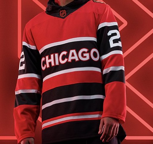
Number 29: Chicago Blackhawks original 25
Admittedly, there is a certain level of uniqueness this jersey brings and if there was some kind of actual crest on them, they may very well be higher on the list, but the “Chicago” wording instead is just something that can’t be redeemed and ruins the entire design.
Number 28: Detroit Red Wings original 24
Chicago was unique, the Red Wings are just a bit baffling. It’s a take on their jerseys from the 1920’s, but the black just feels out of place on a jersey for a team that has never utilized black as a color before. Guess it’s better than their practice jerseys from the last Reverse Retro run.

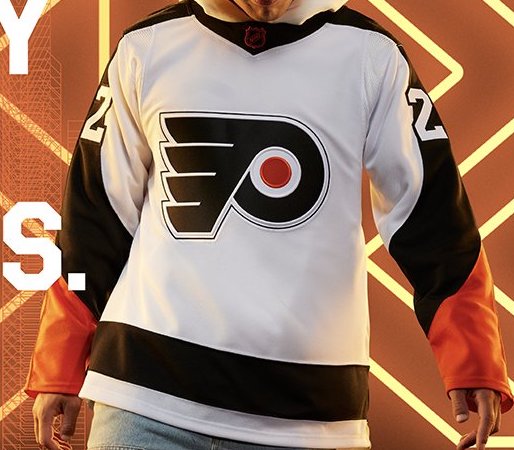
Number 27: Philadelphia Flyers original 30
Damn these jerseys are boring. Yeah, they gained a few spots, but mainly because others fell, these didn’t necessarily rise. The all-black numbers and nameplate on the back are an extra layer of dull. A perfect encapsulation of the Flyers as whole in 2022.
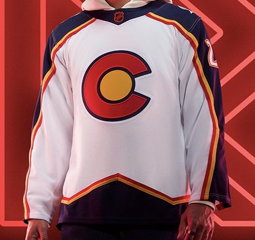
Number 26: Colorado Avalanche original 22
Colorado may have perfectly marked every box for their first Reverse Retro jersey, but these jerseys just aren’t it. It’s a throwback to their original unis with the old Colorado Rockies colors. It fits the Reverse Retro gimmick perfectly, but that doesn’t mean it’s an attractive sweater.
Number 25: New Jersey Devils original 21
It’s still odd that two separate team drew influence from the Colorado Rockies. Now the Avalanche are, ya know, in Colorado and the Rockies ultimately relocated to New Jersey, but going to the same well twice in the same release feels like a lack of communication at Adidas headquarters. Still undecided as to whether or not these are better or worse than their Christmas colored jerseys.

Number 24: Dallas Stars original 20
Aren’t these the exact same jerseys the Blue Jackets are wearing just recolored? The old Stars logo will always be awesome, but the jerseys just kind of fall flat in their attempt to put a modern swing on an old classic.

Number 23: St. Louis Blues original 27
The Blues have a way of rolling out any combo of blue, yellow and white and it always somehow turns out alright. The promo picture Adidas released doesn’t do the whole setup justice. They’re a fine display of the Reverse Retro idea.

Number 22: Vegas Golden Knights original 10
Vegas get the honor of being the biggest fallers on this list. Even in their infancy as a franchise, Vegas has had some of the better jerseys in recent NHL history. While these are a solid attempt at crafting a Reverse Retro for a team with no history to build from, it’s a cool look, but also a bit of an overall empty, bland design. Though it’s hard to screw up a black, gold and red color scheme and the diagonal wordplay will always be a classic look.

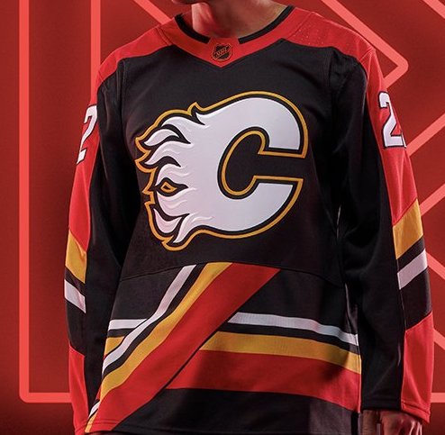
Number 21: Calgary Flames original 19
The Flames’ short-lived pedestal jerseys were some of the wackiest jerseys in NHL history. They screamed 90’s. The updated version, while still a questionable overall design, look so much better with a black base and red, orange and white as the highlights. They’re a middle of the pack jersey.
Number 20: Vancouver Canucks original 23
These jerseys are cool. You can’t not look at these and feel like a lumberjack. I want to put on a flannel jacket just writing this. The dulled tones of the color scheme fit the north west vibes they were going for, unfortunately it makes the jerseys a bit drab because of it.

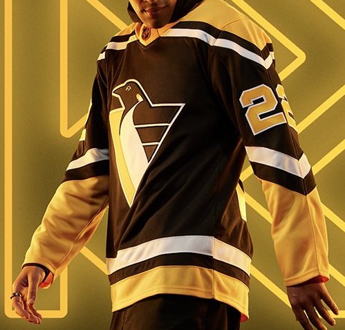
Number 19: Pittsburgh Penguins original 18
The Robo-Pen is just a classic crest. The Penguins are already dabbling with their color scheme from that era, so the shock value of these returning was muted a bit. Still a vintage, clean jersey nonetheless.
Number 18: Arizona Coyotes original 17
The real jerseys are a bit lighter than the promo photo suggests, but they’re still a fun, slightly baffling design. They stuck to the desertscape theme they utilized during the last RR go around, but this time opted for a tan instead of purple. It’s certainly unique and offer a not quite subtle nod to the fact they play in a desert, but they just aren’t it.

Number 17: LA Kings original 8
The Kings’ first Reverse Retro jersey went for the vintage purple and gold as well. These are a direct inverse of their jerseys from the late 80’s. Even though they nail the Reverse Retro look, there’s something about them that feels noticeably dull.

Number 16: Montreal Canadiens original 9
It feels like a sin every time the Canadiens’ classic uniforms get changed up. They paid homage to the Montreal Expos with their powder blue which plays nicely with their regular dark blue and white stripes.

Number 15: Buffalo Sabres original 11
The Sabres still pulled off something of a dream jersey when the crossed over the goathead with the classic blue and yellow color scheme. While they’re undeniably clean as hell, they still lose most of their appeal when the actual black and red goatheads were brought back at the same time. It would be a fun alternate if they ever revert back to the black and red full-time.

Number 14: Carolina Hurricanes original 13
Even since ditching their original, damn near perfect original uniforms back in 2013, The Hurricanes have been testing various bland designs to replace them with. There’s really nothing eye-poppingly cool about these, but there’s really nothing wrong with them either. As we learned in the Vegas entry, I’m a sucker for diagonal crested jerseys, so they get bonus points because of it.

Number 13: Edmonton Oilers original 14
The return of the Oil Drip was heavily awaited and it was nice to have them back. The use of orange as a highlight color still feels very unnatural, but it’s hard to argue how cool such a simple design can be.

Number 12: Florida Panthers original 32
Alright, I’ll admit it, the Panthers jerseys are kinda cool. The colors and new crest leaned a bit too heavy into the ridiculous side upon their debut, but seeing them on the ice is a different, more positive look. It certainly hits the reverse retro gimmick to a T and the crest and color scheme definitely feels like Florida to me.

Number 11: Seattle Kraken original 26
The second biggest gain on the list belong to the Kraken. The promo pictures didn’t capture how cool these jerseys actually are. The light blue is a much more brilliant shade in real life and it works perfectly with the dark blue and the vintage maritime feel these jerseys present.

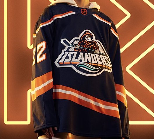
Number 10: New York Islanders original 16
Lou Lamoriello and the Islanders finally caved and brought back a fan favorite in the fisherman jerseys. It’s still an awesome crest, a perfectly unique jersey and the modern dark blue base may actually look better than the originals. It’s not often NYI do something notable when it comes to their jerseys, but these were a home run.
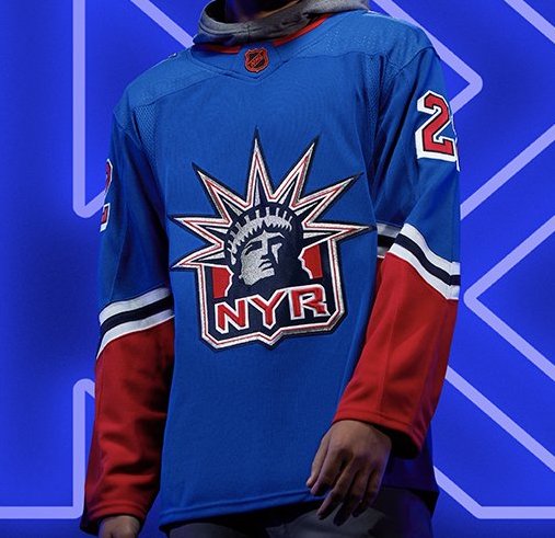
Number 9: New York Rangers original 15
Nothing will ever beat the original Lady Liberty jerseys, but the Rangers bringing back the red sleeves that they left off their last Reverse Retro make these feel more like the jerseys we all knew and loved.
Number 8: Minnesota Wild original 12
Using the Minnesota North Stars colors on the jerseys is the best thing that happened to the Wild maybe ever. The dark green and red color scheme they’ve used for decades is beat to death and the light green and yellow is a much needed facelift and hopefully they keep both of their reverse retro jerseys as the new home and away for the rest of their existence.

Number 7: Ottawa Senators original 7
The Senators have been knocking jerseys out of the park since bringing back their old logo in 2021. The black and red version of their jerseys from the early 2000’s is simple yet very effective. It’s practically impossible for them to design a bad jersey with red, black and white as their color palette.

Number 6: Nashville Predators original 5
As a fan of the Mustard Cat crest, it’s hard to criticize the sweater, but Nashville’s love of relying so heavily on the yellow/gold with little variation is not doing these jerseys any favors. Still very cool, but could’ve been even higher on the list with that proper mustard color.

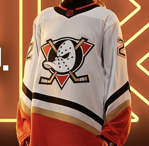
Number 5: Anaheim Ducks original 6
The Ducks have tried a few different incarnations of the Mighty Duck jerseys since they buried the originals and they’ve all been underwhelming, but their regular orange tone on the white base with the gold and black secondary colors work perfectly. If they’re never bringing the eggplant color scheme back, these are a fine replacement.
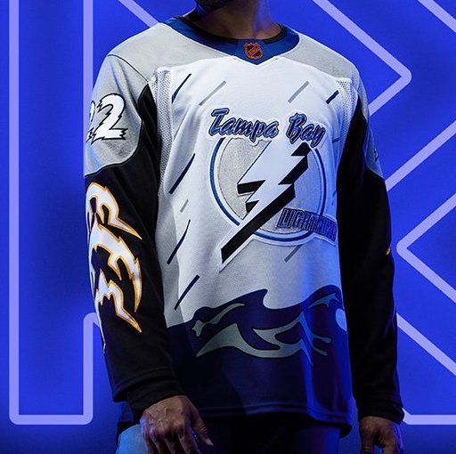
Number 4: Tampa Bay Lightning original 4
In the world of hockey jerseys, there’s a fine line between ridiculous in a good way and ridiculous in a bad way and the Bolts have walked a fine line with the return of their storm jerseys, but they’re ultimately just too cool to ignore. The rain, the ocean, the lightning bolts on the sleeves. Perfectly wacky.
Number 3: Boston Bruins original 3
The original yellow Pooh bear jerseys rank high on the all-time jersey list, so breaking them back out and inverting them was a big gamble, but it paid off in spades.

Number 2: San Jose Sharks original 2
Even if the jerseys themselves are a bit bare, the entire uni is a thing of absolute beauty. How the Sharks never paid tribute to the Seals before is still a mystery, but these jerseys need to be kept in their rotation permanently. they’re just too perfect to leave behind yet again.

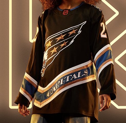
First: Washington Capitals original 1
The Screaming Eagle jerseys are still just the best. The crest, the uneven stripe, the blacked out jersey with the gold inlay. Just an elite hockey sweater.
By: Dan Esche (@DanTheFlyeraFan)
photo credit: adidas.com
